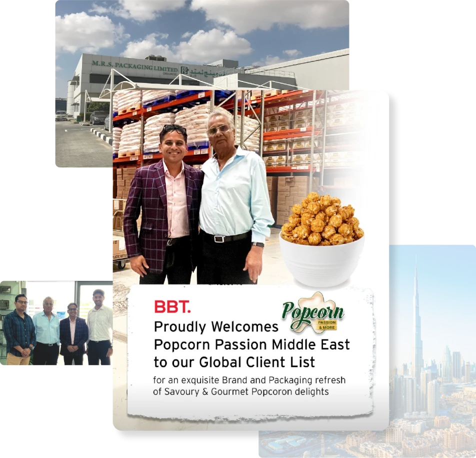
Modernizing Dubai’s leading Popcorn Brand.
A come hither pop to the
most loved snack ‘Popcorn’
most loved snack ‘Popcorn’
Popcorn Passion is a brand with 25+ years of excellence in fun food solutions. A HACCP certified brand has led the distribution scenario of Popcorn across Dubai. As a growth leap the brand sought to enter the retail and e-commerce arena, a strategic move that required a brand refresh and a packaging overhaul. The goal was to undergo contemporary and consumer-centric brand and packaging refresh to be relevant to the fun category and modern market.

Modernizing for scale & consumer connect
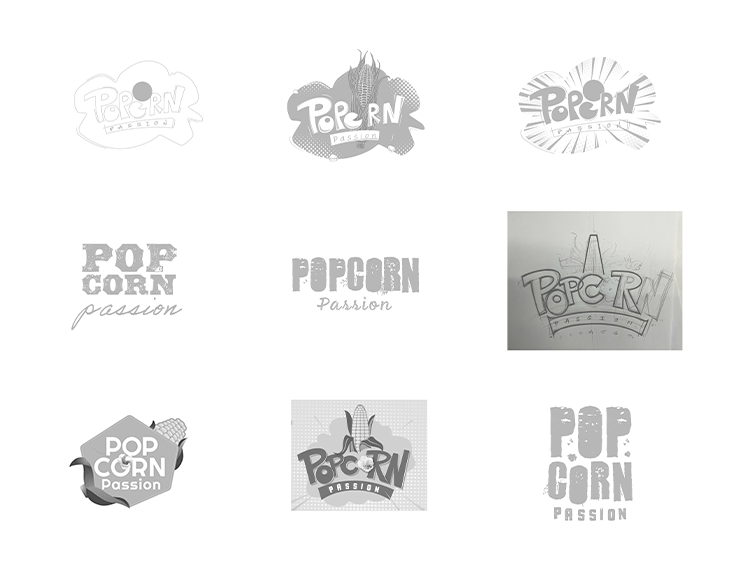
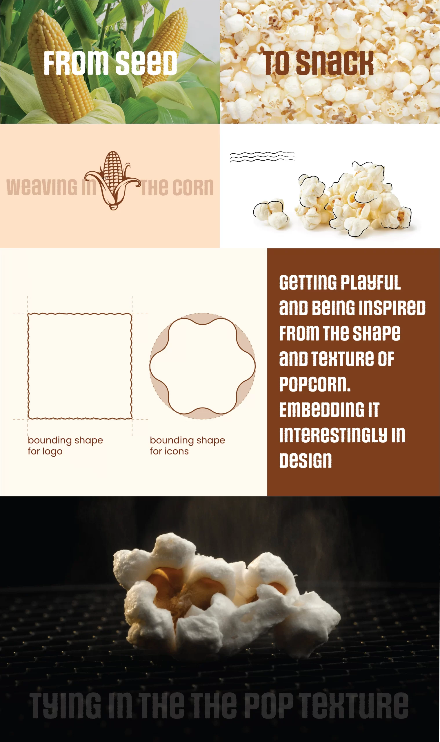
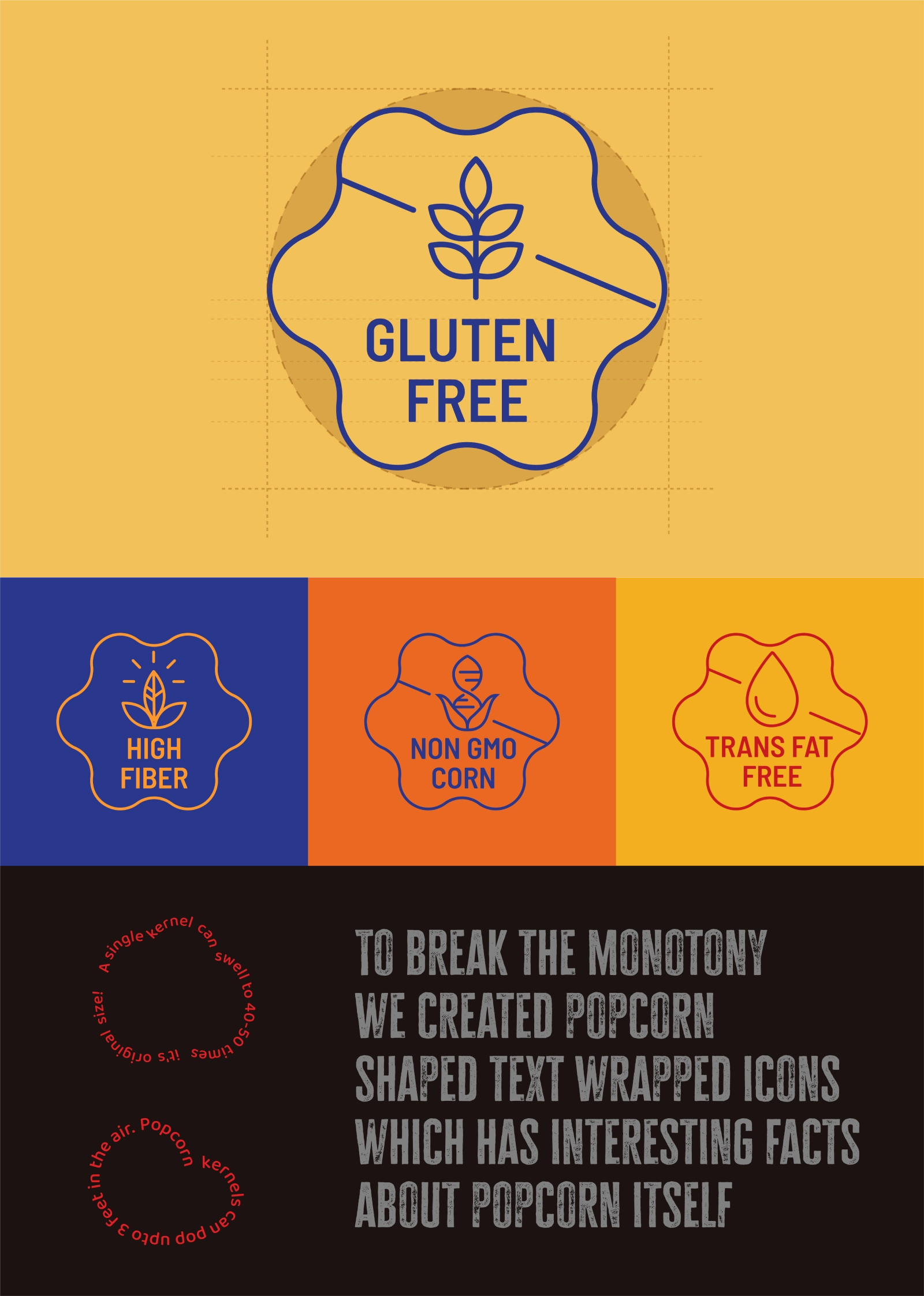
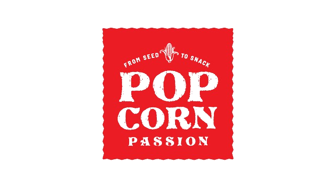
We evaluated the existing logo on three key parameters:
consumer connect, visibility and technical scalability.
The existing logo of popcorn passion while representing
the brand had room for modernization and thus we
refreshed the brand identity for scale and connection.
consumer connect, visibility and technical scalability.
The existing logo of popcorn passion while representing
the brand had room for modernization and thus we
refreshed the brand identity for scale and connection.
Conversations, insights, strategies & field visits
Founding the brand refresh journey on deep and insightful conversations. Our team visited the world of Popcorn Passion in Dubai to understand its true essence as an organization and thus as a brand. Structured brand discovery workshop with the founder and core team, market visit and dynamics became the north-star to our brand refresh. We thank Mr. Manu for sharing his vision with us.
Glimpses of the immersive creative moments
that lead to a consumer friendly brand.
that lead to a consumer friendly brand.
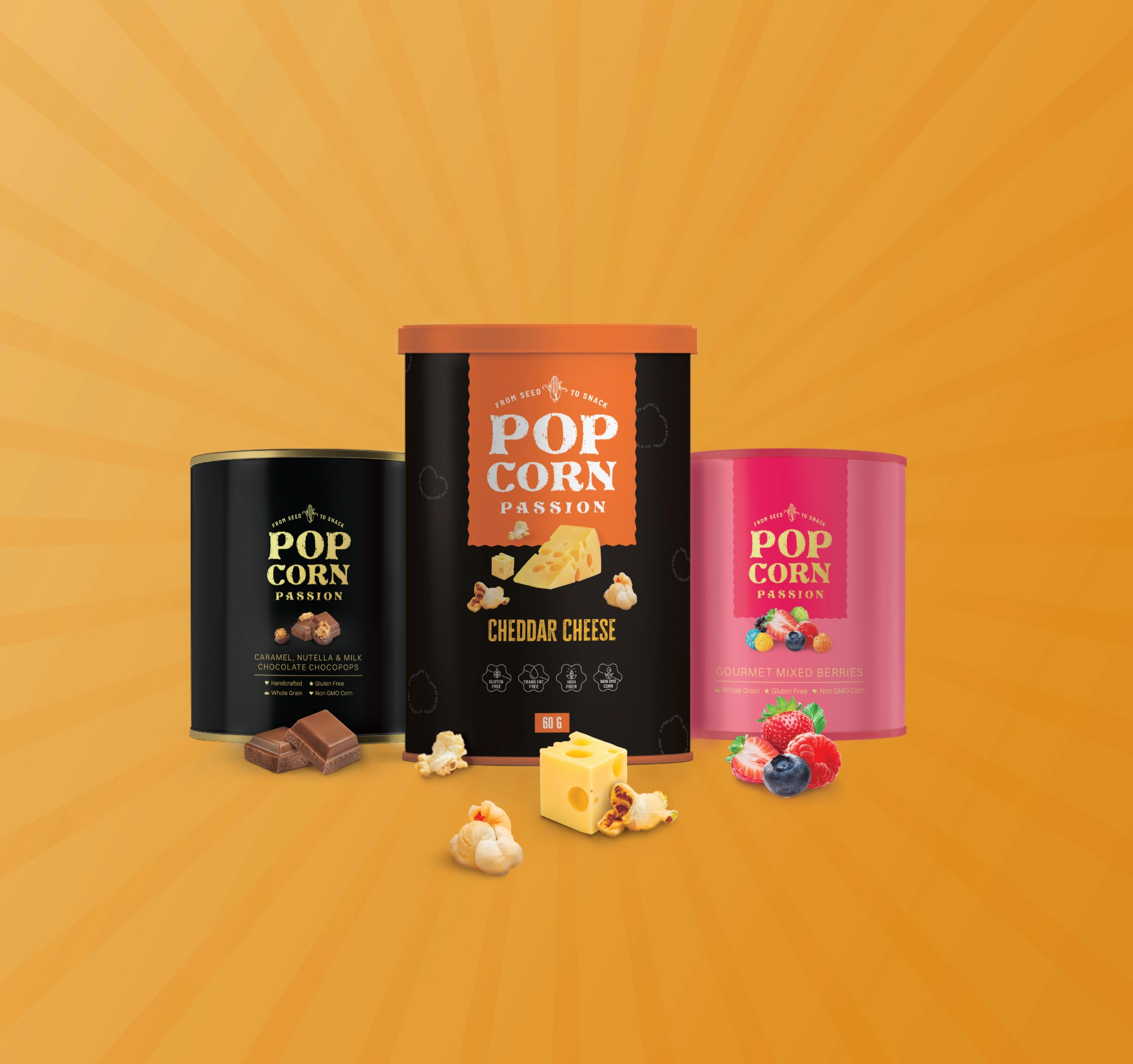
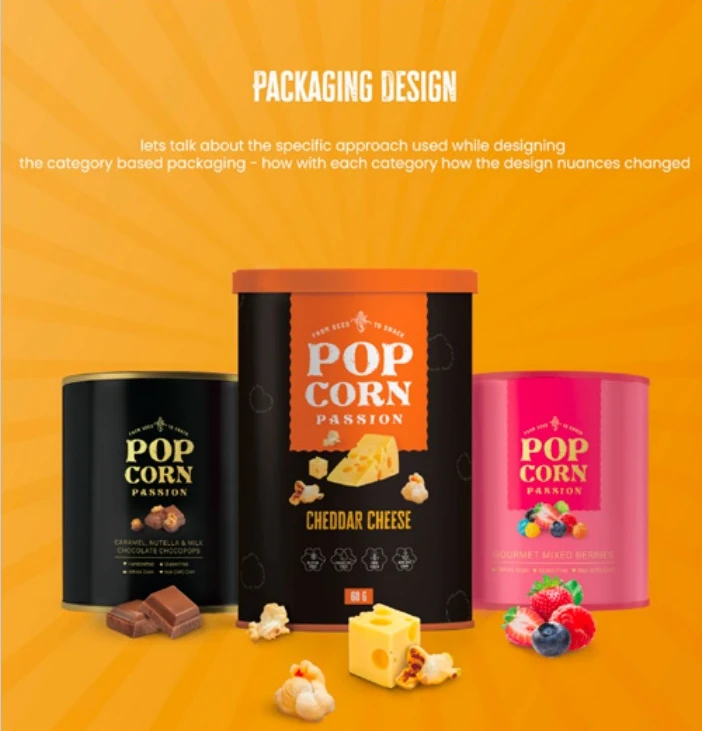
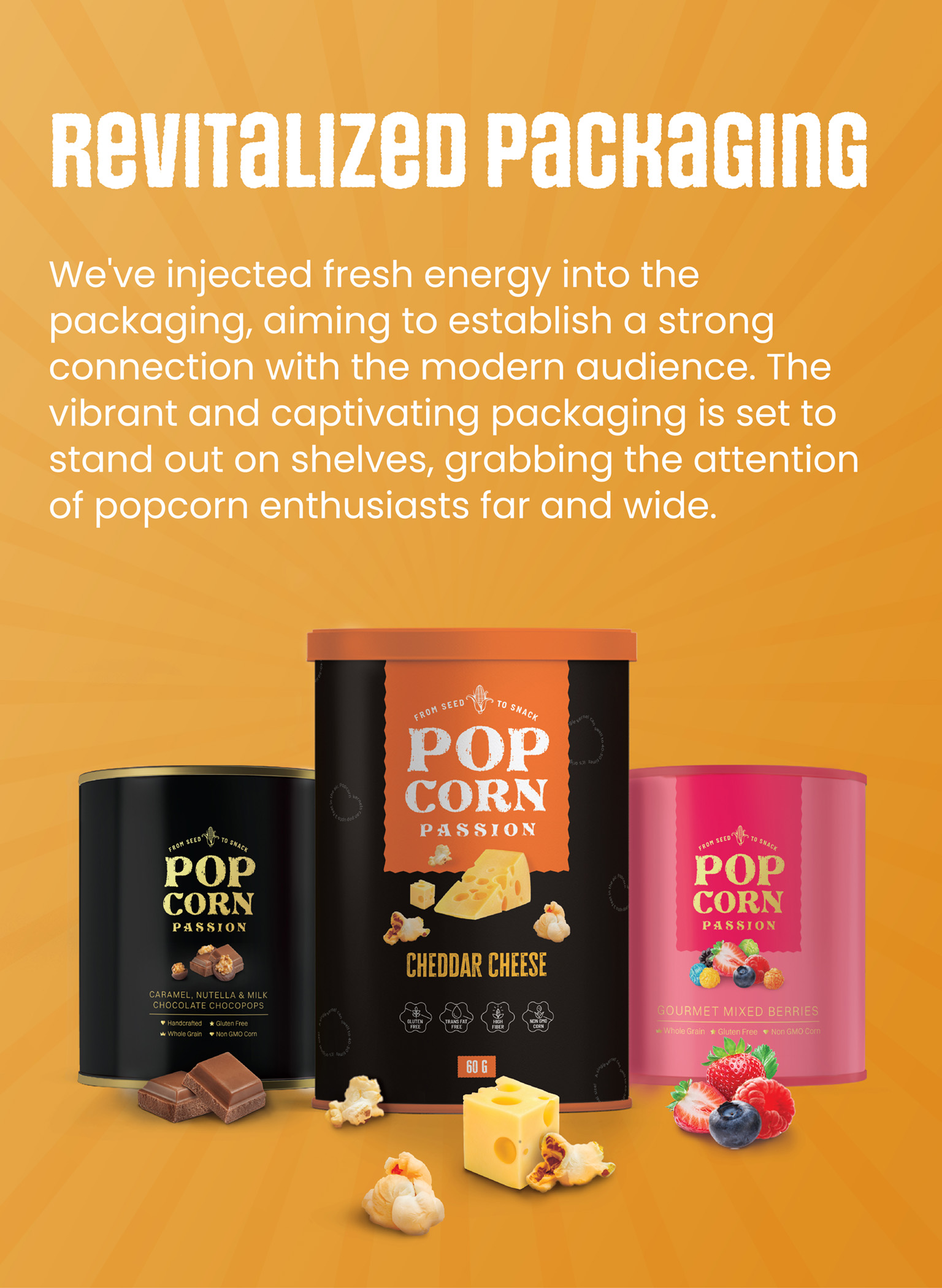
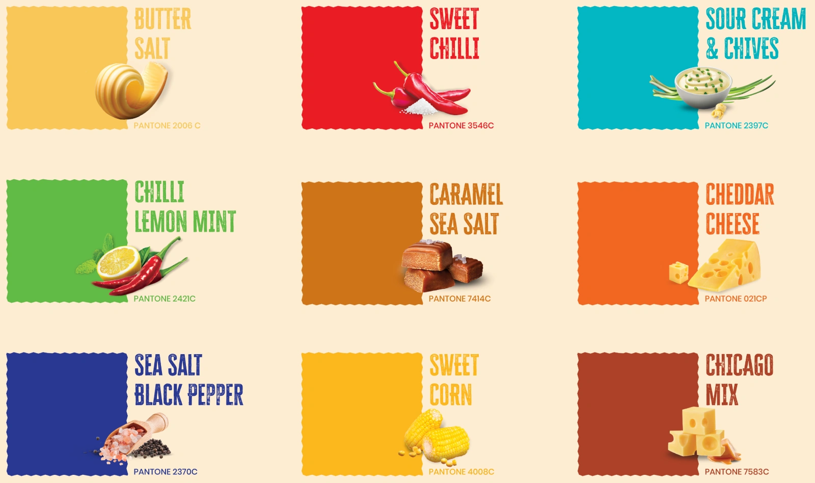
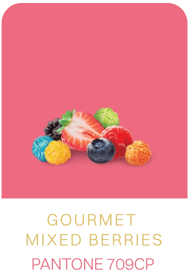
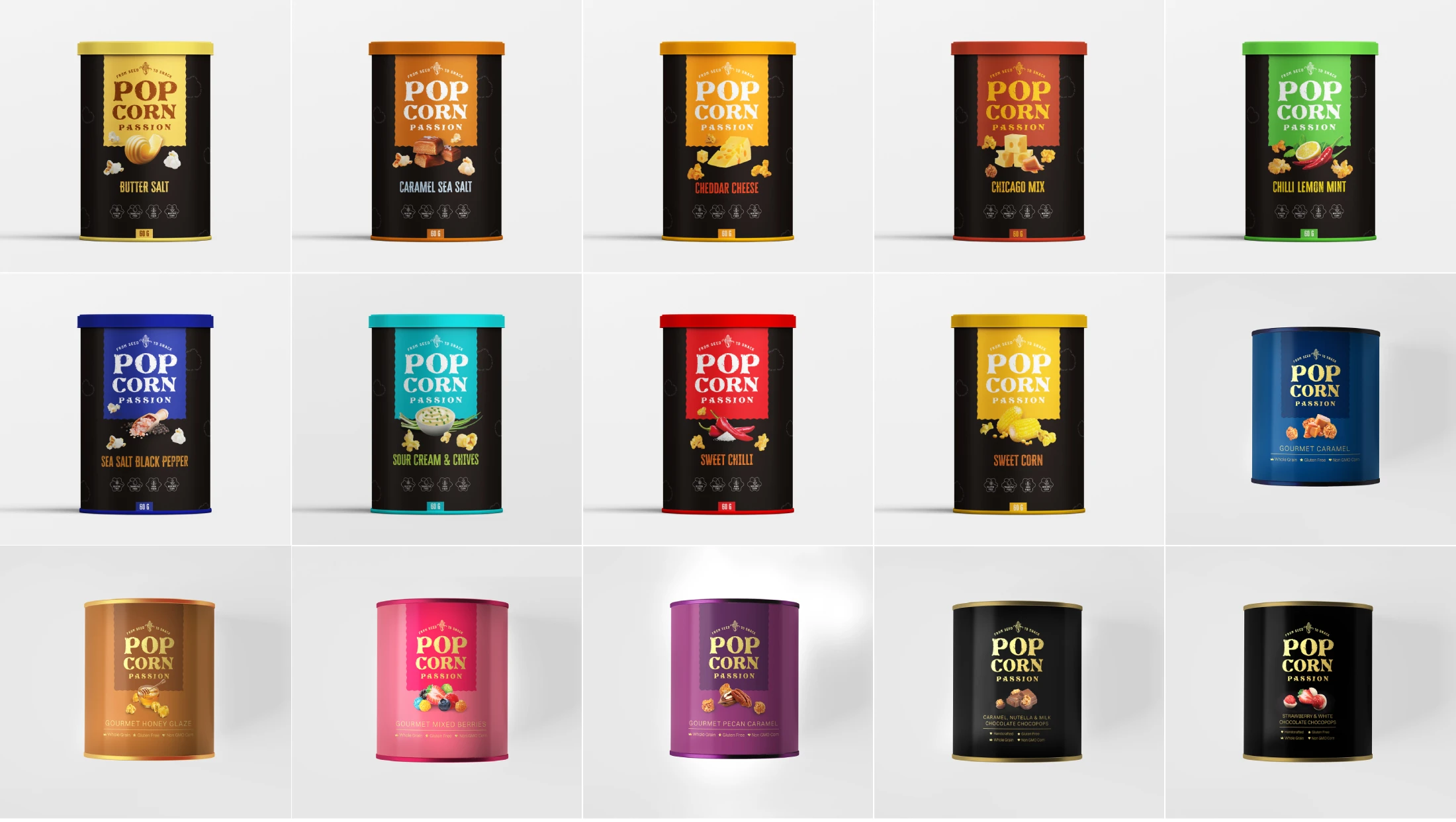
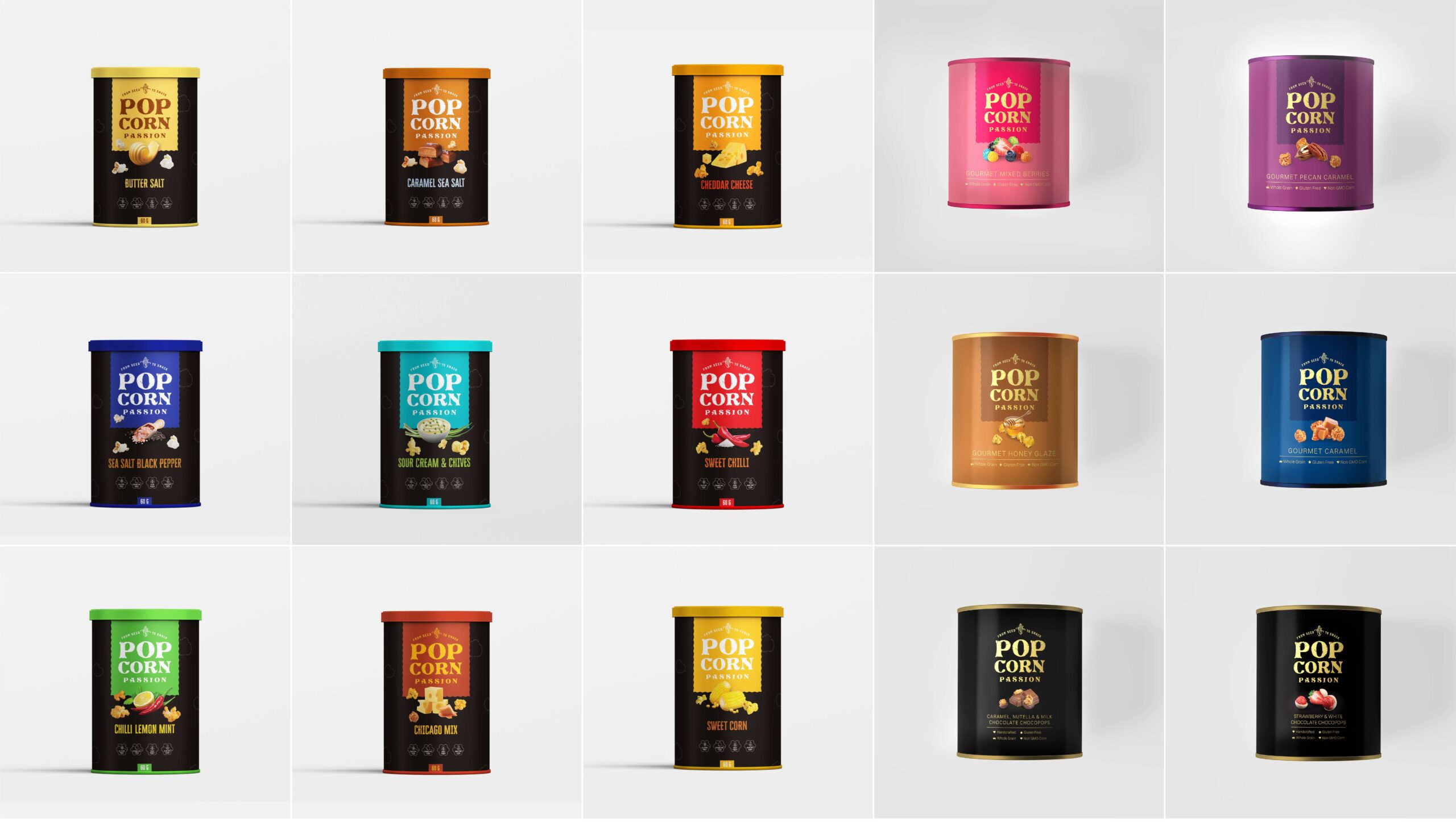
Savoury Range
The idea was to have them ‘Pop’ at the retail shelves. A much loved category, with unique flavours called for a packaging that differentiated the flavours and yet ensured that each pack belonged to a singular brand family. Since the brand was seeking to launch itself for the first time in retail space we ensured that the Brand name and logo and the flavour both constitute the major part of packaging real estate. Pop colors enabled modernization and visual impact.
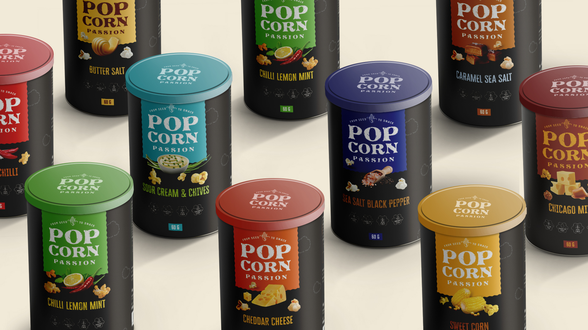
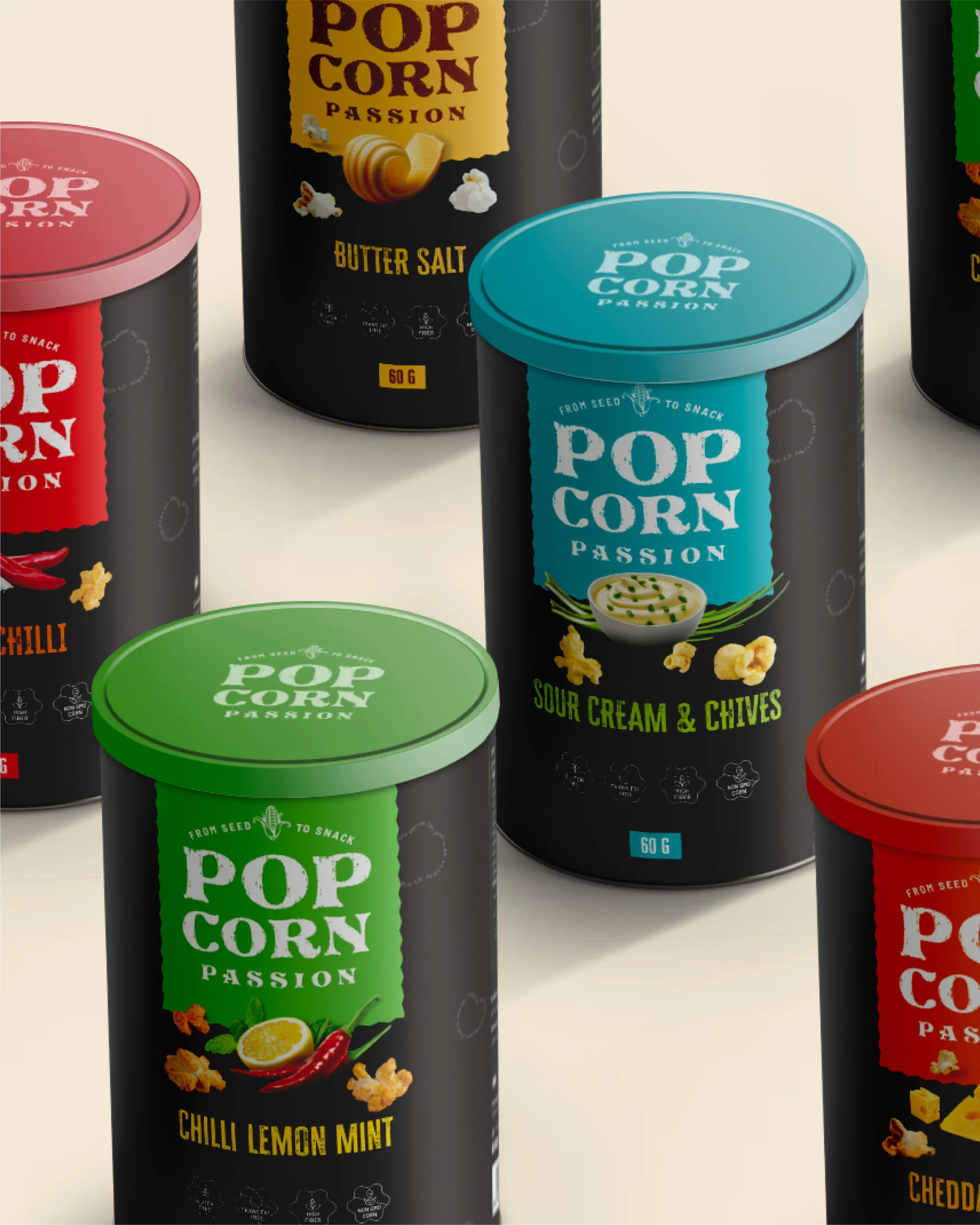
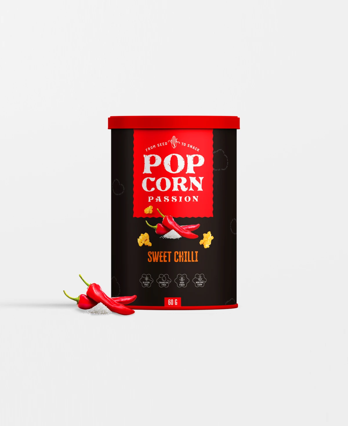
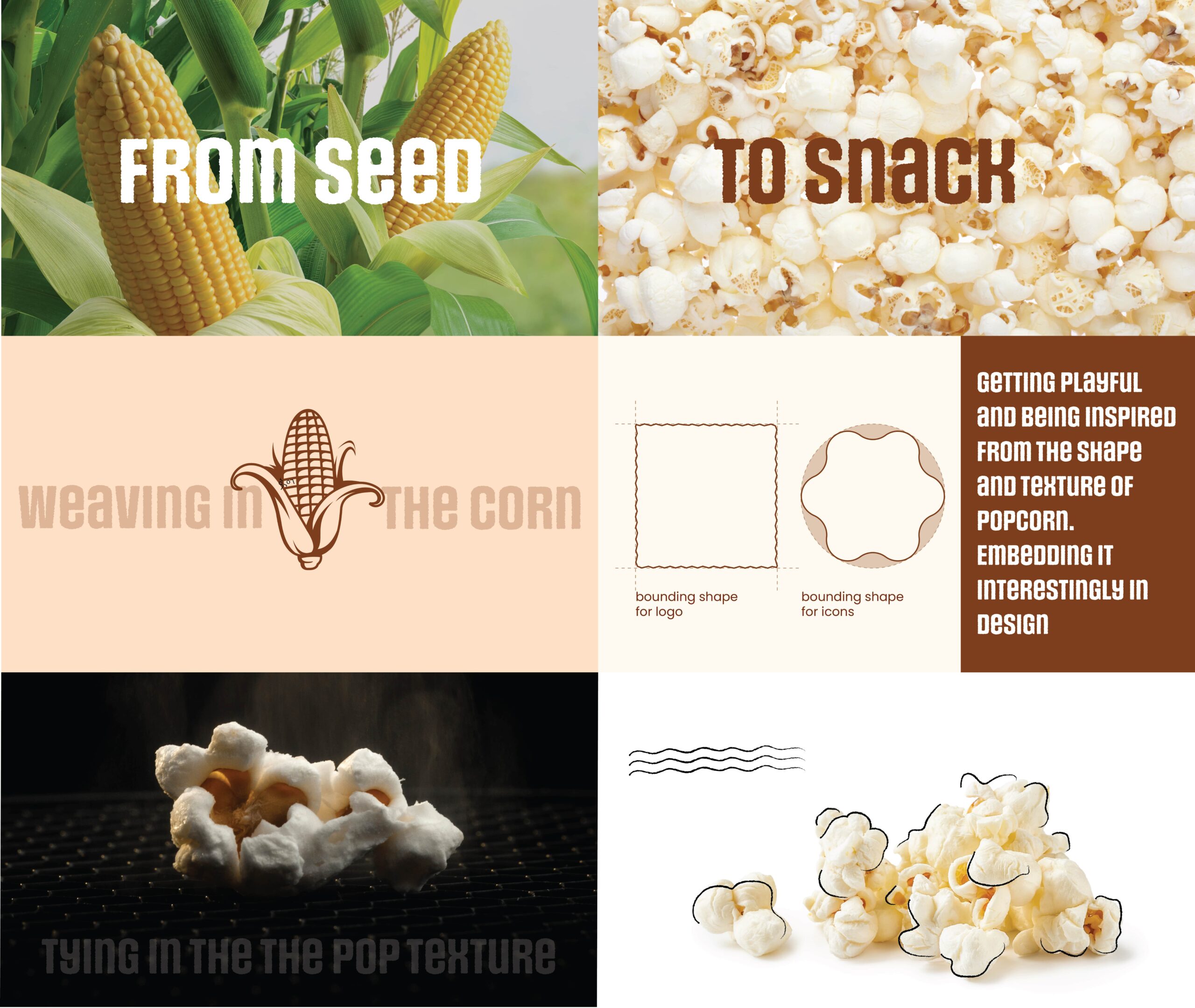
Colour
Colours are inspired from the native ingredients of the flavour, ensuring relatability and emphasis. The bright colour palette ensures visual impact.

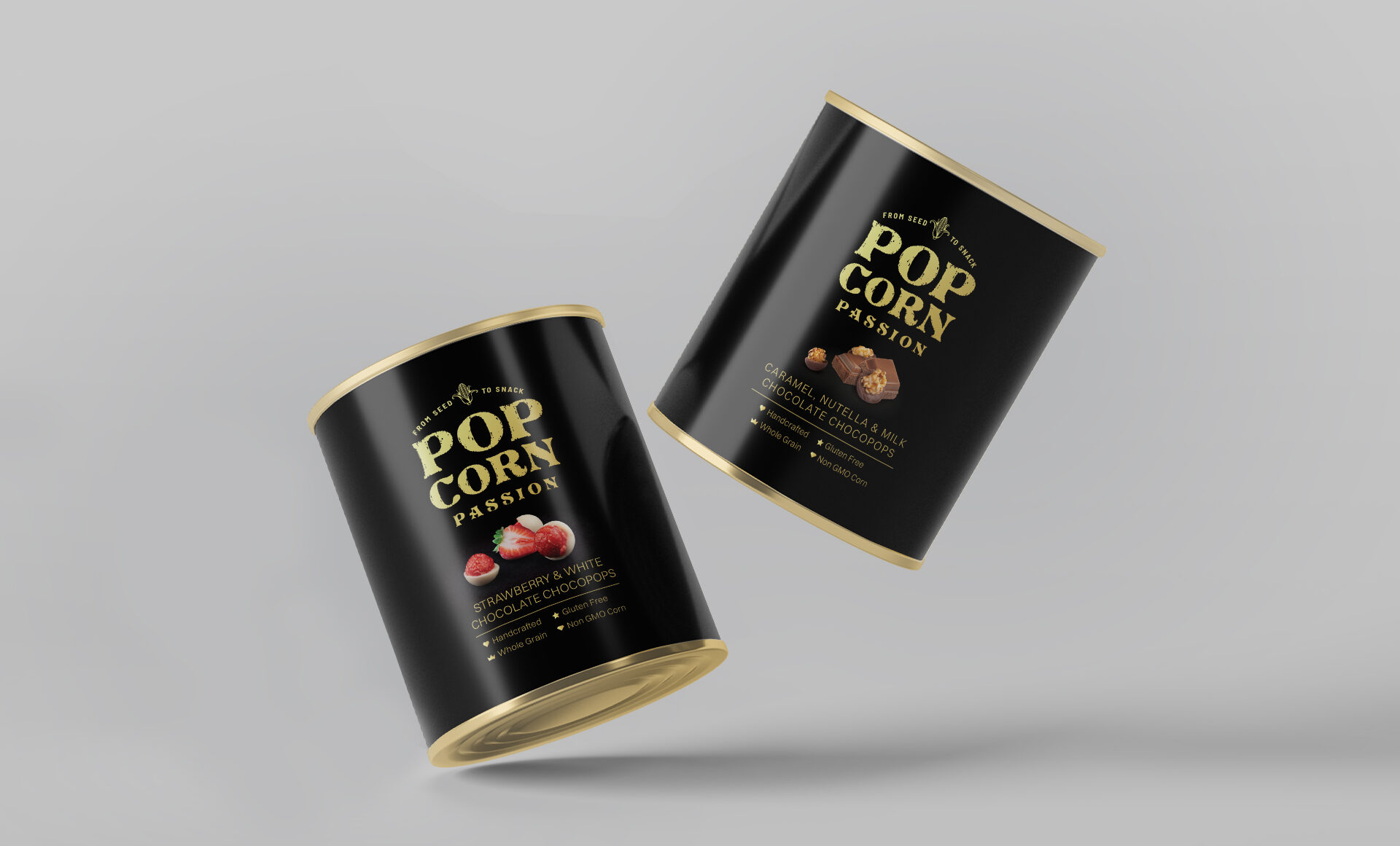
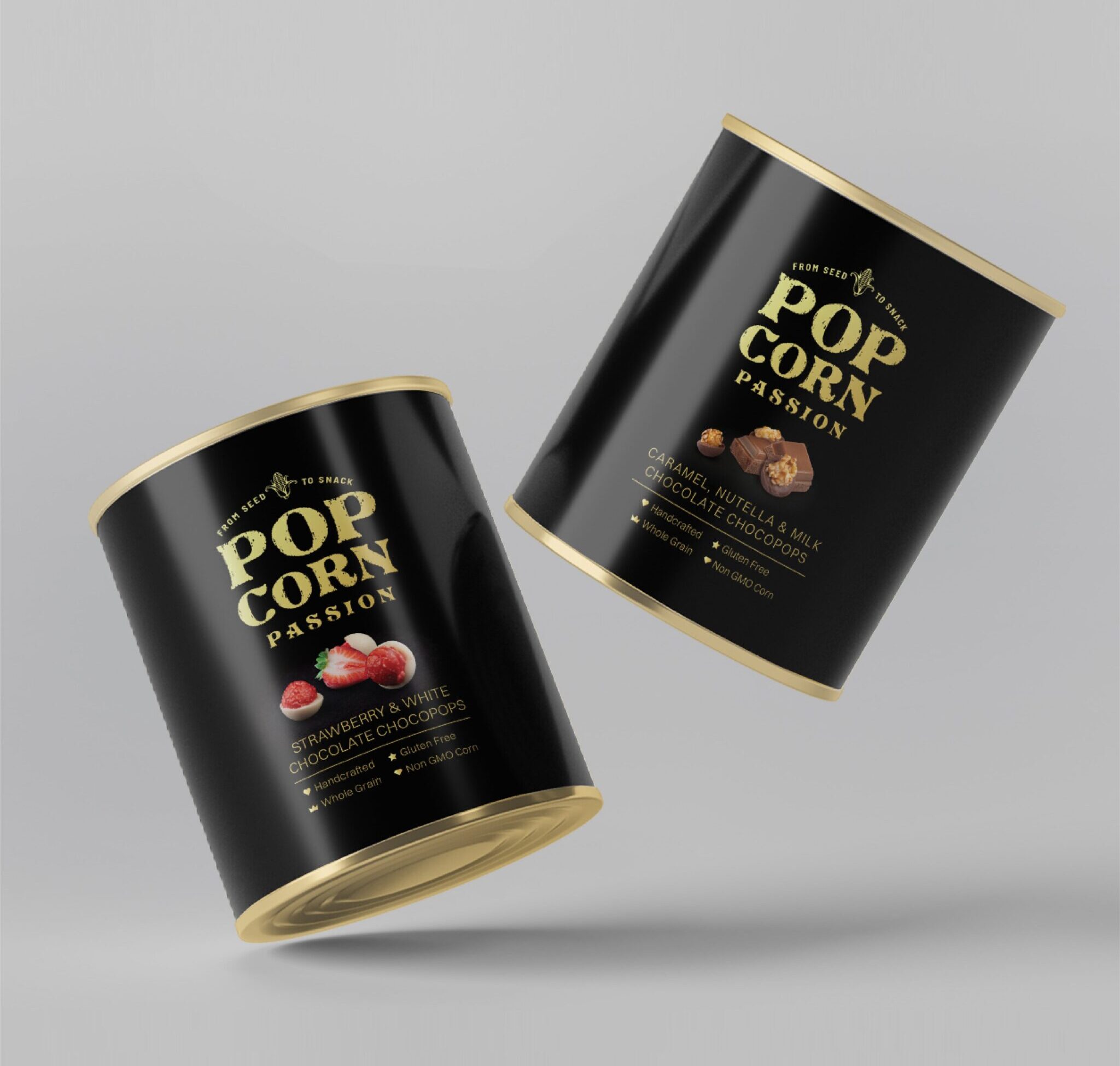
Bringing in a touch of royalty to the premium, gourmet range of
Popcorn. Popcorn Passion has a gourmet range that experiments
with innovative flavours and premium ingredients and the
requirement was to communicate the exclusivity through design.
A deep hued solid palette, with gold accents and retaining
the structure for consistency.
Popcorn. Popcorn Passion has a gourmet range that experiments
with innovative flavours and premium ingredients and the
requirement was to communicate the exclusivity through design.
A deep hued solid palette, with gold accents and retaining
the structure for consistency.
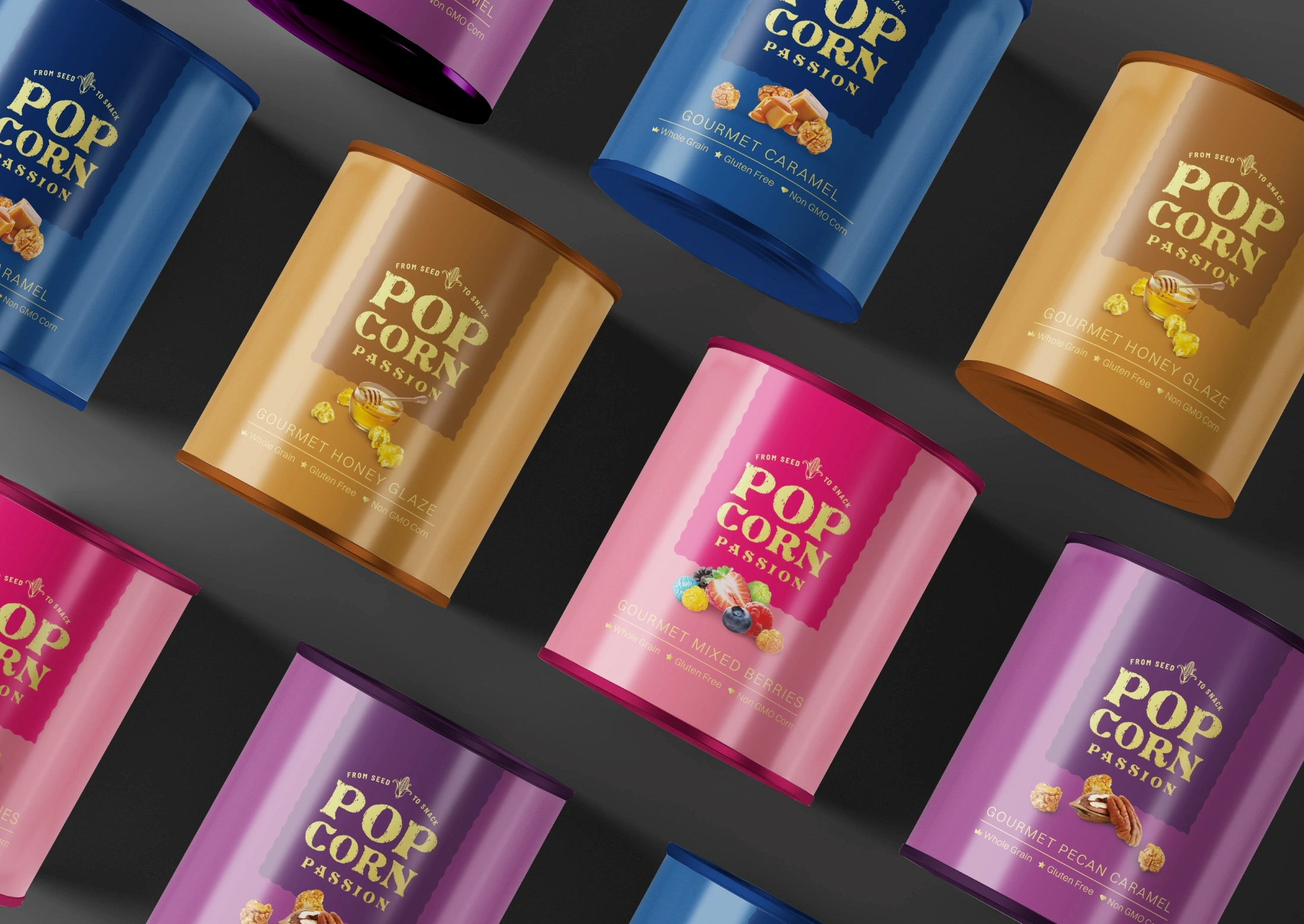
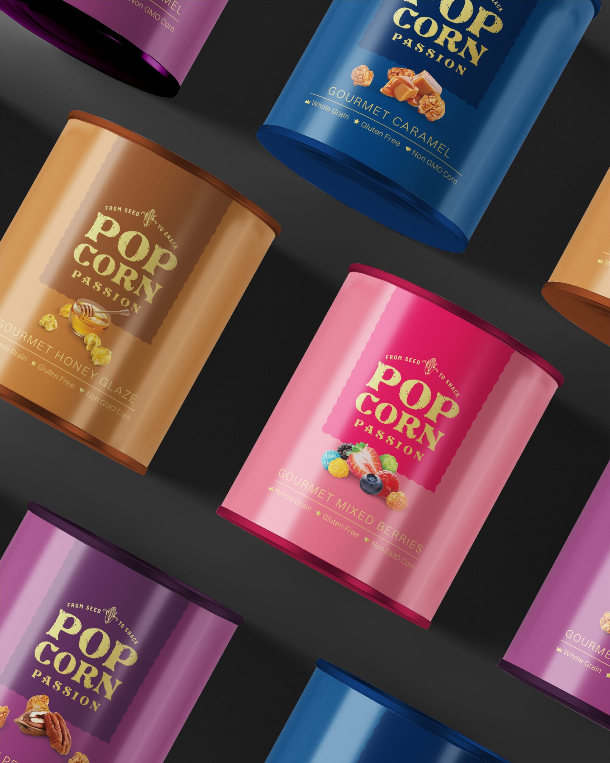
Deep solid hues that almost give a velvety royal feel. Inspired by the ingredients.
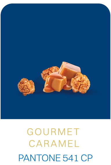
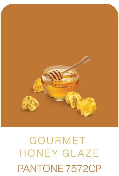
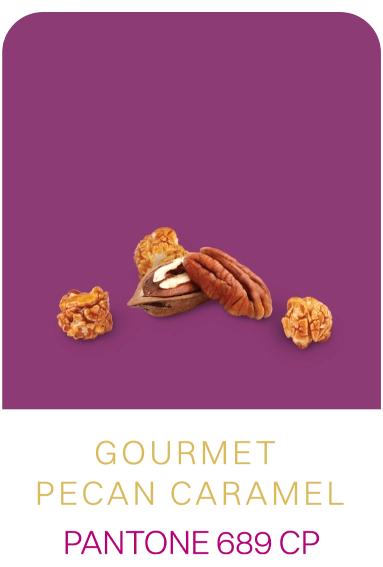
Gold foiled icons to assert a premium and gourmet experience.

Inspired from the richness of the premium cocoa used for this unique range we went all black to bring in sophistication. Gold accents added oomph.
AT A GLANCE
Before

After
Thank You
Team Popcorn Passion trusted our creative prowess and created a project environment that is conducive to immersion and experimentation. We are honoured to be a part of Popcorn Passion as a project and as a vision.