A brand refresh that tells the story of traceability and authenticity.
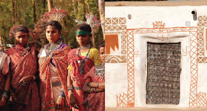
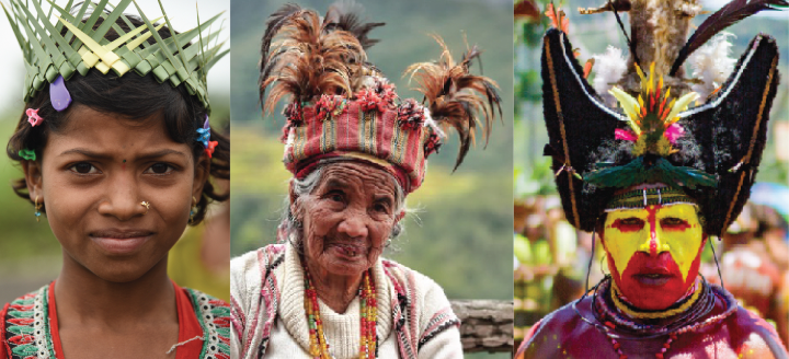
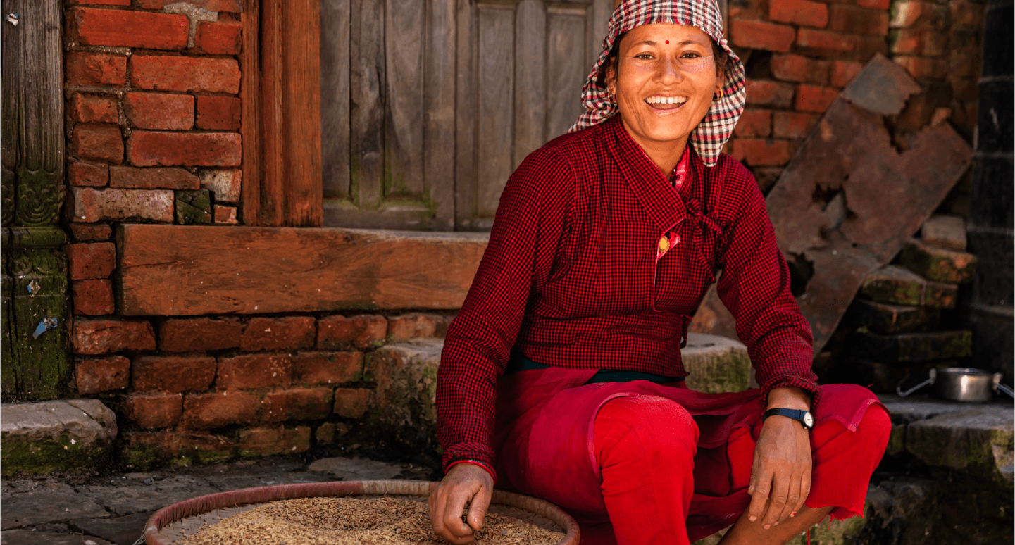
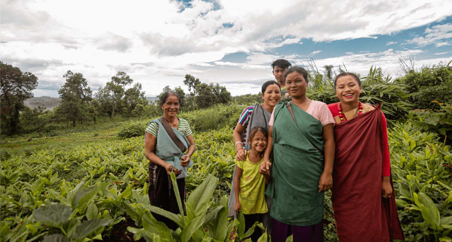
Spirit of the Tribe anchors its being and essence to traceability, to the journey of source-to-consumer and authenticity. It is a brand that is founded on the purpose of livelihood creation, market linkage and empowerment of marginal farmers. SOTT is an initiative of Ncourage Social Enterprise Foundation, a wholly owned subsidiary of Tata Chemicals Ltd. Inspired by the natural wisdom and simple living of the indigenous Indian tribes, Spirit of The Tribe offers authentic products and experiences that instil a sense of balance in the lives of the urban consumers.


Key Challenge
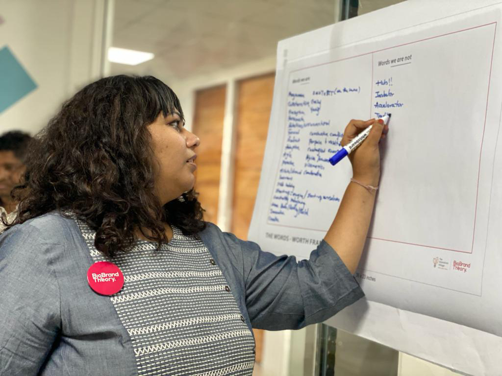
The biggest trend that is driving change in the food and beverage industry right now is transparency. Spirit of the Tribe’s vision and communication, while having the foundation of traceability, story of origin and authenticity, faced the challenge of translating it into a connection that remains with consumers. Their challenge was to gain attention and appeal to the spoilt-for-choice urban audience. The gap between what they wanted to say as a brand and what they were saying was wide. BBT partnered with Spirit of the Tribe to collaborate in creating a brand refresh journey that creates an impact in the consumer’s mind and connects as a story.
“From initial concepts and ensuing research, BigBrandTheory nailed the final design in an incredibly short time. And the additional narrative, and tone of voice work we conducted together ensured that the new brand identity and packaging was implemented seamlessly. They play the role of true brand custodians.”
Ujas Dave, Chief of Operations,
Ncourage Social Enterprise Foundation
Ncourage Social Enterprise Foundation


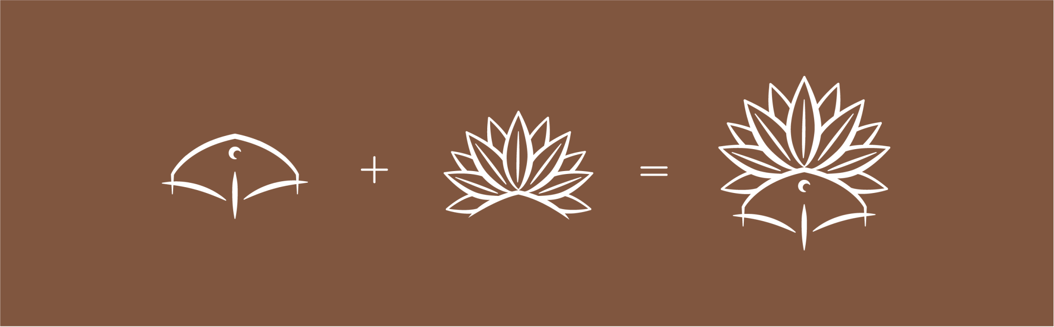
The original and intricate design ecosystem.
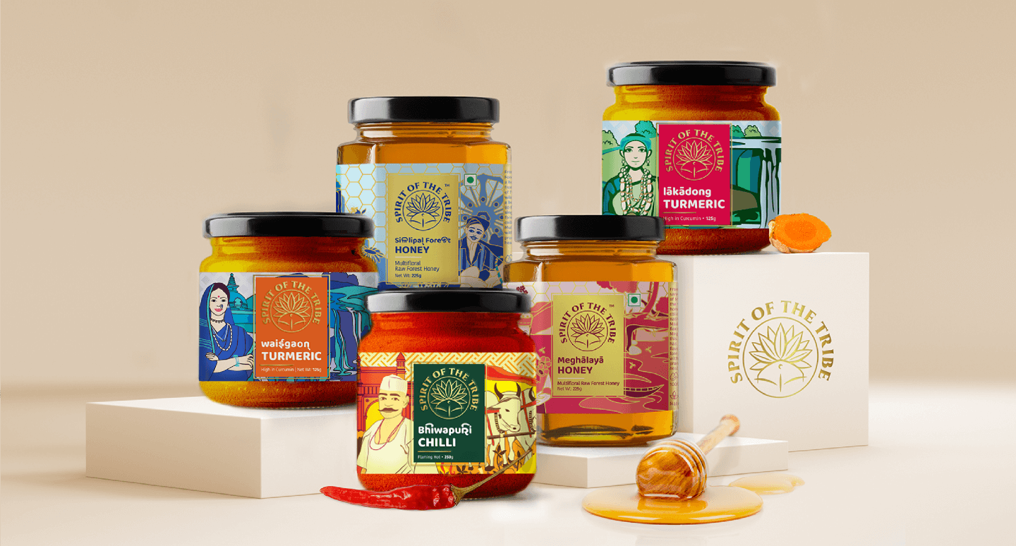
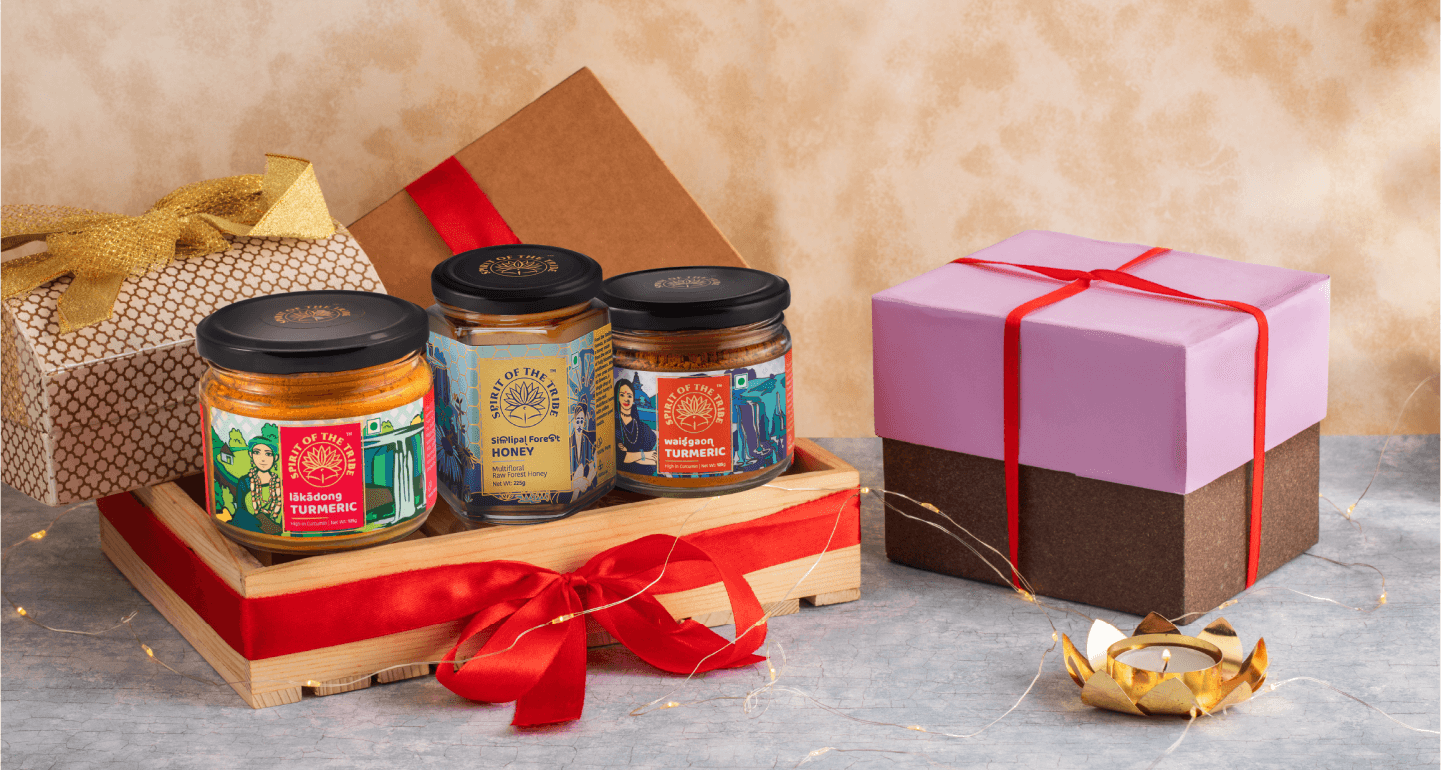
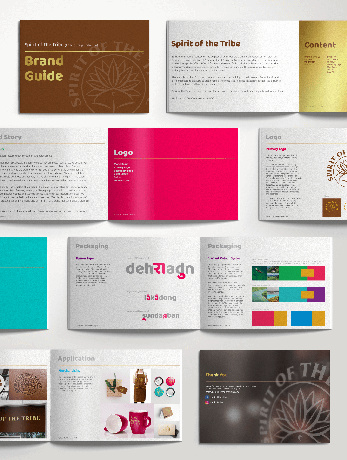
A unique series of illustrations have been created for the brand. They comprise of a collage made of elements that define the rural terrain through their uniqueness and specialties. The art style is large strokes as well as line drawing. These illustrations are specially designed for Spirit of the Tribe and they are used across various manifestations and packaging with relevant context and stories.

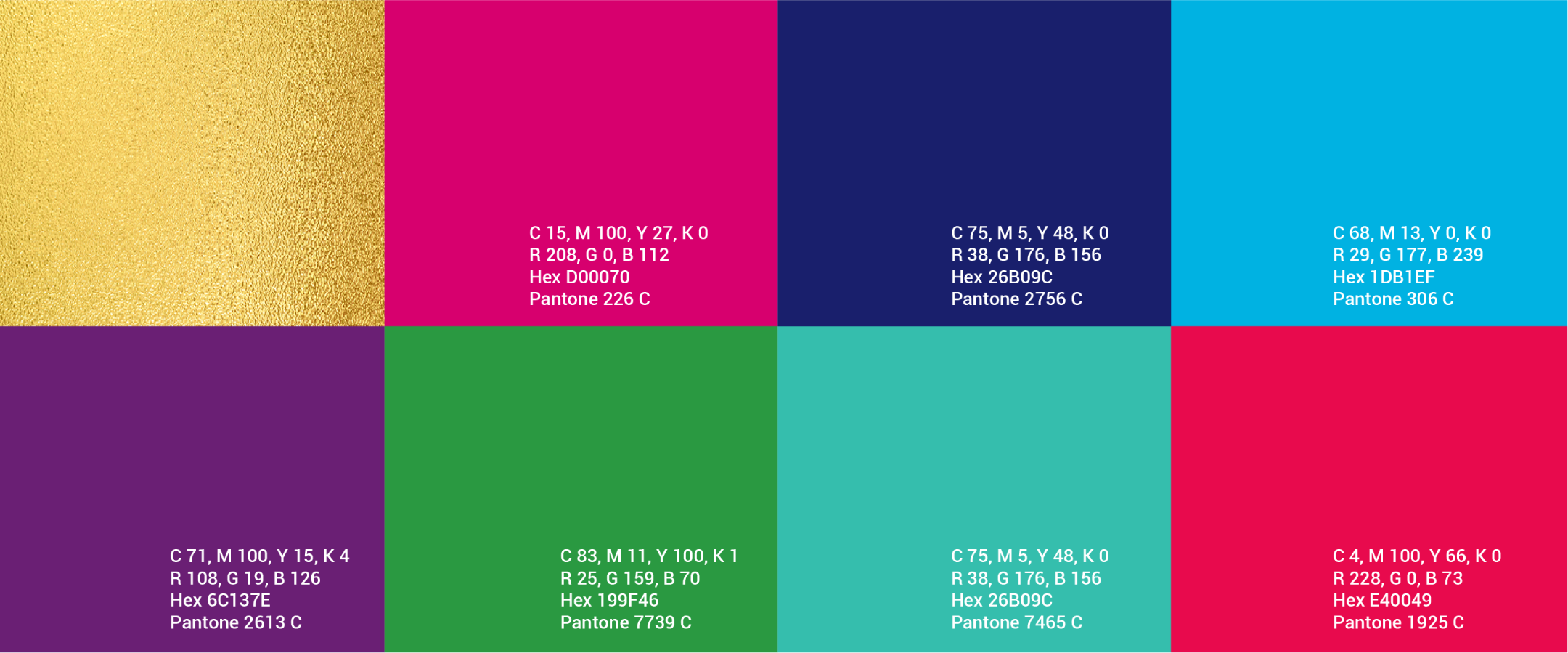
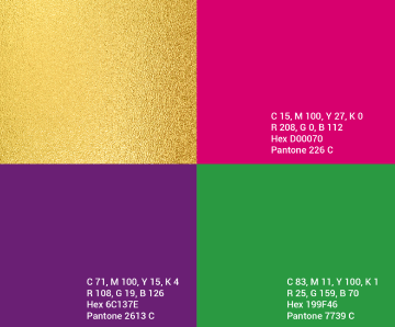
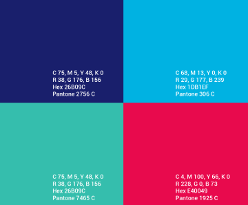
The Colours of Origins
A unique series of illustrations have been created for the brand. They comprise of a collage made of elements that define the rural terrain through their uniqueness and specialties. The art style is large strokes as well as line drawing. These illustrations are specially designed for Spirit of the Tribe and they are used across various manifestations and packaging with relevant context and stories.
The source story lived a
unique way.
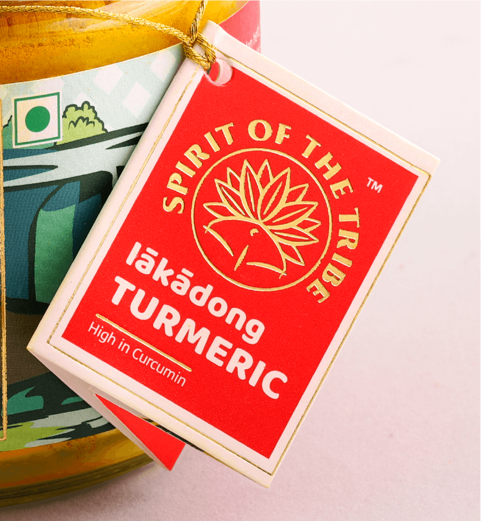
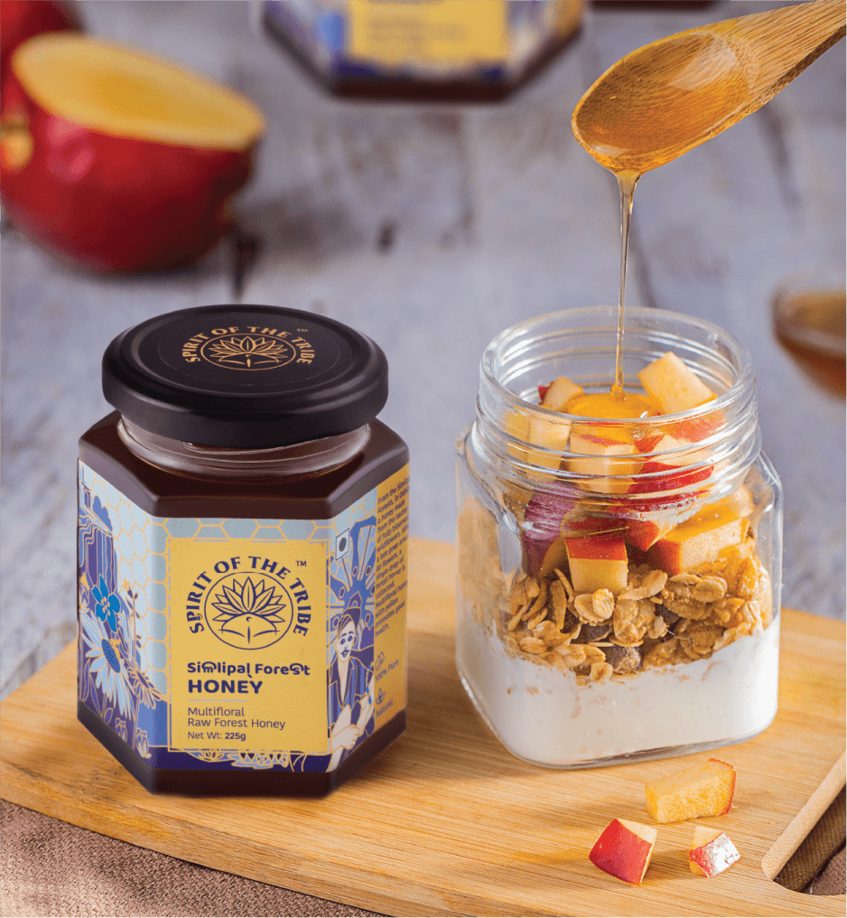
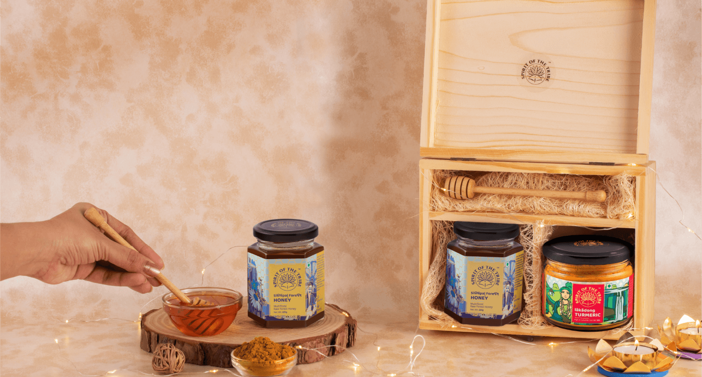
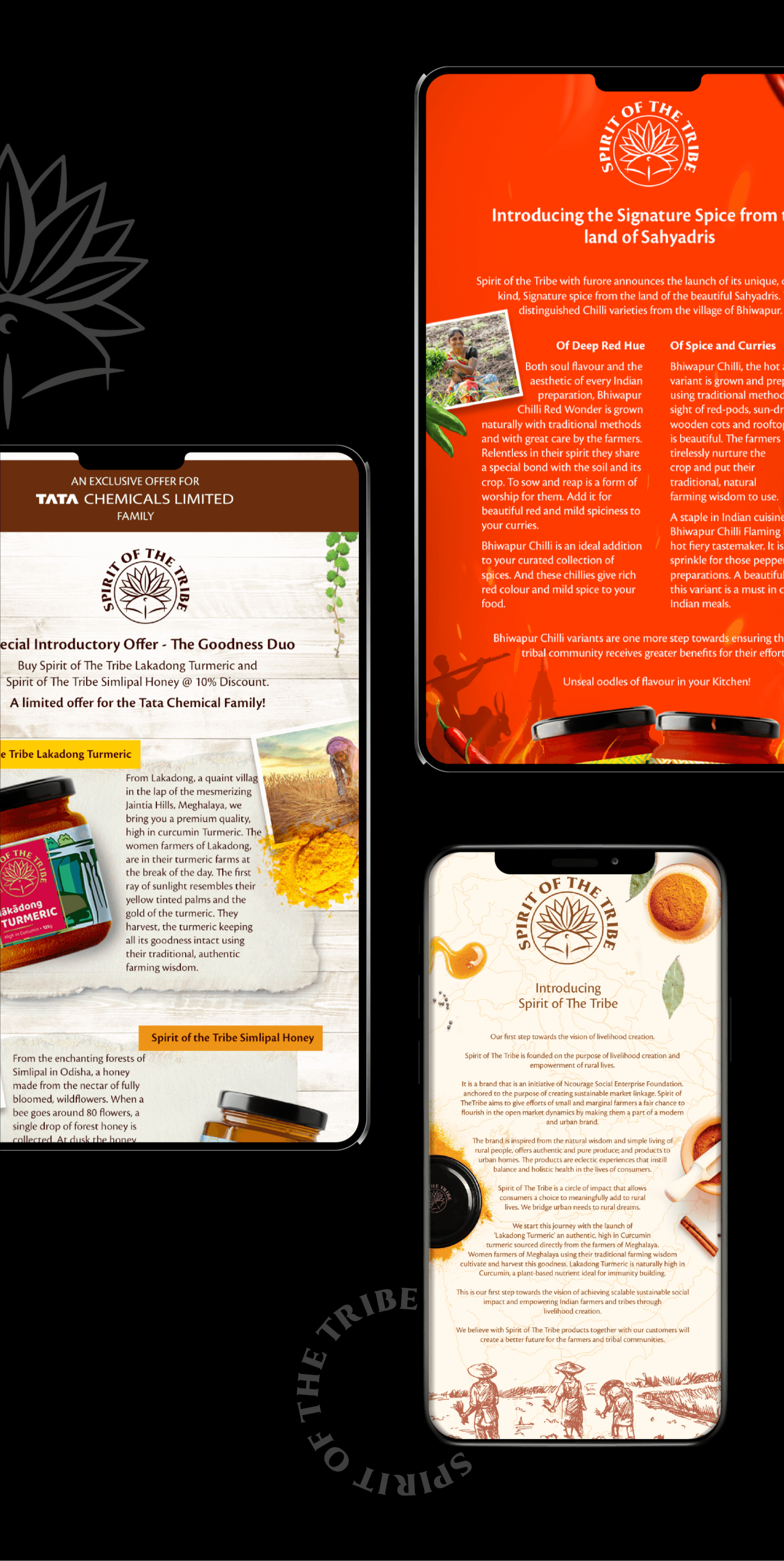
BBT designed the brand’s packaging to bring alive the story of ‘origins and traceability’. The journey from farm to home was illustrated and intricately crafted.
The modern-day narratives of natural, pure and farm-fresh are the cornerstones of our design thinking and the same is translated in our packaging.
A unique fusion of typography and illustrations was created for an authentic local flavour. The colour palette is bright and inspired from the geographic locations of the respective products.
The Baloo font family was adapted into a fusion font that is used to depict the ‘place of origin’ of the product on the package. The font will be combined with the local script of the location the product hails from.
A comprehensive guideline
The entire visual ecosystem and branding structure is translated into a comprehensive and simple-to-adapt brand guideline for easier replicability and standardization.
Before
After

Thank You!
A project so intensive and original wouldn't have been possible without the absolute support, trust and creative freedom provided by team Spirit of The Tribe.
AN AWARD WINNING CASE STUDY

Bagged the India's Best Design Communication Project 2021 by IBDA
Bagged the Baby Blue Elephant by 2021 Kyoorius Design Awards