


DesiNutri: brand naming, identity and packaging architecture for a D2C millet food brand

India's oldest grain, and a generation that had never learned to cook it.
Skandhanshi Agro Foods set out to build a consumer brand around millets, the grain that fed Indian households for generations before convenience quietly moved it off the shelf. BBT partnered with the founders from the ground up, from strategy and naming through to packaging architecture and launch.
Reviving a category is harder than entering one. Millets were not unknown, they were unfashionable, and no brand can argue a household into nostalgia. The job was never to explain the grain. It was to make it look like something a modern kitchen would choose on a Tuesday.
- Brand strategy
- Naming
- Positioning
- Brand philosophy
- Messaging

.webp)
.webp)
-(1).webp)
What DesiNutri taught us.
Two words, doing opposite jobs on purpose.
Desi carries authenticity, heritage and the richness of Indian farms. Nutri carries conscious nutrition and a modern life. Together they let the brand hold a past and a present in one word, which is precisely the tension the category sits in. A heritage brand that sounds only like heritage gets bought as a gift. It has to sound like a weekday to get bought weekly.
Block printing, redrawn for a supermarket shelf.
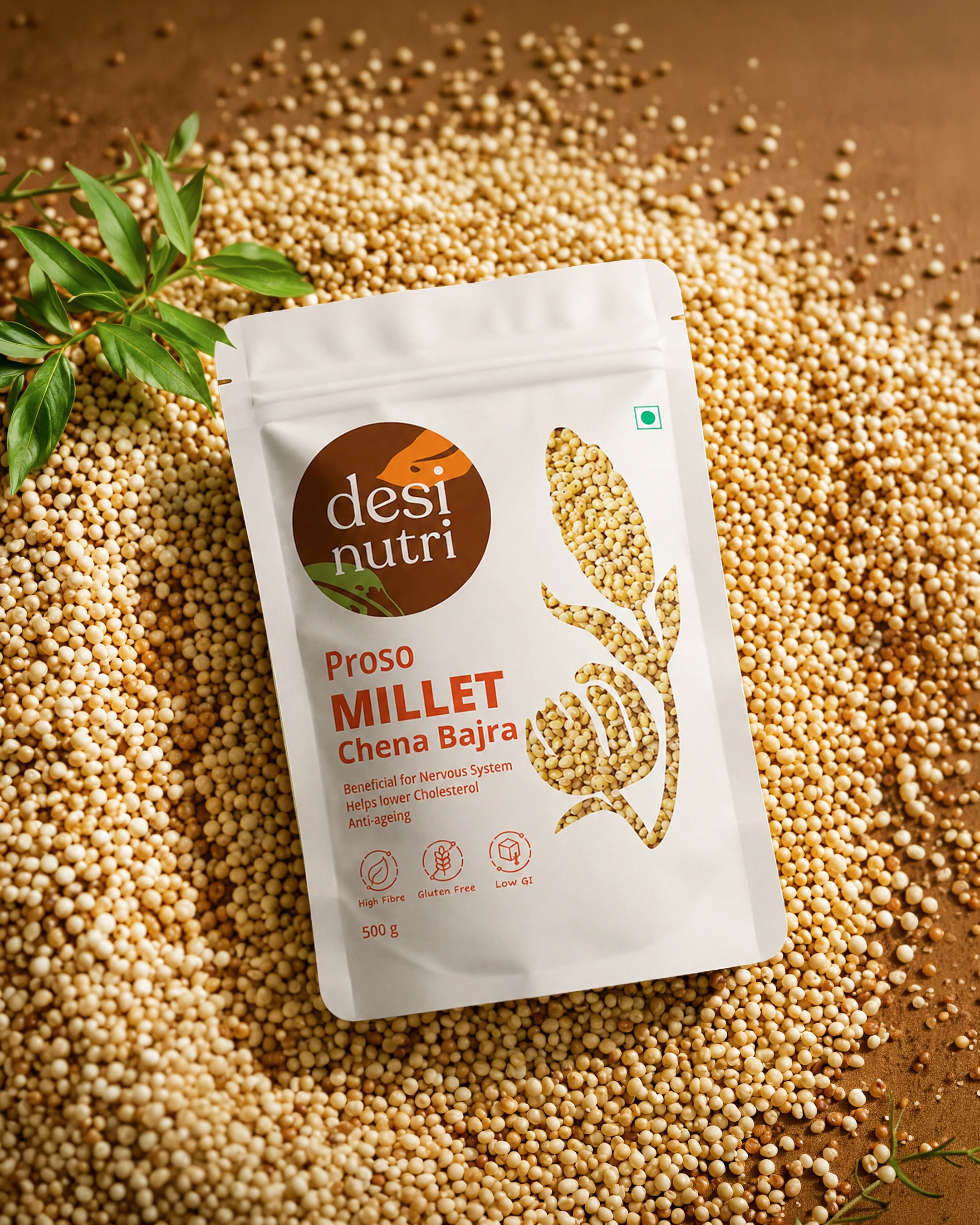
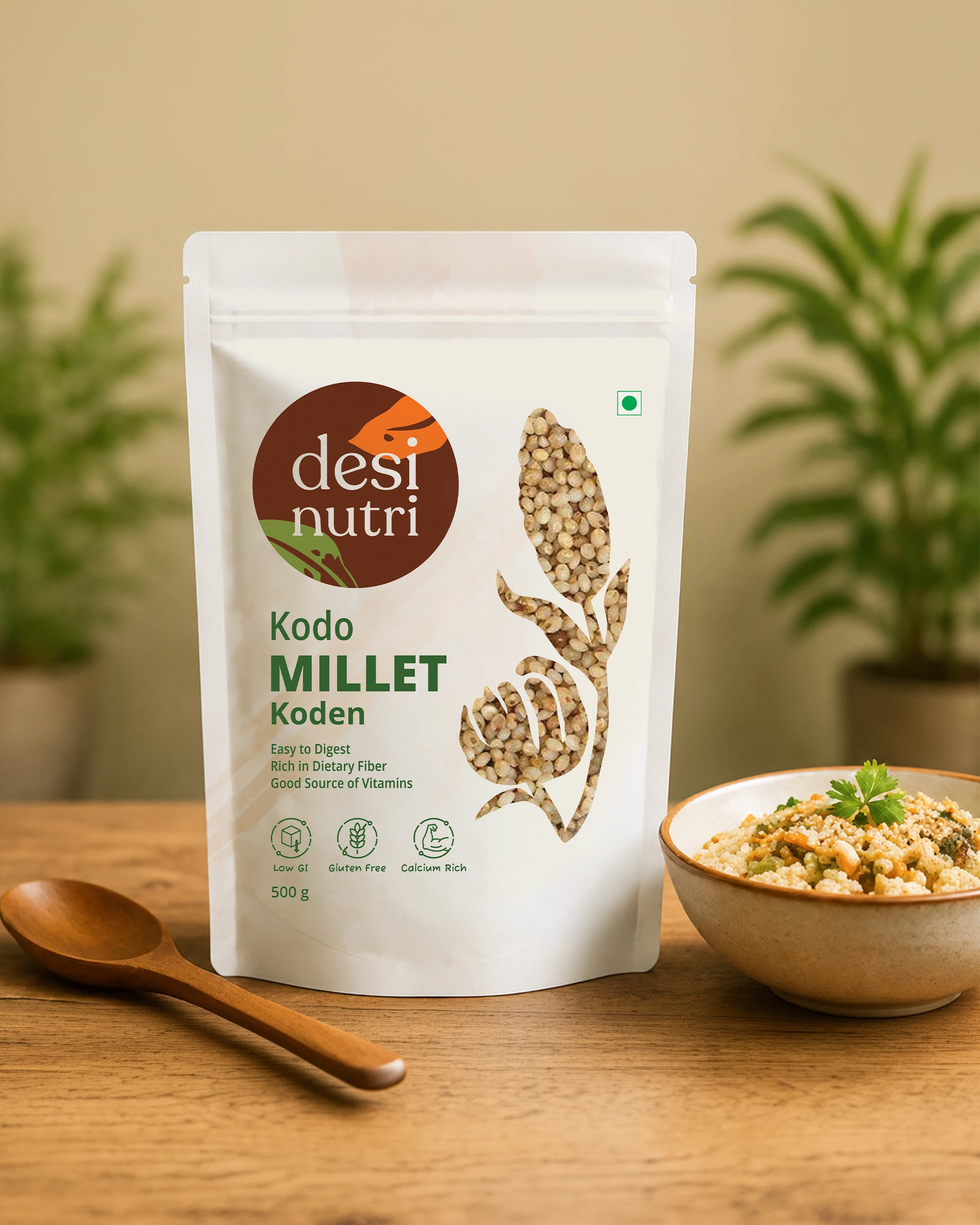
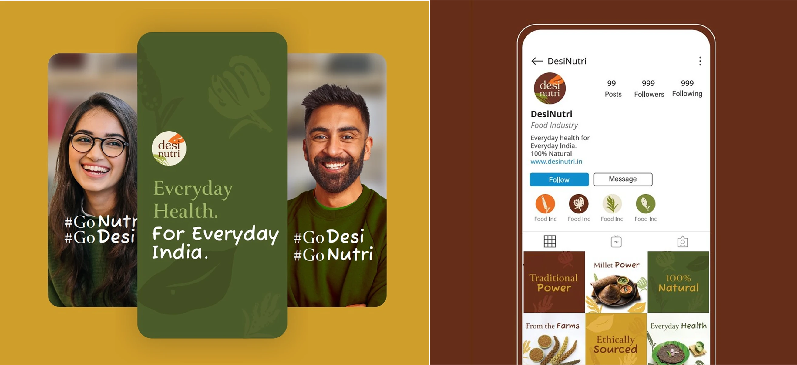
The identity takes its cue from India's traditional vegetable block printing, reinterpreted rather than reproduced. Circular forms carry nourishment and completeness. Millet silhouettes sit underneath, present but never shouting, so the hero ingredient is felt rather than illustrated. It had to read as distinctly Indian while holding its own beside imported health food brands, which is the harder half of the brief.
Fifteen products, one argument, and a window.
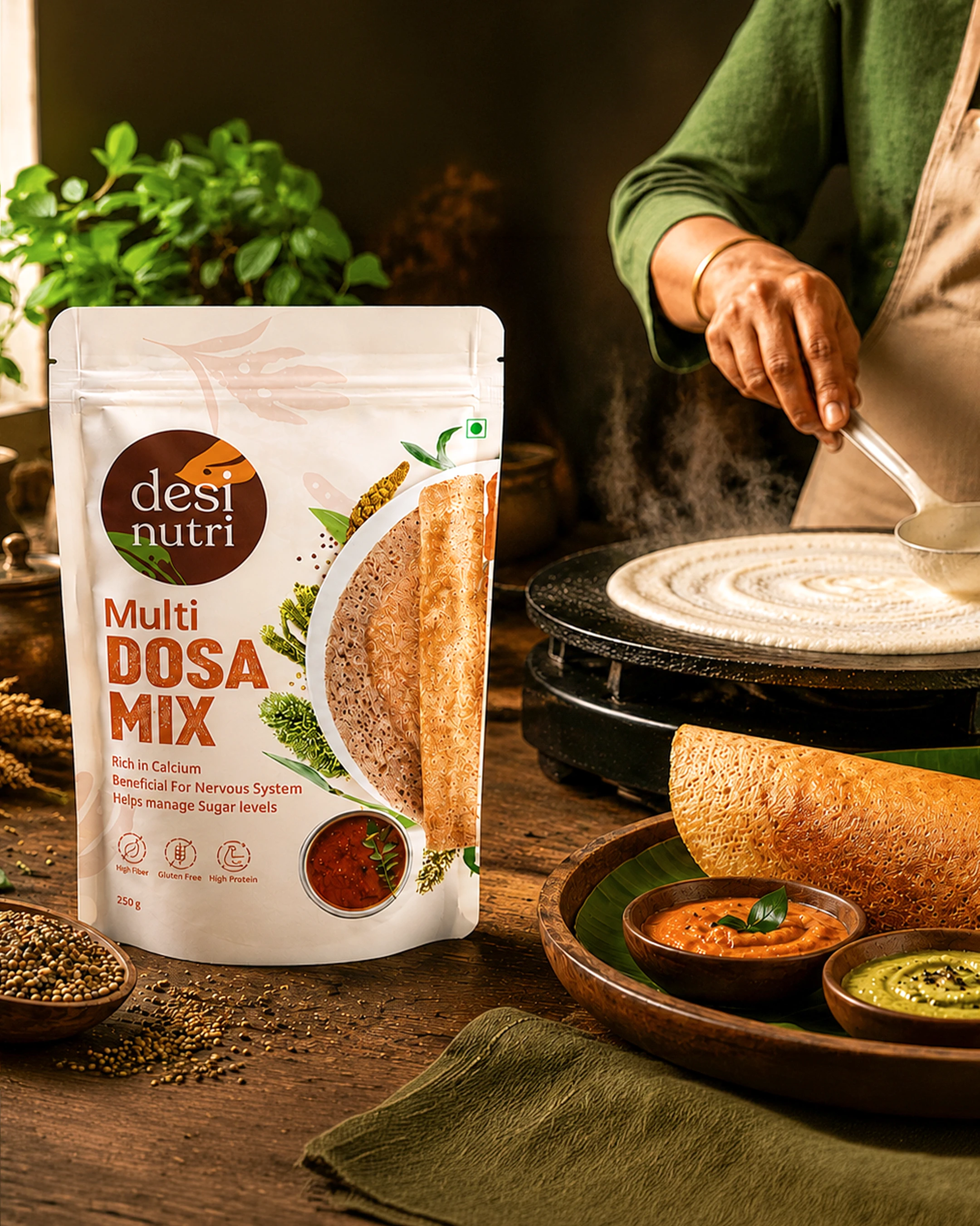
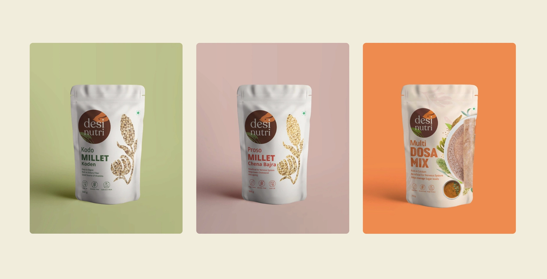
Packaging carried most of the persuasion here, so we built an architecture across categories and more than fifteen variants that keeps every pack recognisably one family while letting each hold its own identity. Window cuts let the grain be seen, which does more for trust than any claim printed on the front. Colour drawn from the ingredient itself. The reverse used to teach rather than to fill space. Transparency, in a category that mostly sells reassurance.
Discovered anywhere, understood the same way.
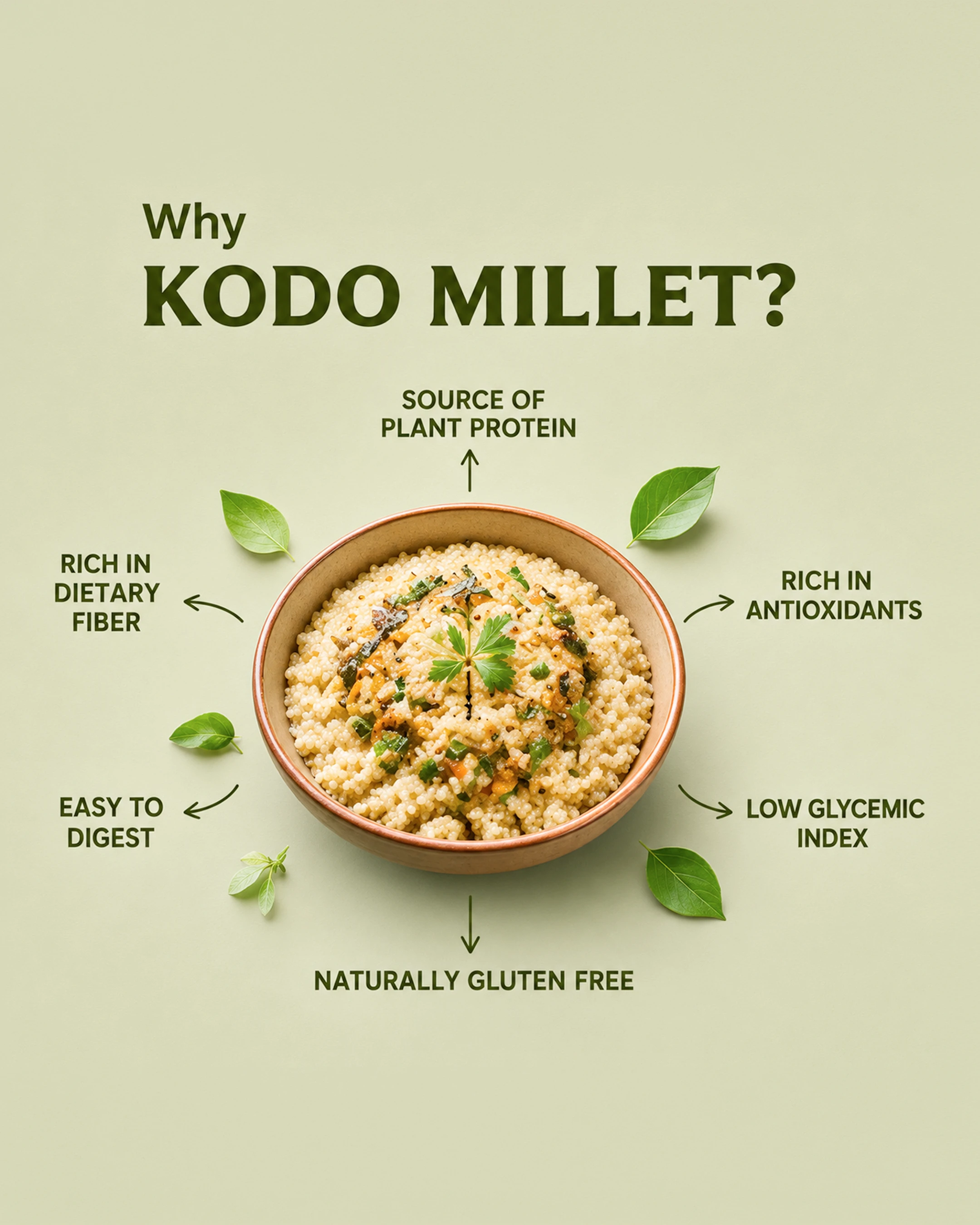
Retail, e-commerce, digital, social and the launch communication were all drawn from one system, because a shopper who meets the brand on a marketplace listing and again on a shelf should never have to work out that they are the same thing. Healthy eating does not have to feel complicated, and neither should finding it.

-(2).webp)
.webp)
-(1).webp)

.webp)


BigBrandTheory understood our vision long before they began designing it. They became a true strategic partner, helping us shape a consumer brand rooted in wholesome nutrition.
A forgotten grain, given a shelf it can compete on.
Build note · Replace with client-verified outcomes before publishing. Retail listings secured, SKUs live, sell through by variant, D2C revenue, repeat purchase rate, distribution footprint