

Popcorn Passion: FMCG brand refresh and packaging architecture for a Dubai snacking leader entering retail

Popcorn Passion ·
Twenty five years of being chosen by cinemas. Now it had to be chosen by people.
(Scroll)
For more than twenty five years Popcorn Passion has supplied popcorn and fun food to the cinemas, entertainment venues and food businesses of the Gulf. Inside its own trade it is the name that gets called first. Its product has passed through millions of hands without one of them knowing whose it was.
Then the ambition changed shape. Modern retail and direct to consumer were next, and neither channel cares how good a supplier you are. A buyer's trust and a shopper's attention are earned in completely different currencies.
Disciplines
- Brand strategy
- Identity refresh
- Packaging architecture
- Typography
- Colour system
- Retail communication
- D2C branding
- Brand guidelines
-(1).webp)
.webp)
.webp)
The philosophy
Anticipation, before the first bite ·
.webp)
.webp)
-(1).webp)
.webp)
-(1).webp)
.webp)
-(1).webp)

Client testimonial
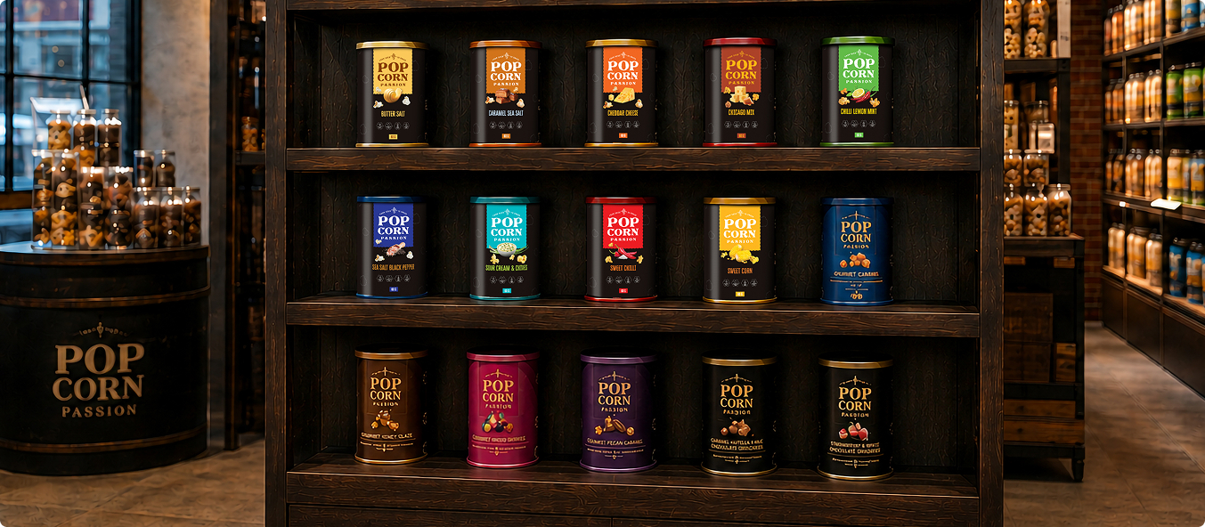
BigBrandTheory helped us rethink the brand architecture, create a distinctive visual language and build a packaging system that brought consistency across every flavour and every shelf.
(08) What
changed
From a supply chain name to a shelf name.
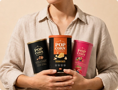
Presents as a consumer brandThe business now shows up as contemporary FMCG rather than as a trusted supplier, in the channels where the next growth actually sits.
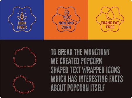
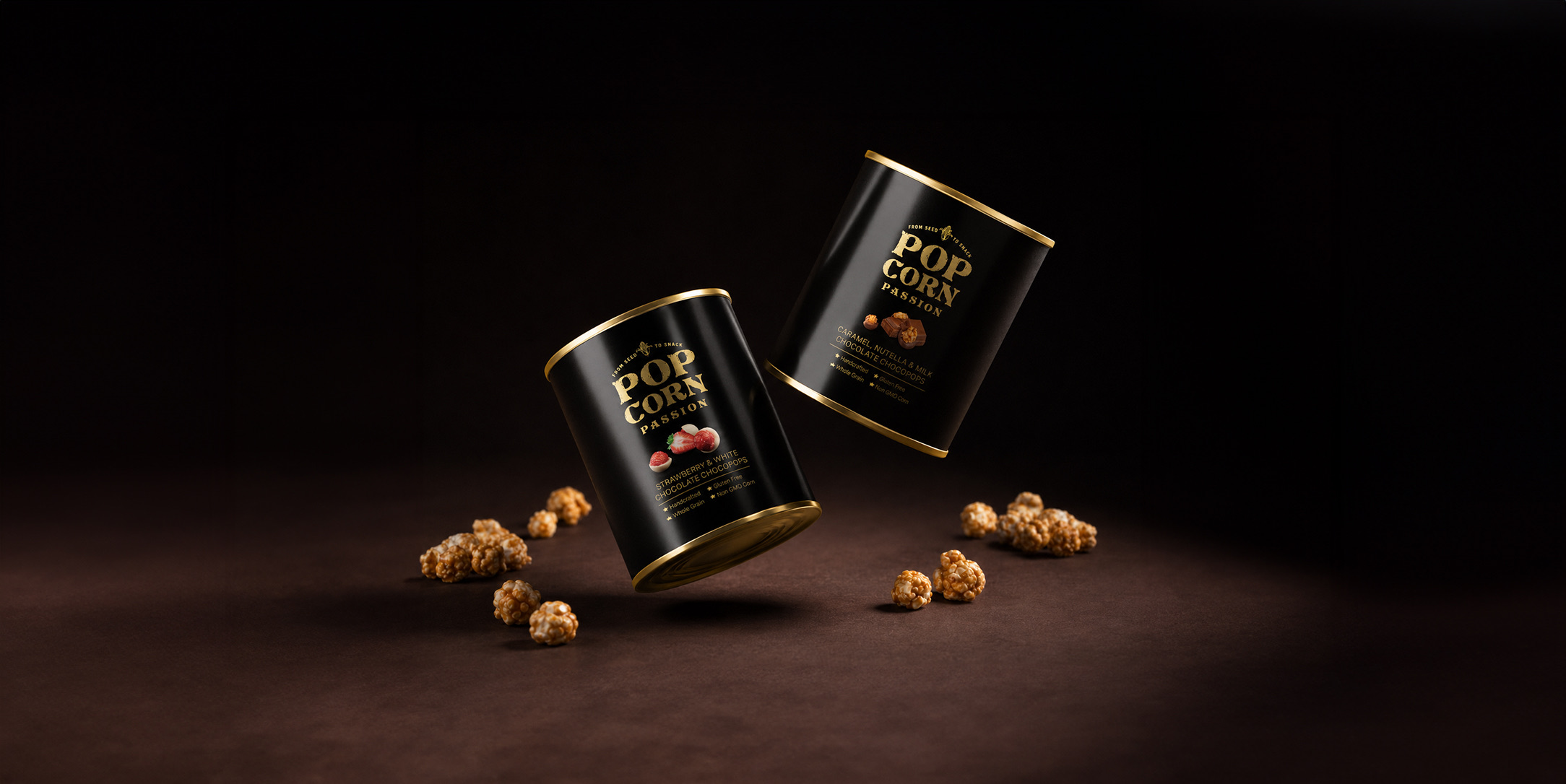
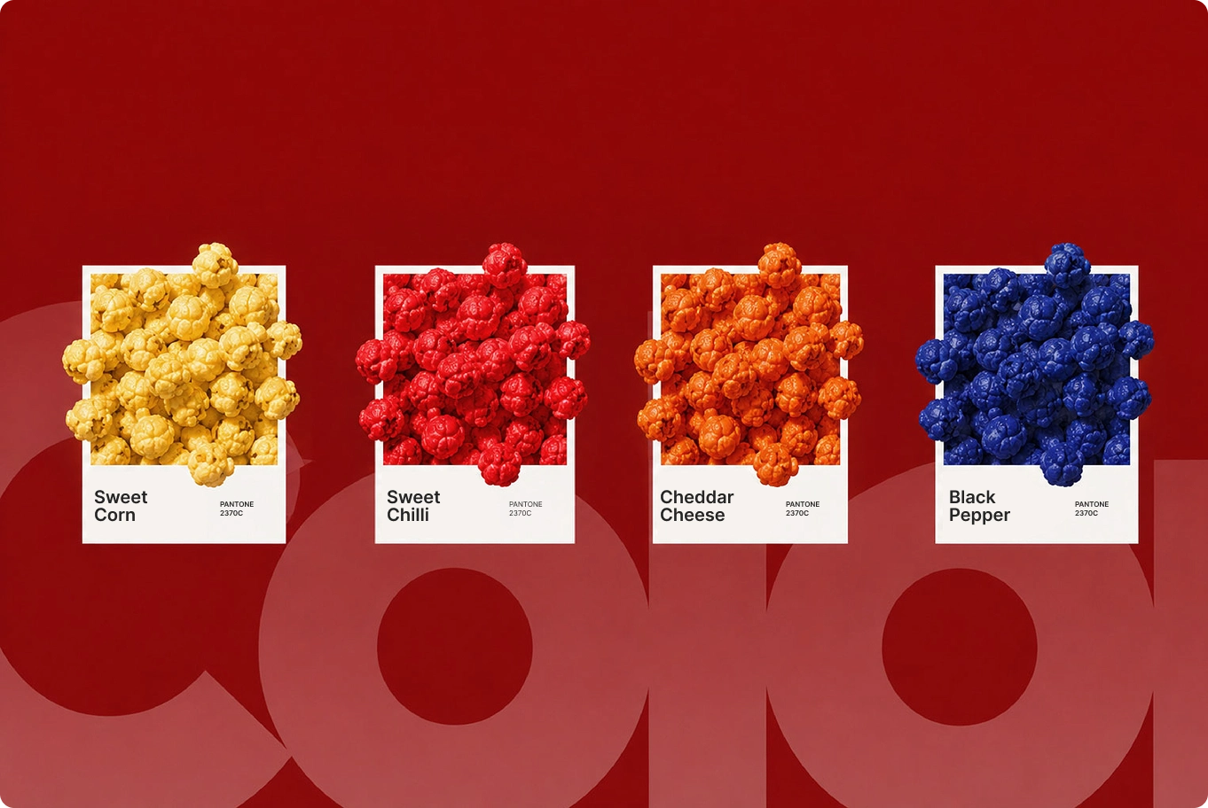
One family, many flavoursThree ranges with genuinely different personalities run on shared rules, so extension is a template rather than a project.
Ready for the regionThe architecture was built to travel across GCC markets and retail formats without being redrawn for each one.