


Phillip Capital: brand repositioning, narrative platform and environment design for a wealth management firm

Financial services · Wealth management · India
Repositioning a wealth management business around life stages.
Twenty years as their brand partner, and the one idea that moved PhillipCapital from selling products to holding a role.
PhillipCapital has been in India for twenty-five years, part of a financial services house operating across Asia. In that time the business grew well past broking, and its clients grew from first-time investors into families whose decisions now carry consequences for a generation.
The brand moved with neither. PhillipCapital still spoke in the language of its product lines, and looked like a brokerage house long after it had stopped being one. BigBrandTheory has been their brand partner for twenty years, which is the only reason a rebuild this deep was possible.
20 years as their brand partner · 3 pillars · 1 platform across every touchpoint · Adopted inside first, then taken to market
- Financial services branding
- Brand strategy
- Brand positioning
- Brand narrative
- Brand refresh
- Campaign platform
- Campaign copy and art direction
- Print advertising
- Environmental branding
- Presentation design
- Social media design
The role nobody was playing
We read the category first. Platforms compete on access and speed, private wealth firms on scale and control, hybrids on tools. All of them compete on what they offer. Almost none compete on the part they play in a client's life.
PhillipCapital's clients said the same from the other side. Time-poor, responsibility-rich, and the decisions feel heavier as the wealth grows. They do not want more control. They want confidence.
From a product shelf to a role
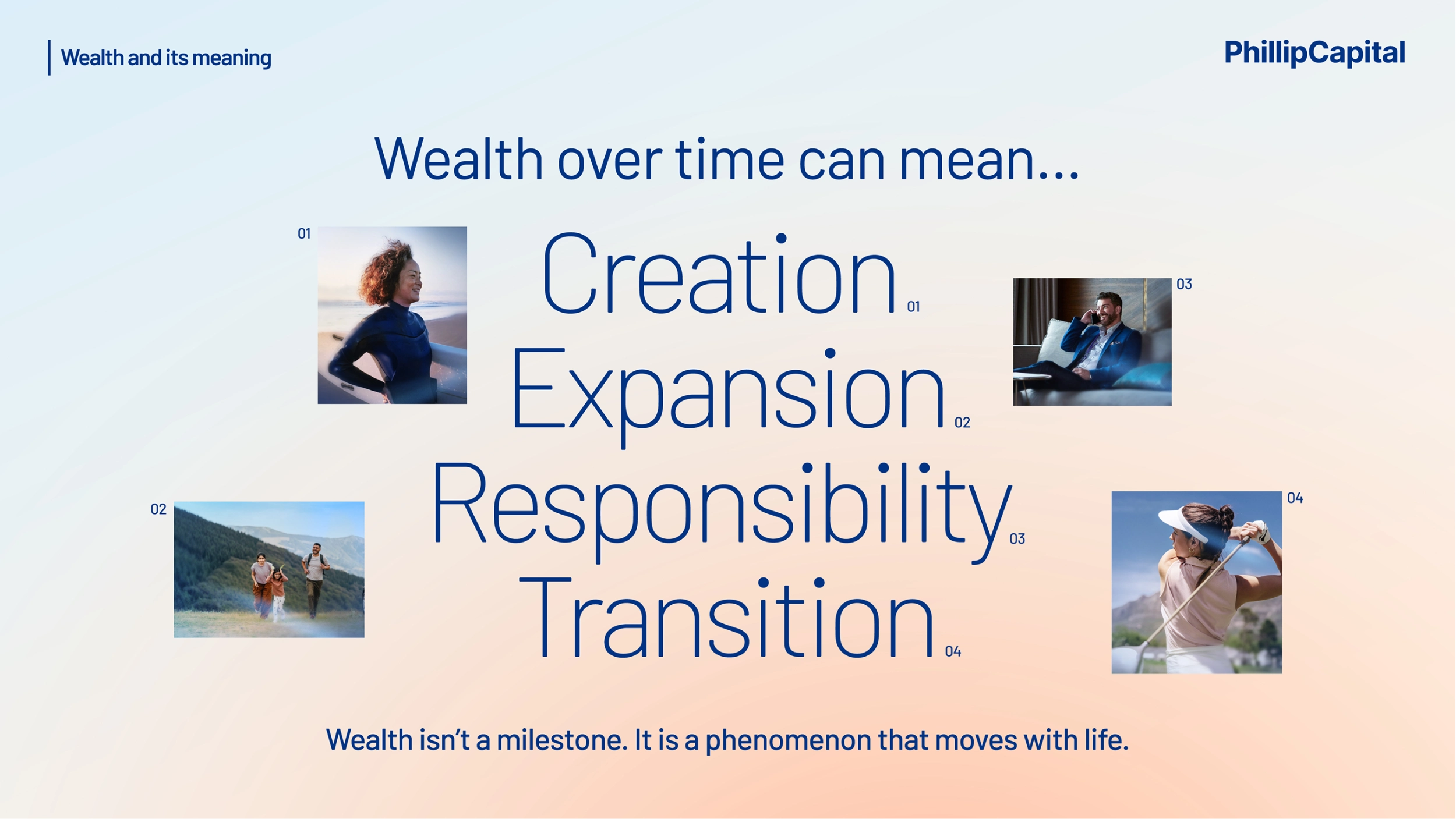
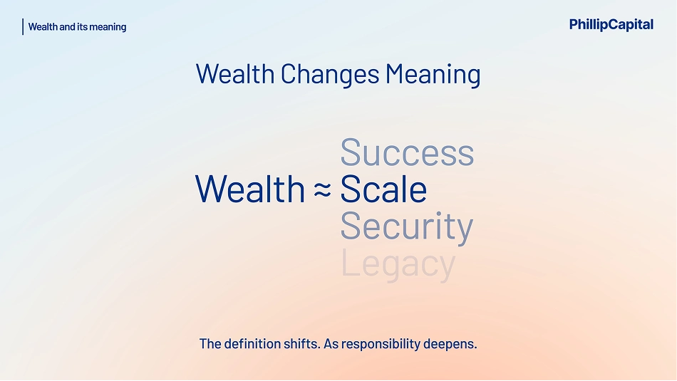
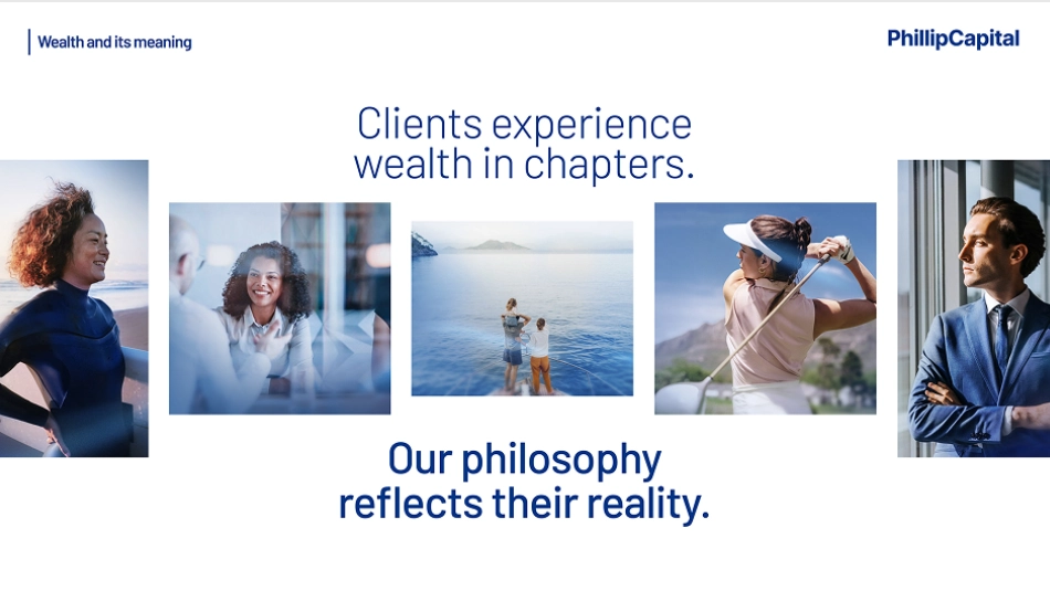
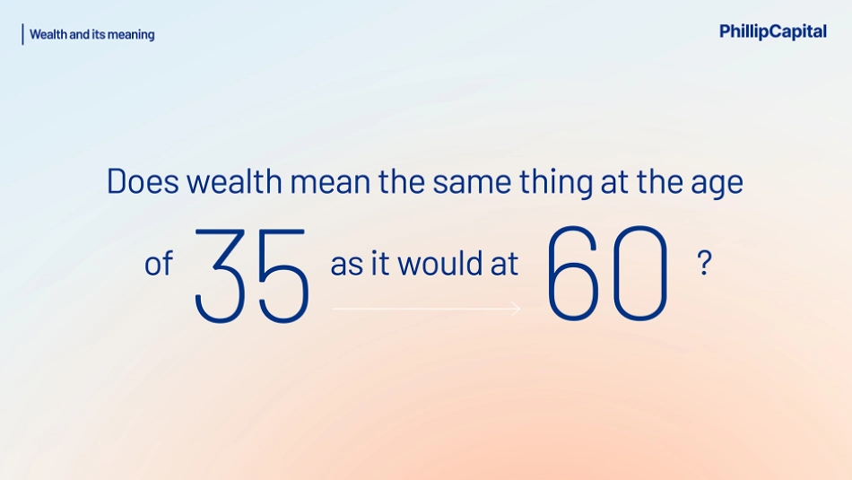
Wealth does not mean the same thing at thirty-five as it does at sixty. It moves through creation, expansion, responsibility and transition, and changes meaning at every stage.
So we defined PhillipCapital by the role it holds across a client's chapters, not by the products it sells in any one of them.
Writing the philosophy first
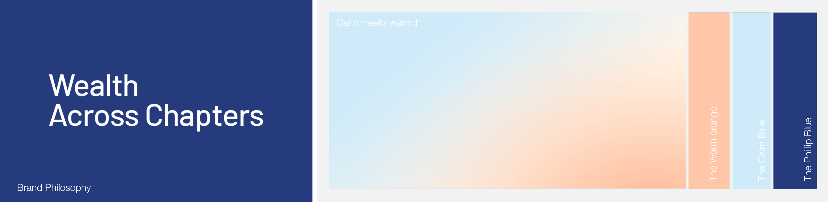
We settled the words before anything was designed. The philosophy is Wealth. Across Chapters. From ambition to inheritance. From local to global. From now to next.
We built three pillars under it. The Head is the Trusted Wealth Partner, an identity built on the depth of the partnership rather than the transactions. The Heart is Long-term Wealth Stewardship, preservation ahead of excitement. The Hand is Dedicated Wealth Insights, the research working quietly behind both.
Earned, not claimed
A position only survives contact with a sales floor if the business can already prove it.
So we tested each pillar against what PhillipCapital already had. Twenty-five years through market cycles, a research-led culture, long-tenure client relationships, proven PMS and advisory experience, and a human-first relationship model.
The platform
Wealth. Across Chapters.



The client moved it before we designed anything
PhillipCapital's leadership took the philosophy into the business while it was still only words. Leadership first, then the wider team, and only then the market.
We built the belief system with them. Depth is a discipline. Trust is the only currency. The long game is the only game. Quiet confidence is the standard. The relationship precedes the recommendation.
I will. I won't.
Each belief carries both halves, because a value that cannot be refused is not a value.
I will go beyond the brief and know my client's life stage, not just their portfolio. I won't skim the surface and call it sufficient. A brand its own people have already adopted does not need enforcing later.


The campaign gave the client the first word
Most financial advertising speaks on behalf of the institution. We started the other way round, with the person.
There's still so much more I want to do. What I've built should outlast me. Home isn't just one place anymore. Three first-person lines carrying ambition, legacy and a life lived across borders, without making every client's story sound the same.
Emotion opens, stewardship answers
Each one is paired with a question only the firm can answer. What continues when markets turn? What strengthens when generations change? What holds when ambition expands?
Emotion opens the conversation. Stewardship gives it substance. The print work carried the same move in a single line: it used to mean success, now it means choice.



Designing the calm
The category had moved from noise to calm. The brands speaking most convincingly were not selling products, they were mirroring the lives of the people they served.
We kept Phillip Blue as the anchor. Cool tones carry trust, warm accents carry human connection, and the gradient we built between them became the brand's own territory. Selective blur, clean composition and quiet confidence hold the rest.
Making it usable
PhillipCapital produces a great deal of material, across many product lines, from many desks. A guideline document would have been read once.
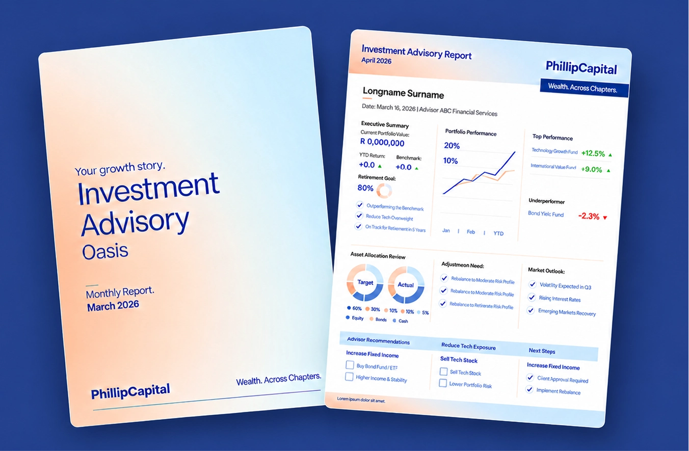
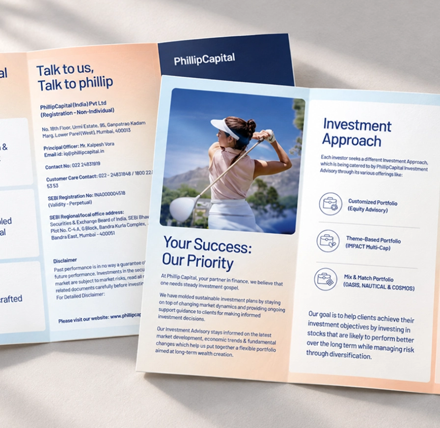
So we shipped it as a product kit for each line. Standees, flyers, emailers, folder sleeves, reports, presentations and web banners. Five product covers that had been five unrelated designs became one family.

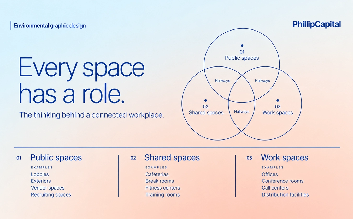
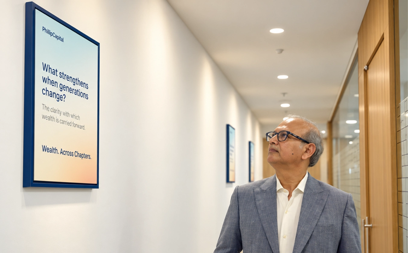
A philosophy you can walk through
The Mumbai office still carried the previous brand in its most literal form, announcing an integrated Asian financial house and a most preferred stock broking house.
We rebuilt it from the entrance inward. Reception, corridors and custom-designed wall frames now carry the philosophy in the client's voice rather than the firm's, with Build, Grow, Continue running through the physical experience.
What a visitor reads is what an employee hears
We wrote the internal cultural communication to the same language.
So what somebody reads at reception is what a relationship manager hears at their desk, which is the only way a philosophy survives the walk from the brand deck to the sales floor.
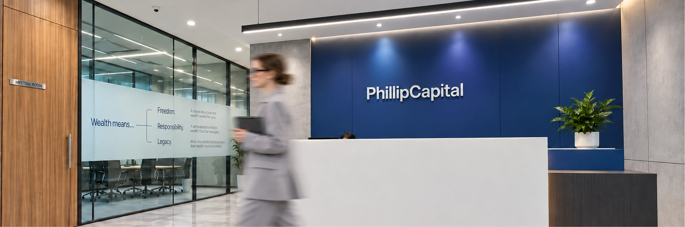
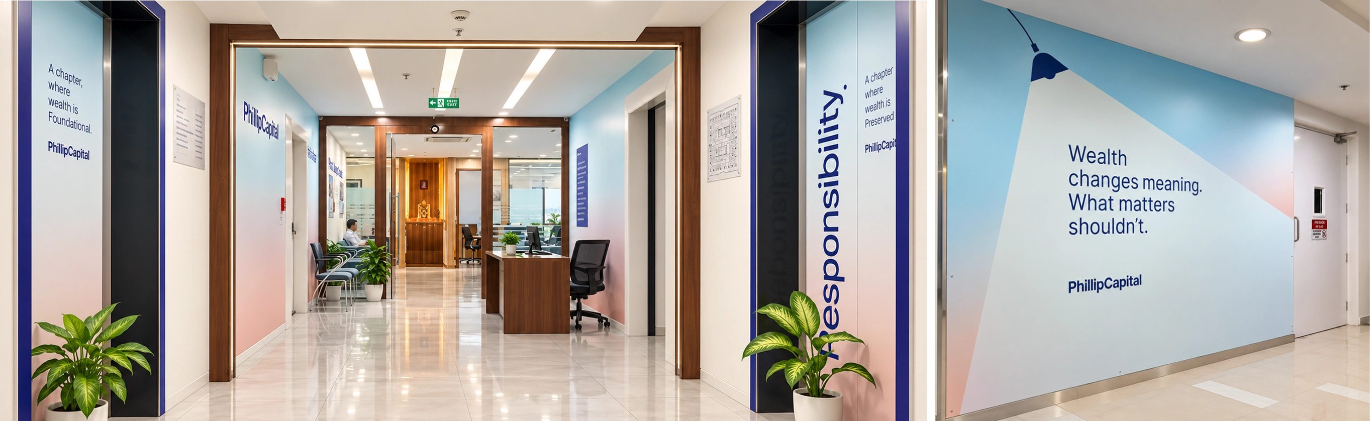
We left PhillipCapital with a modular platform built to carry a business that will keep changing shape. One source, PhillipCapital as trusted wealth partner. Products and solutions beneath it, initiatives and experiences beneath that. Different expressions, one consistent role.
Campaign work is now running on it.
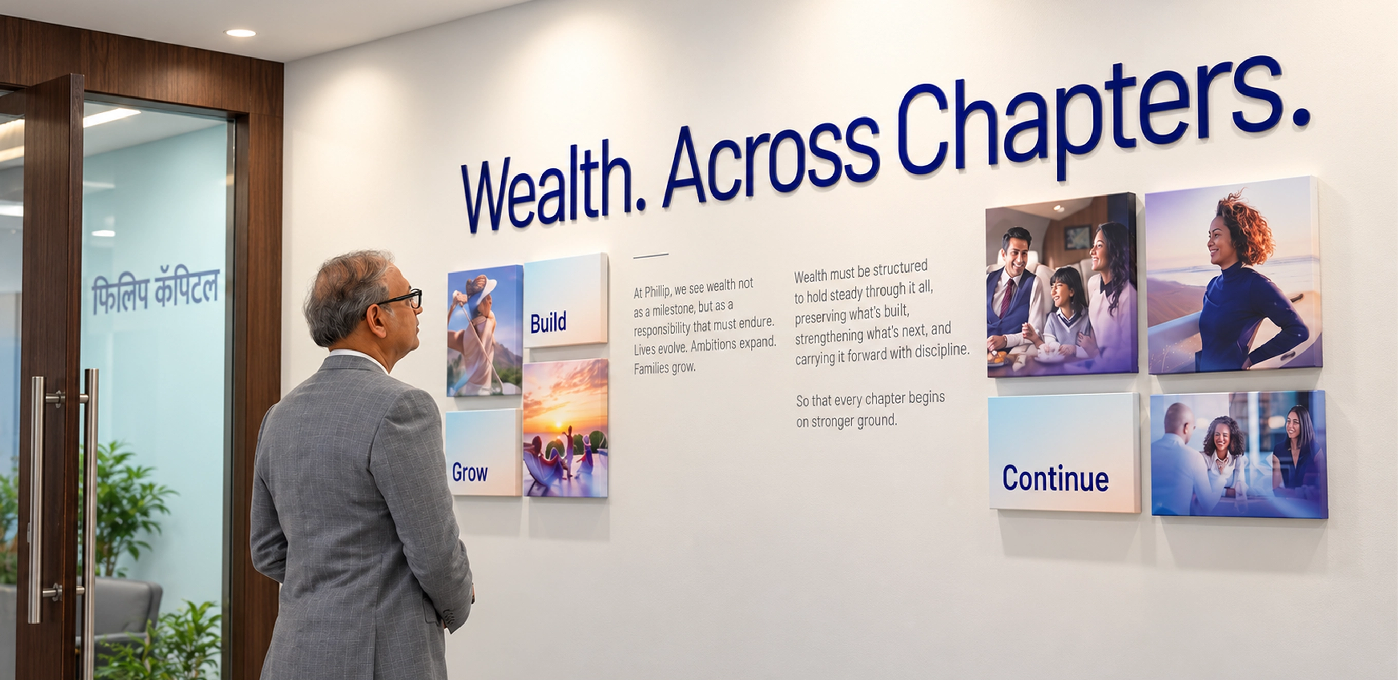

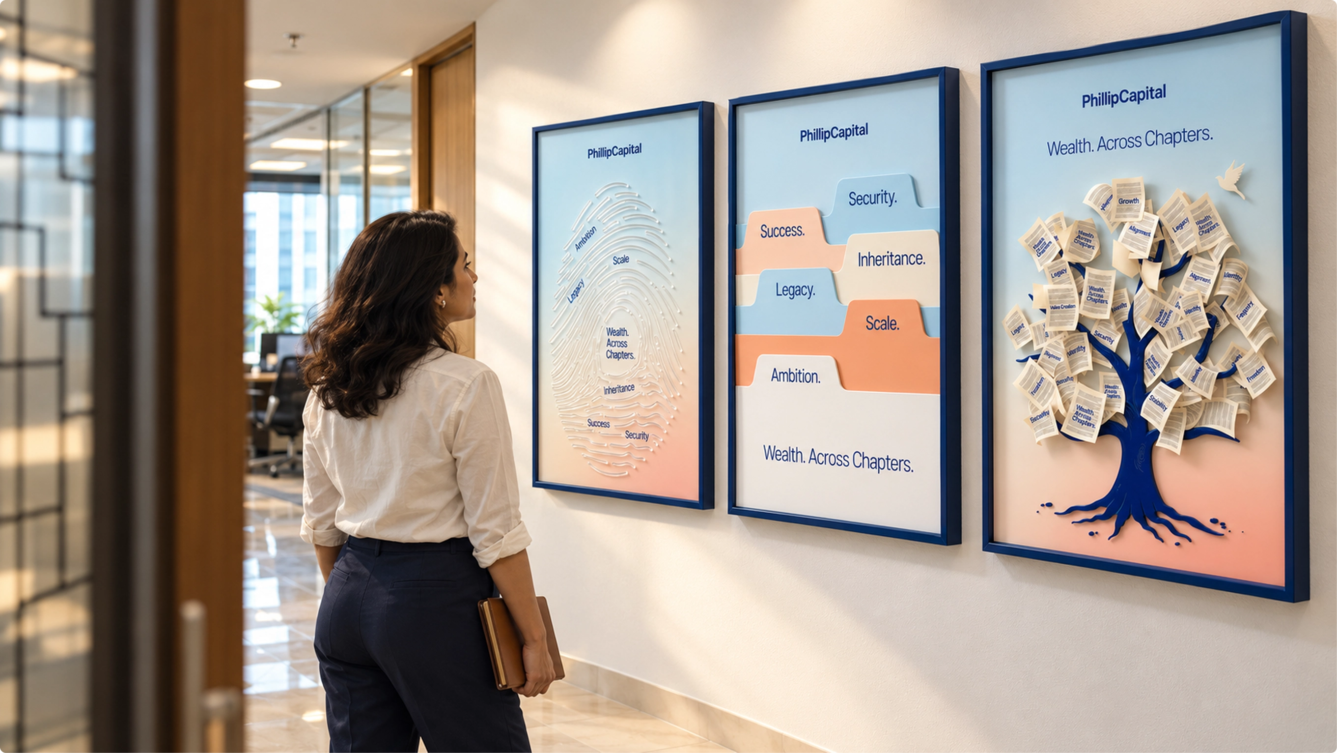

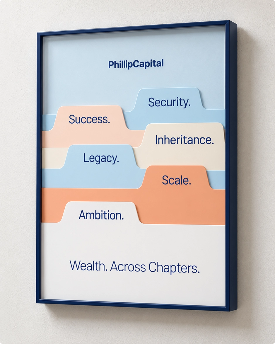
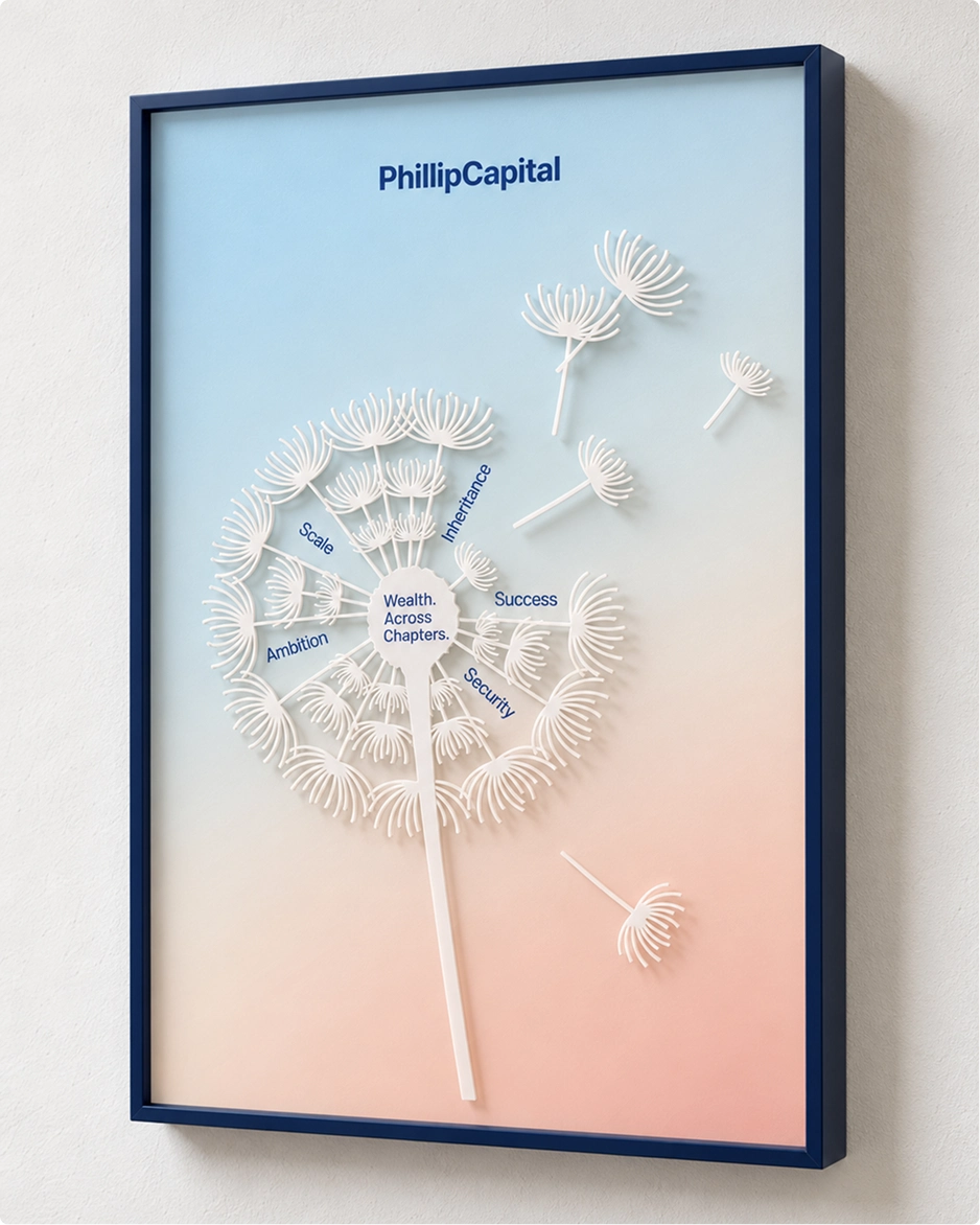

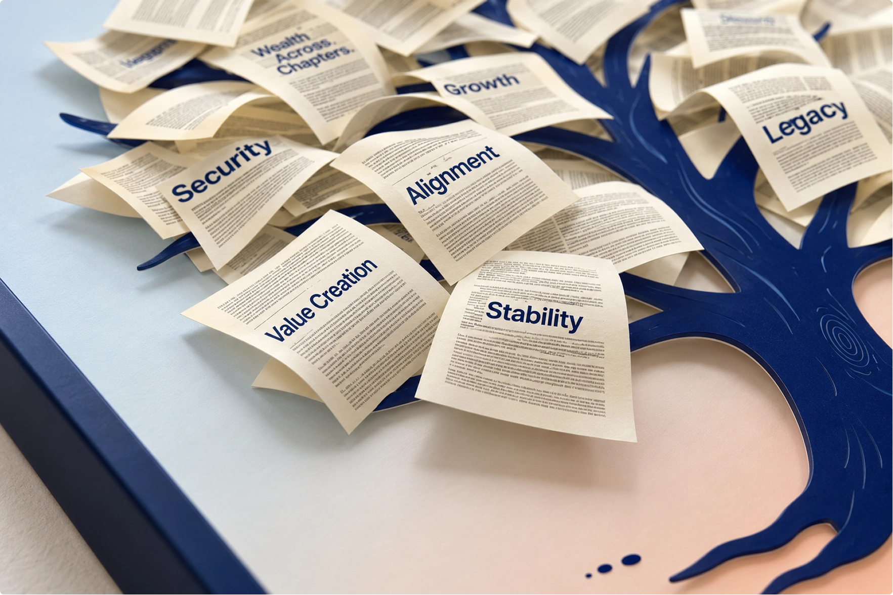

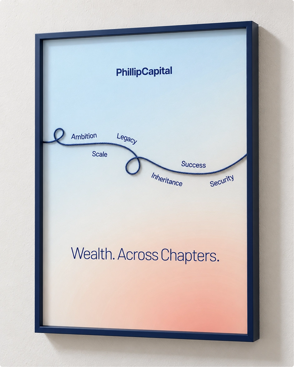
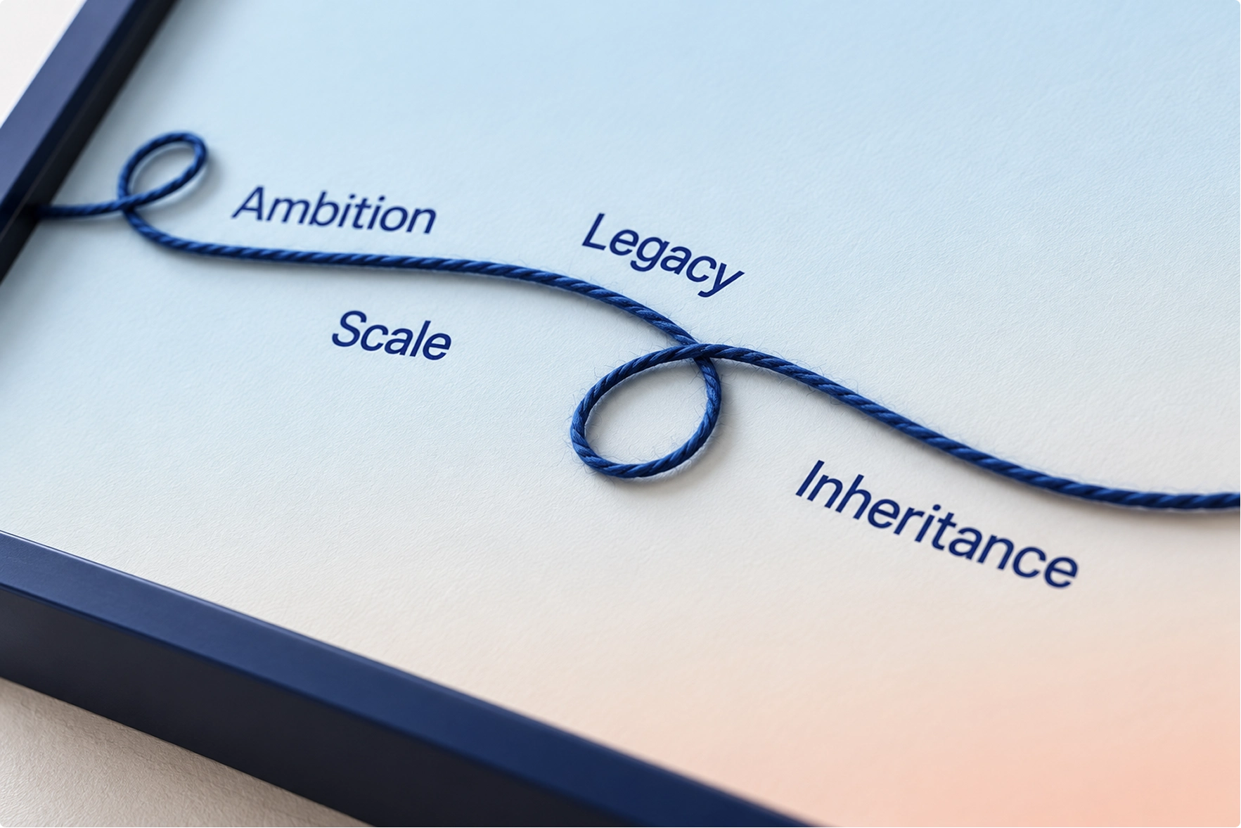

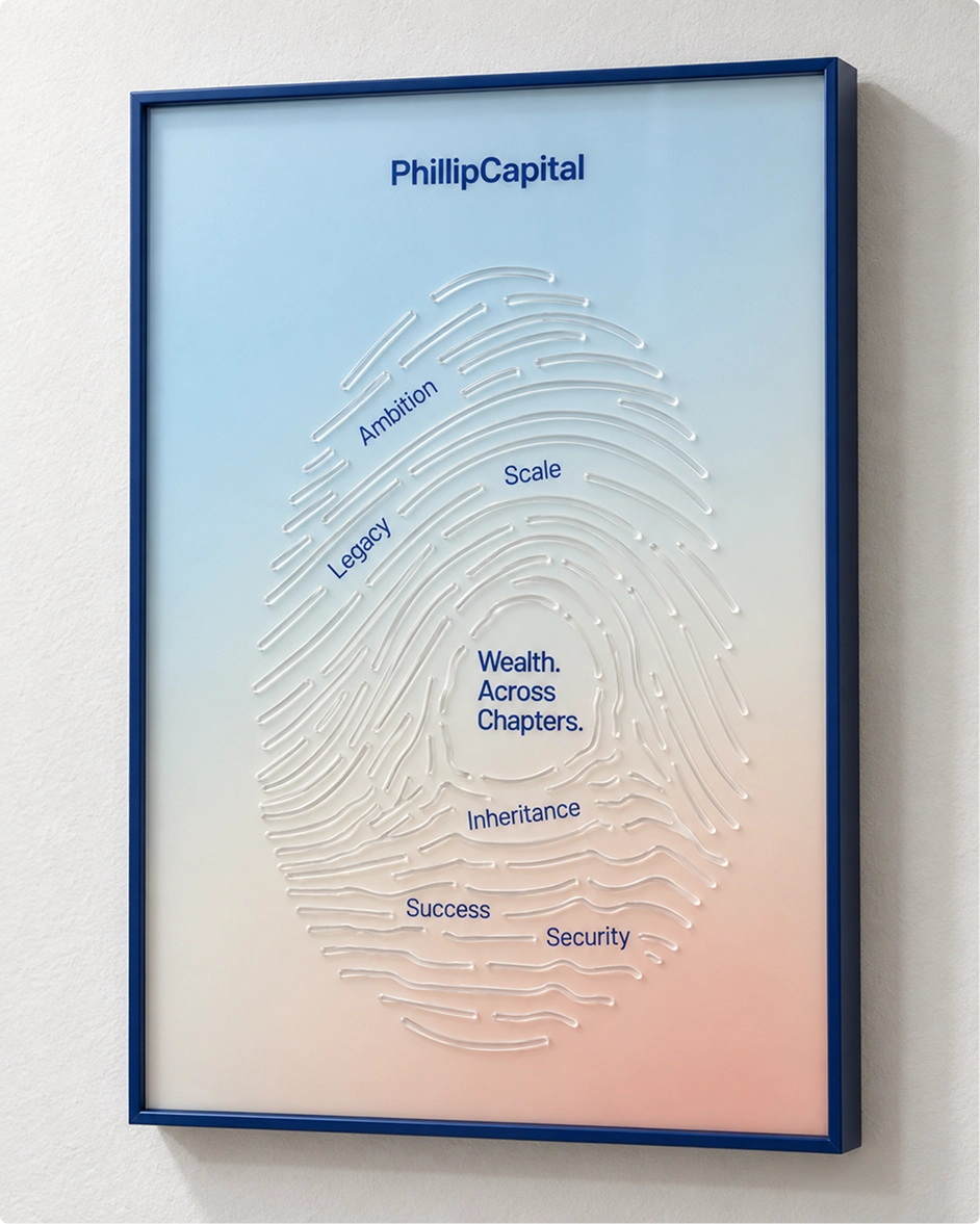
We realised that the meaning of wealth and its implication almost mirrors the way the journey of life takes us all through. It was this understanding that we co-created as an idea with our long-standing branding partner, BigBrandTheory, who have been a part of PhillipCapital's own journey and our own chapters for the last 20 years. Wealth Across Chapters is not a campaign, it is not a tagline. It is an approach and a framework that we apply, so that we are able to understand at what stage of life our customers are, and align ourselves to provide a better solution.
A role the business can hold, not a line it has to repeat.
Frequently asked
What did BigBrandTheory do for PhillipCapital?
BigBrandTheory has been PhillipCapital's brand partner for twenty years. The most recent work repositioned the firm from a product-led brokerage to a trusted wealth partner, covering brand strategy, the Wealth. Across Chapters. philosophy and its three pillars, the internal belief system, a brand refresh, the campaign platform and its copy and art direction, print advertising, environmental branding for the Mumbai office, presentation design and social media design.
What is Wealth. Across Chapters.?
It is PhillipCapital's brand philosophy and operating framework. It reframes wealth not as a milestone to reach but as a responsibility that continues, moving through creation, expansion, responsibility and transition, so the firm's role is defined by the client's life stage rather than by the product being sold.
How do you reposition a financial services brand?
By finding the role the business already plays rather than inventing one. For PhillipCapital that meant reading the category, which competes almost entirely on what it offers, then testing every pillar of the new position against what the firm could already prove: twenty-five years through market cycles, a research-led culture and long-tenure client relationships. A position only survives contact with a sales floor if the business can back it on day one.
Why take a brand philosophy inside the firm before launching it?
Because a philosophy that the people delivering it have not adopted becomes a campaign rather than a way of working. PhillipCapital's leadership took Wealth. Across Chapters. into the business while it was still only words, followed by the wider team, and only then clients.
How long has BigBrandTheory worked with PhillipCapital?
Twenty years, across multiple brand evolutions and rebrands. BigBrandTheory works in financial services and wealth management branding in India, and PhillipCapital’s managing director describes the current platform, Wealth. Across Chapters., as an approach and a framework the firm applies rather than a campaign it runs.