


Divine 5: brand, worldbuilding and publishing design for a sci-soul storyverse
Five siblings.
One homeland. A book that needed to behave like a franchise.
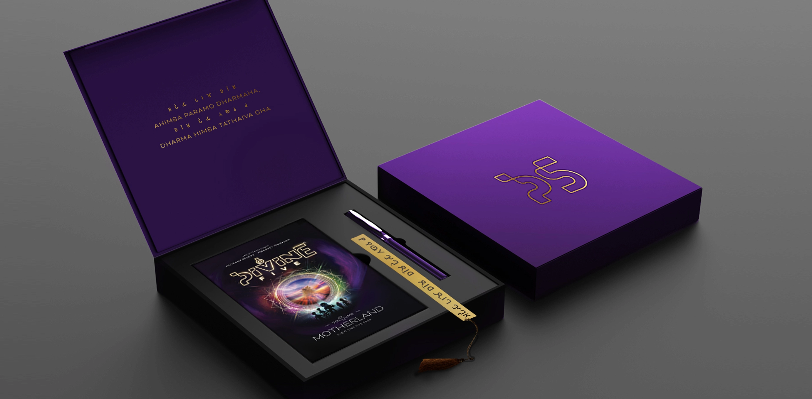
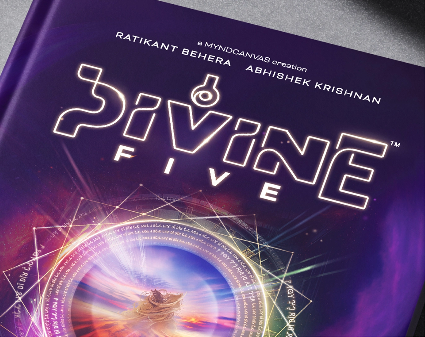
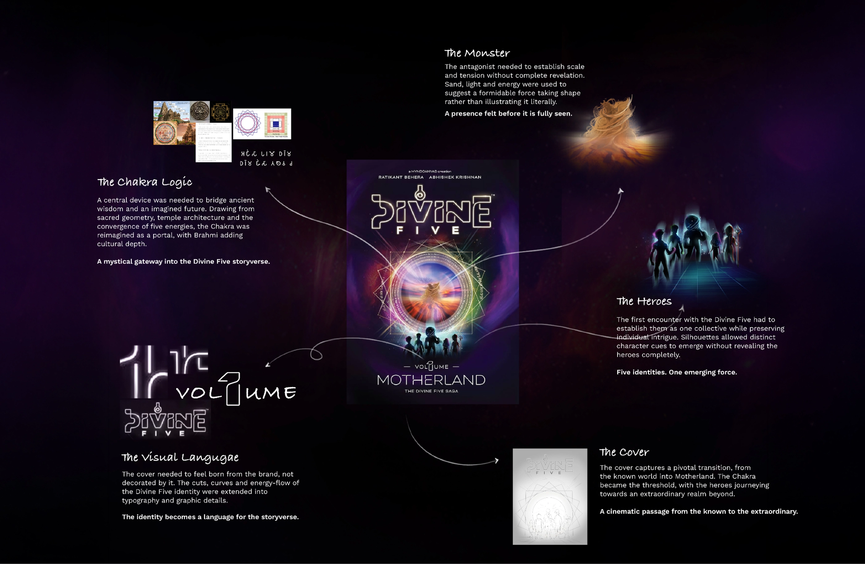
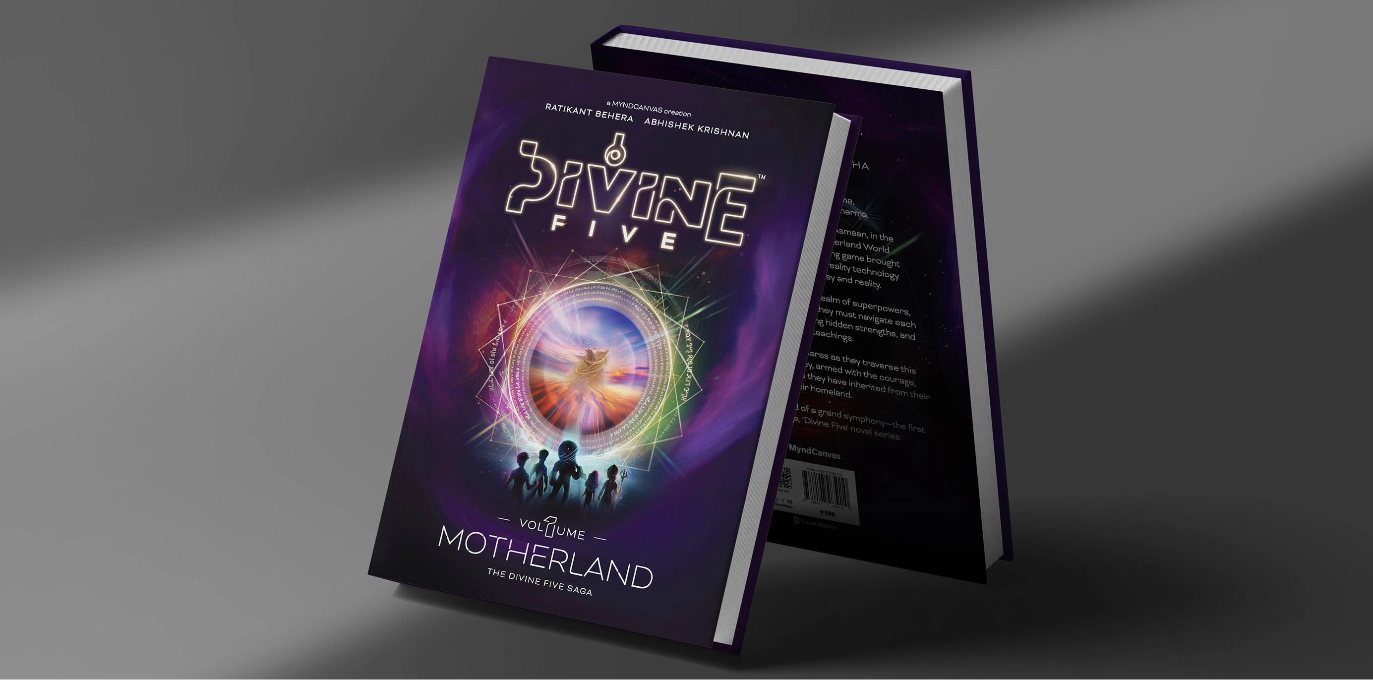
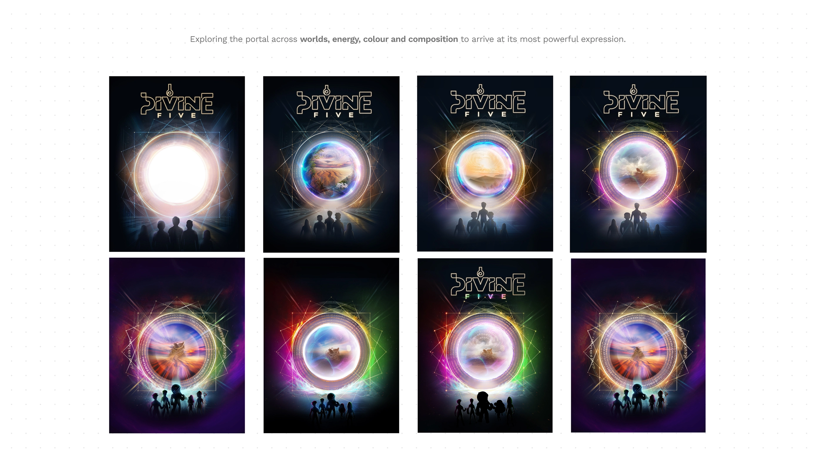
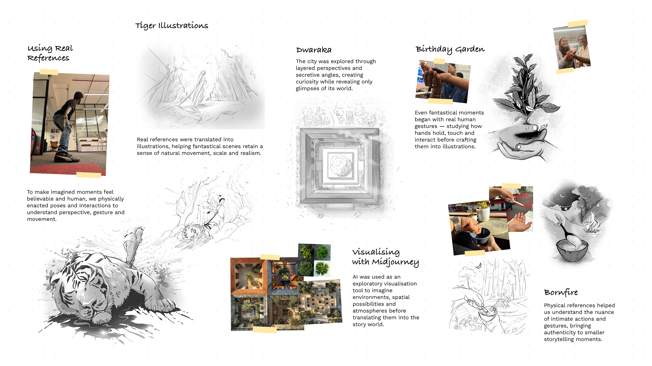
Divine 5 launched as Volume 1, Motherland, but the work was never only a cover. Five siblings, a homeland called Asmaan, and a championship that lives in virtual reality meant the brand had to hold a storyverse: characters children would follow, a world parents would trust, and a system that could travel from page to screen.
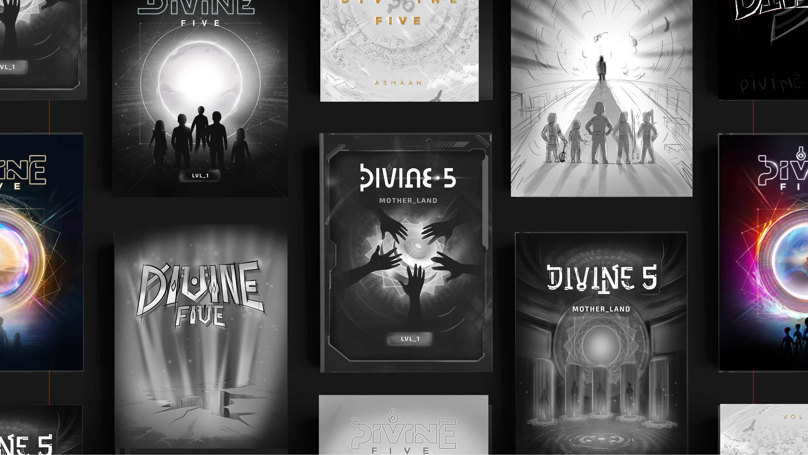
MyndCanvas came with a finished manuscript and an unfinished world. The job was to give that world a face, a voice and a set of rules that would still work when the next volume arrived. The first volume is an entry, not the whole argument.
Disciplines
- Brand system
- Worldbuilding
- Identity
- Illustration
- Cover
- Motion
- Site
- Social
- Marketplace
- Publishing
.webp)

.webp)
.webp)
.webp)
.webp)
.webp)
.webp)
(14) What
changed
From a manuscript to a world people could enter.
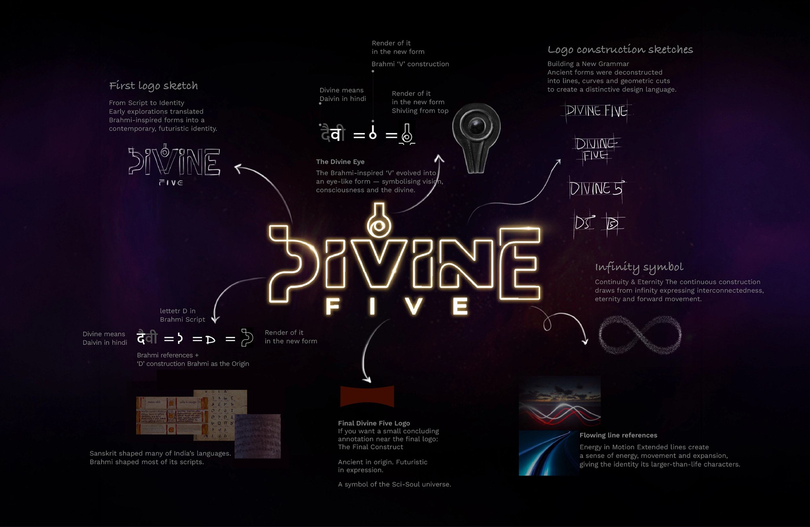
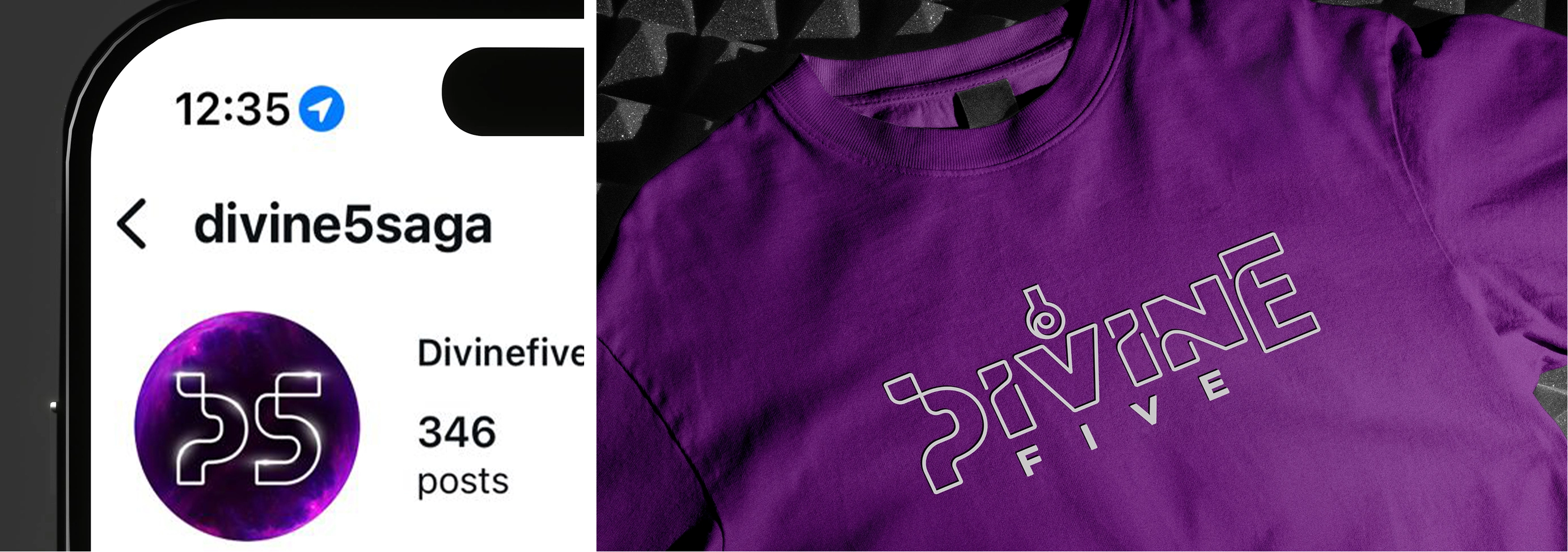
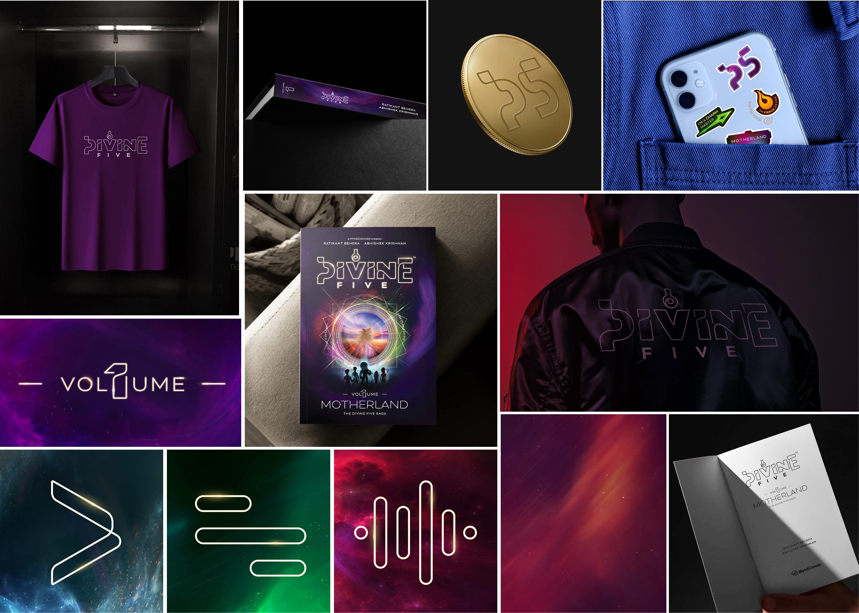
A world, not a titleIdentity, characters, motion and marketplace now read as one verse, so Divine 5 shows up as a place you can enter rather than as a single book.
Built to extendThe next volume has a system to land in. Colour, mark and hierarchy do not get redrawn each time a new championship round arrives.
Audience that answersSite, social and listing were built for the child who wants the world and the parent who buys the object.