

The One Sixth Sense: brand ideation, identity, packaging and D2C launch for a clinical sensorial skincare brand

Skincare · Direct to consumer · India
Branding a skincare brand from the name to the ad account.
Two founders, one of India's most crowded categories, and a consultancy that runs a D2C brand of its own.
The One Sixth Sense is an Indian skincare brand built from nothing in 2026 by two young founders, Desha Yadav and Krishna Vilas Yadav. They came to us with a conviction, a formulation point of view and an ambition to break through in one of the most crowded consumer categories in the country.
They did not come only for branding. They came for growth, which is a different conversation, and one most brand consultancies cannot have. We did not come in as an agency either. We came in as founders, mentoring them on the business alongside the brand: what it should stand for, what the range should be, and what it would take to actually sell it.
Name to ad account · 5 products, one routine · 3 channels live · Still running the growth
- D2C branding
- Brand strategy and positioning
- Brand naming
- Brand idea and narrative
- Visual identity design
- Packaging design
- Ecommerce website design
- Launch photography and art direction
- Launch PR
- Social media
- Community building
- Performance marketing

The category sells results. Skin wants health.
We read the category first. Clinical skincare looks like pharmacy and talks like treatment. Natural skincare feels kind and proves very little. Underneath, both sell the same thing: a visible result, soon.
Skin does not work that way. It behaves differently in humidity, pollution and Indian sun, and much of what reaches the shelf here was formulated for another climate and adapted on the way in.
Skin health, not skincare
So we moved the brand off the result and onto the condition. Skin Health. Not Skincare. Four words that reposition everything behind them, because a brand selling health has to argue for consistency rather than for speed.
It also set the standard the business then had to meet. Barrier support built into the formulations rather than added to them, a skin-compatible pH, and ninety-five percent natural origin held without losing stability.
The platform
Skin Health. Not Skincare.
A name that argues the position
Skin is the largest organ of the body and it has a language of its own. It already knows how to protect, restore and glow. What it lacks is a support system that understands what it is trying to do.
We built the brand as that support system and named it for it. The One Sixth Sense: a sense beyond the five, and a sixth of the whole.
The modern skin mentor
The promise is not that we will fix your skin. It is that we will listen to it, and that changed what the brand is allowed to sound like.
We wrote the persona as the Modern Skin Mentor, gracious, honest and bold. Warm and precise at once, confident enough to state a claim plainly and kind enough not to shout it.
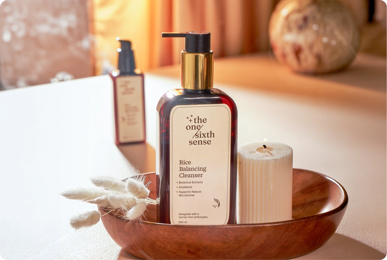
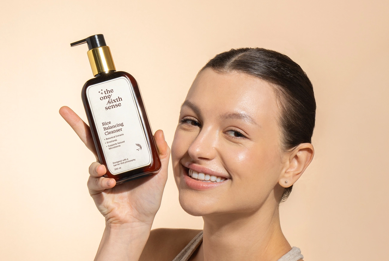
Five products, one routine
New brands in this category launch a catalogue and hope something sells. We argued for the opposite. A range small enough to be understood and complete enough to be a routine.
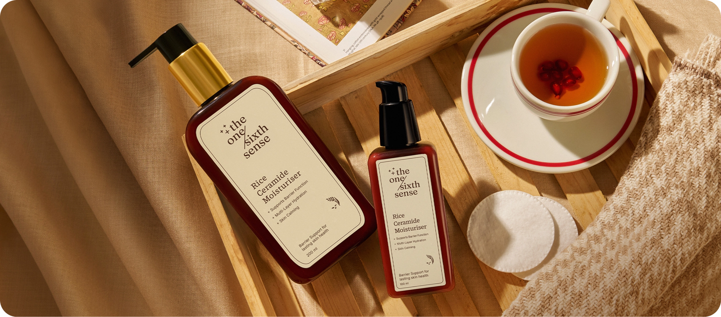
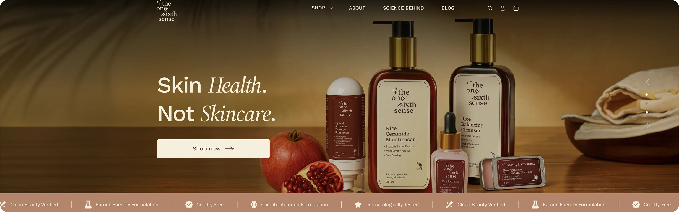
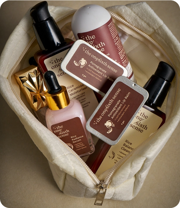
Five products, each with a job. Cleanse, nourish, treat, protect and care. Nothing on the shelf without a place in the ritual.
Rice as the thread
A range needs a reason to be one range. We built it around rice, which calms and brightens, and which already belongs to how skin has been cared for here.
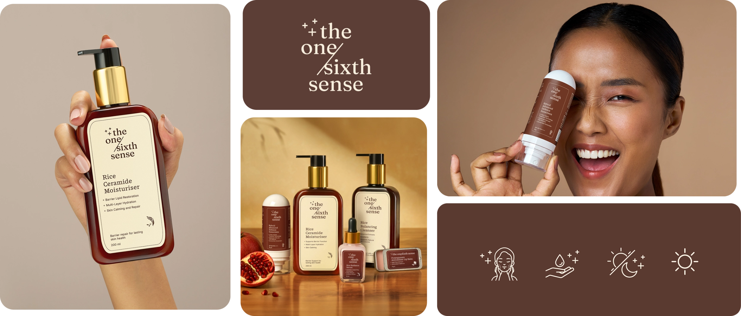
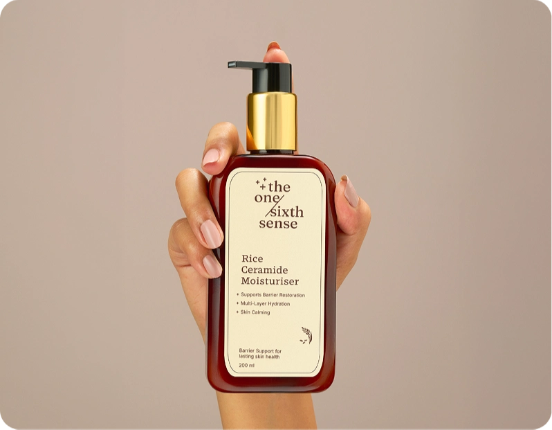
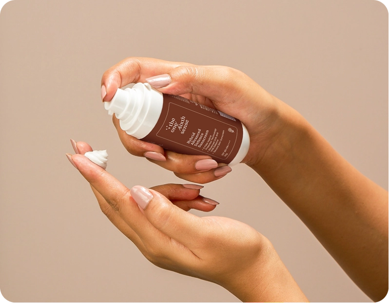
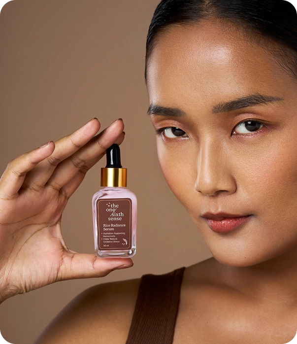
Rice runs through the cleanser, the moisturiser and the serum, with the science stated plainly beside it: ceramide NP, niacinamide, beta-glucan, hyaluronic acid, and a hybrid sunscreen at SPF 80 PA++++. The bundles then sell the routine rather than the products, which is what a brand built on consistency has to do.
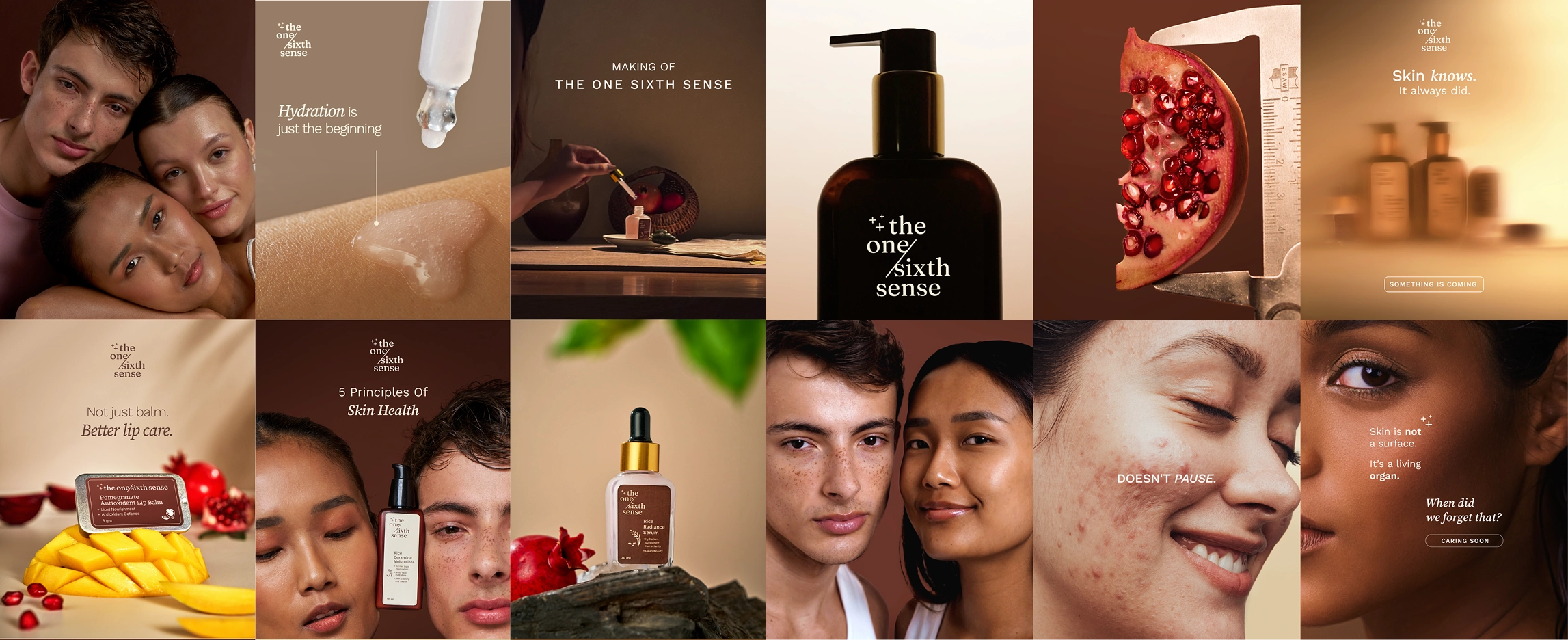
Both halves, visible in the mark
The logo had to hold nature and science in one construction rather than alternate between them.
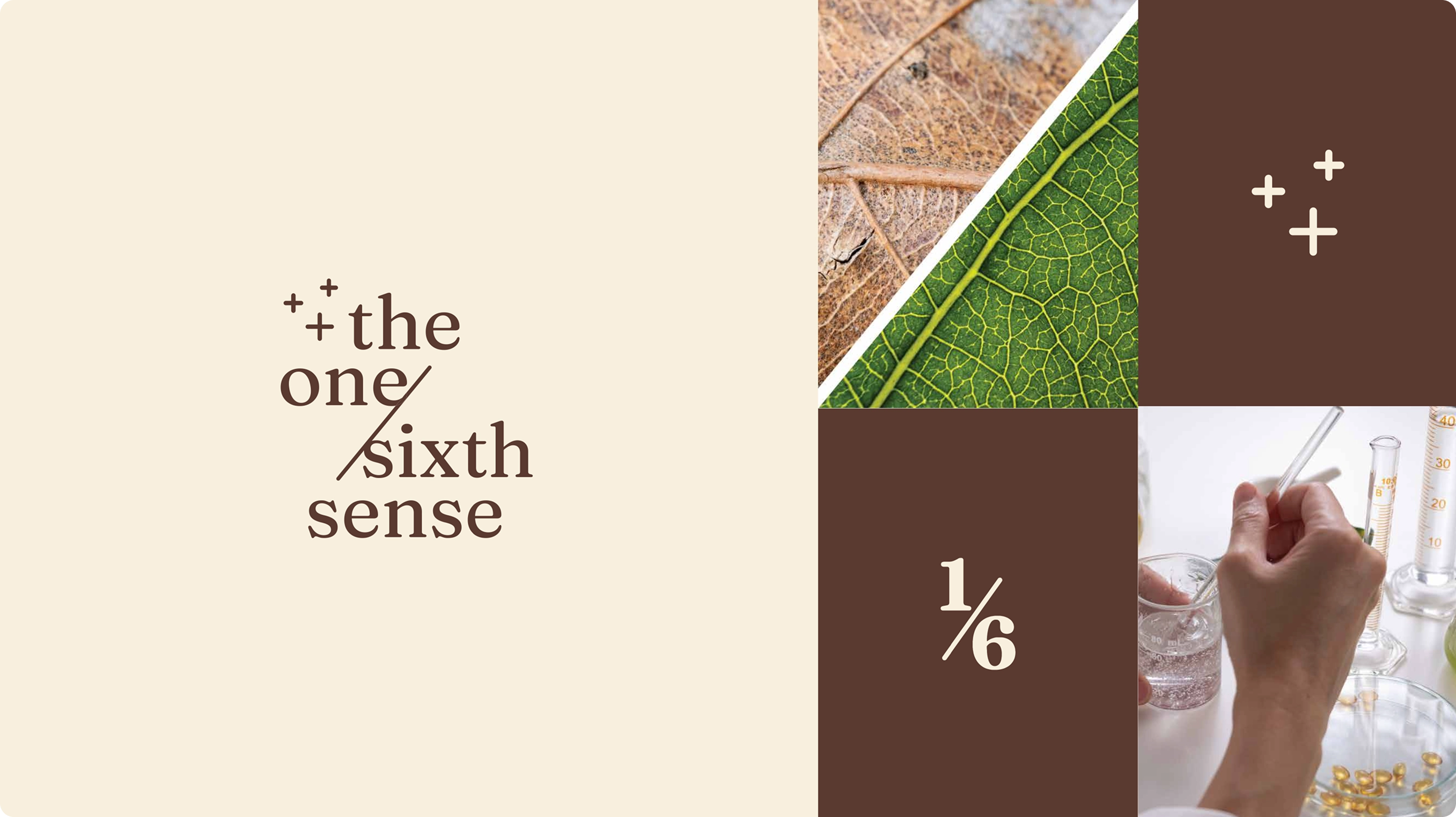
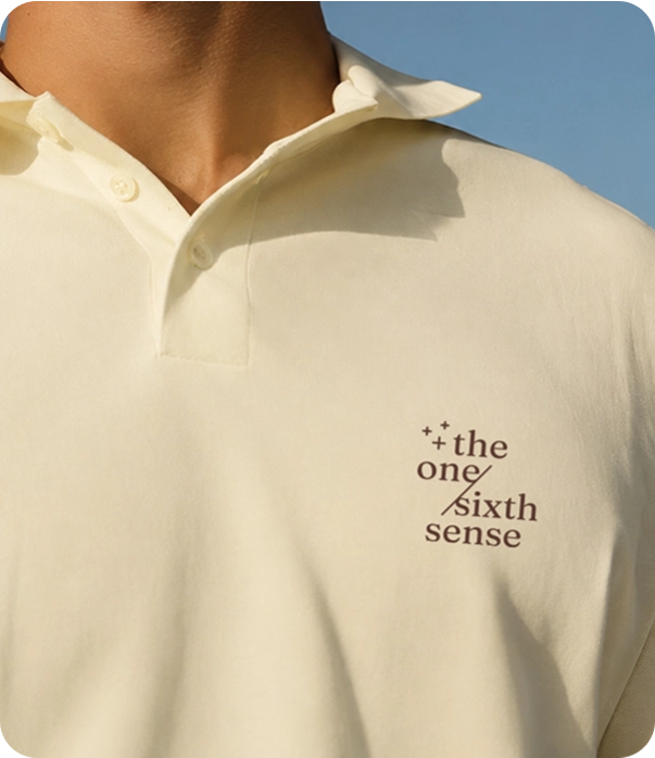
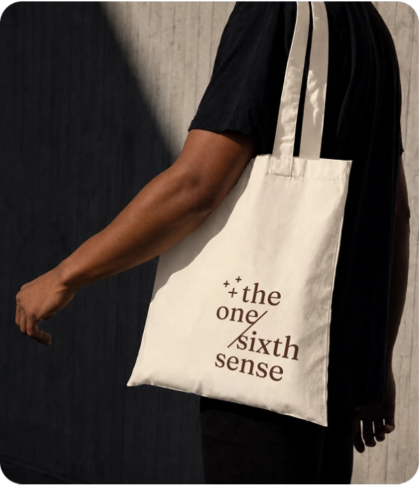
We drew the letterforms from organic, leaf-like influences, soft curves and gentle proportions, so nothing reads as sharp or aggressive. The plus marks carry the other half, formulation expertise and dermatological precision, and in skincare a plus already signals actives and improvement. The slash both divides and connects one and sixth, carrying the move from surface care to deeper awareness.
Mocha, not clinical white
We built the palette away from the category's default. Mocha anchors it, cream carries it, latte sits between the two. Work Sans gives the system structure and Source Serif 4 gives it voice.
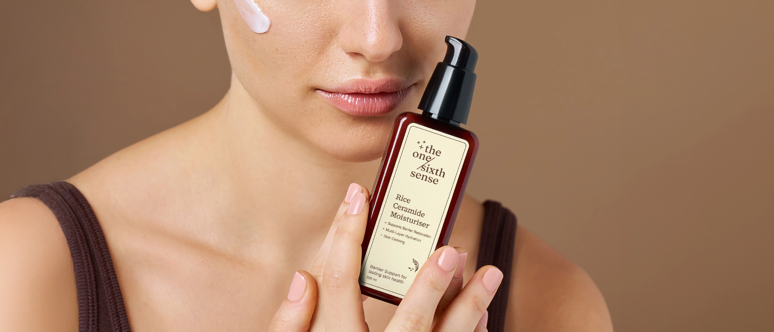
The packaging had to earn a premium at the price the ingredients justify, which is a harder brief than looking expensive. Restraint reads as confidence in this category. Decoration reads as compensation.
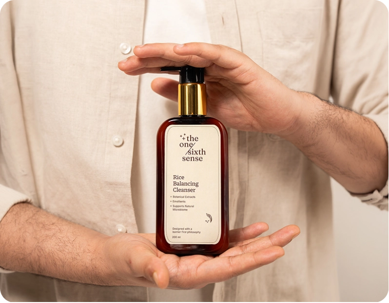
Before commerce comes attention
A new brand has no demand to capture. It has to create the reason to look first, which is why the launch was built as one piece rather than as a sequence of deliverables.
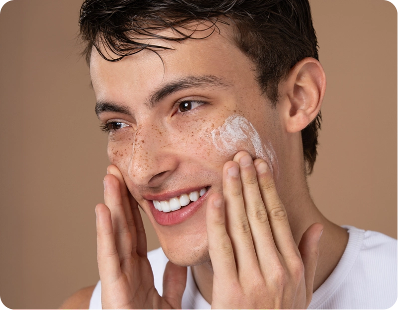
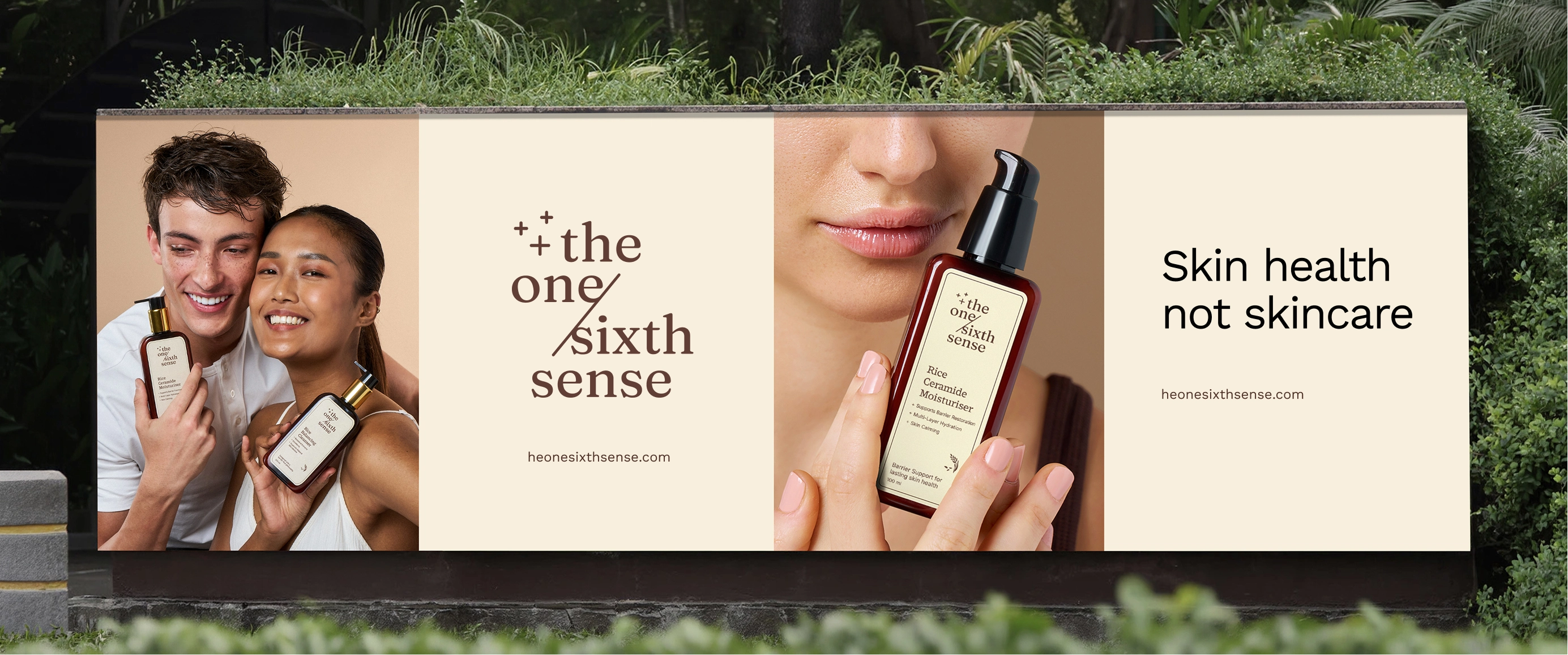
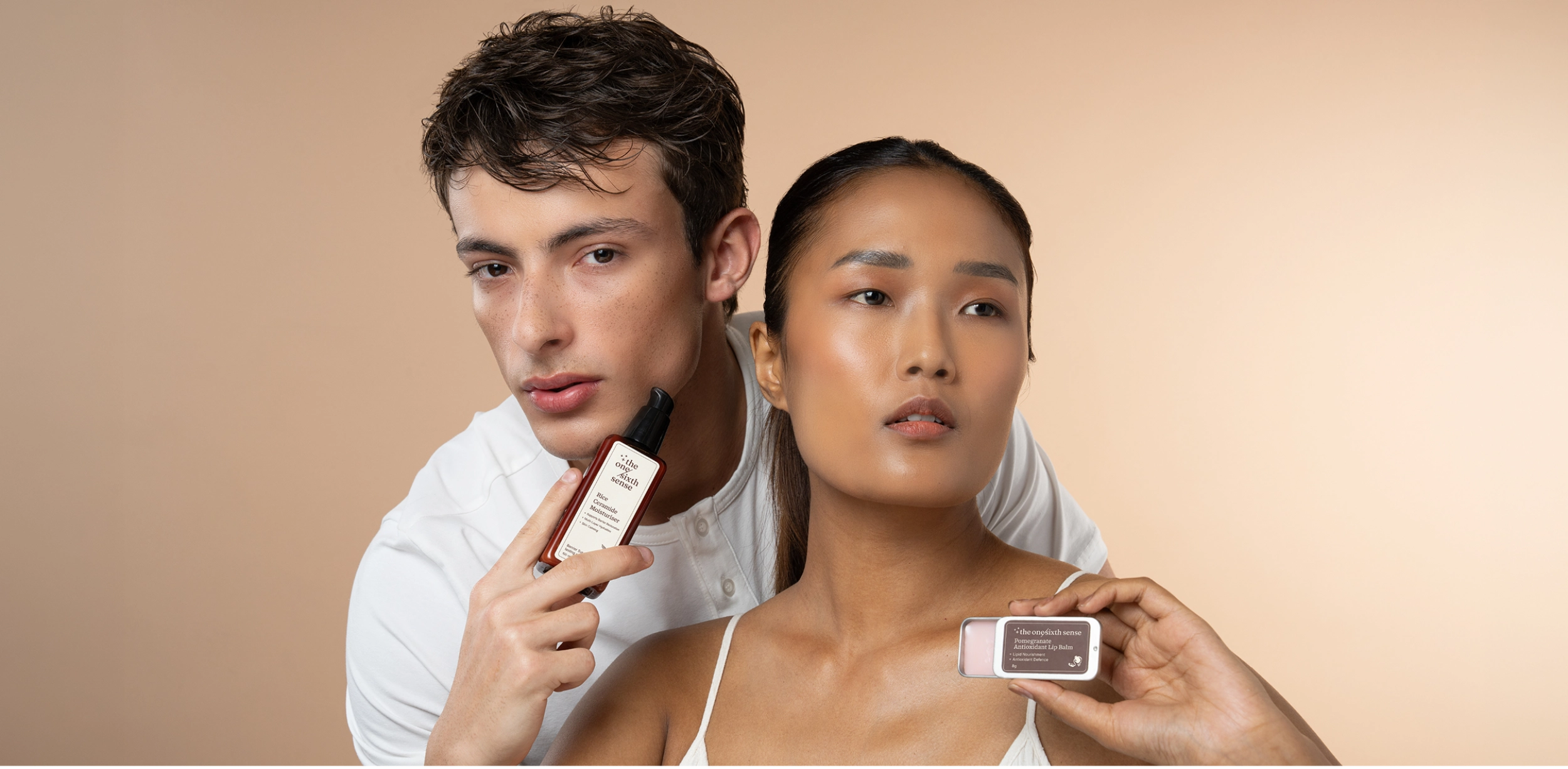
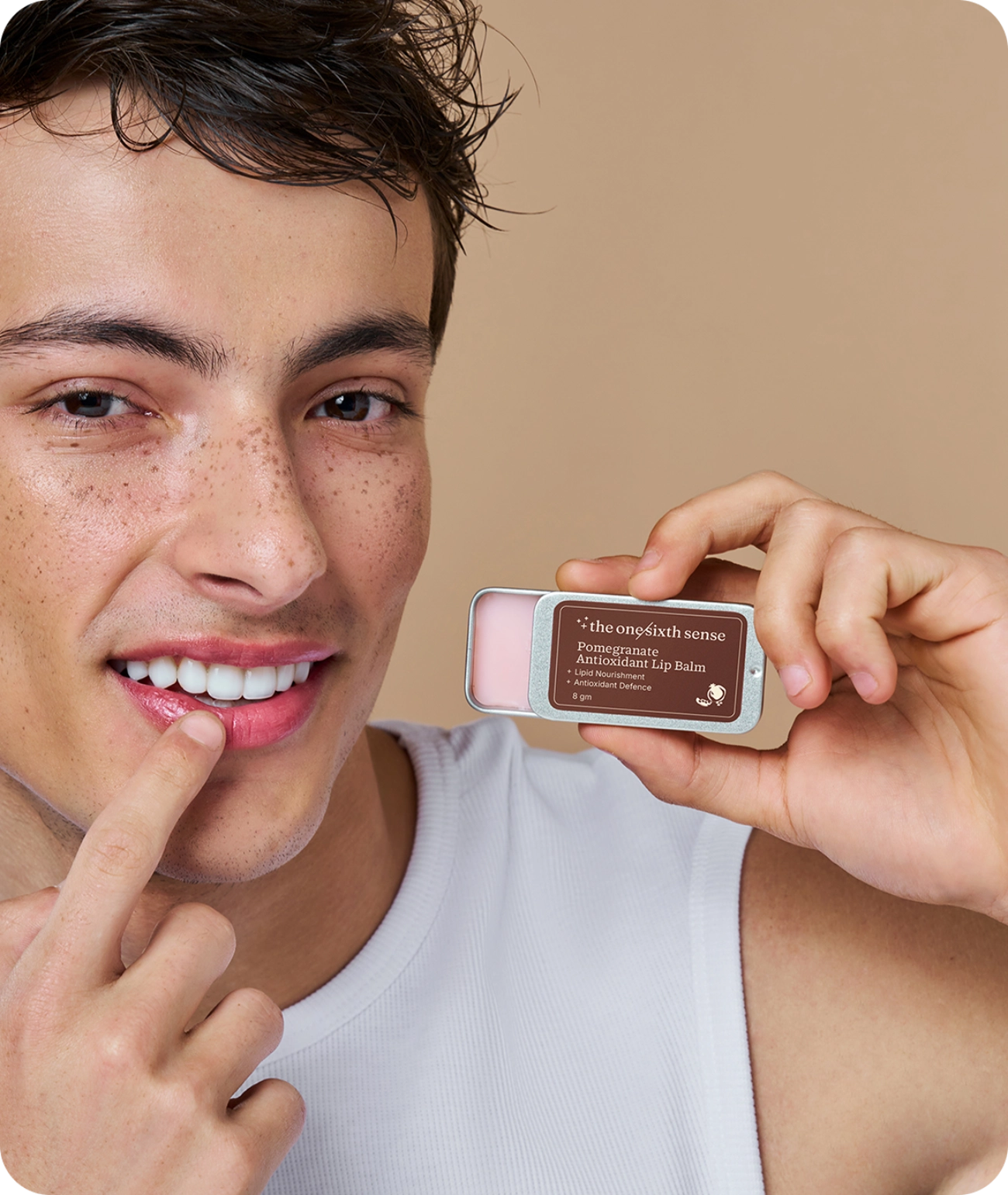
We art directed and shot the range, designed the ecommerce experience as the one place the brand makes its full argument, built the social presence, and placed the launch story in the national press.
Designed for a shelf and a thumbnail
Packaging here has two jobs and only one of them is physical. Most of the category is bought as a small image on a listing, sitting next to forty others.
So we designed the range to hold at both sizes. The mark, the palette and the hierarchy survive the crop, because a pack that only works in the hand loses the sale before anyone holds it.
We did not hand it over
Most brand work ends at launch. This one did not, because the founder question and the growth question are the same question, and we were already answering both.
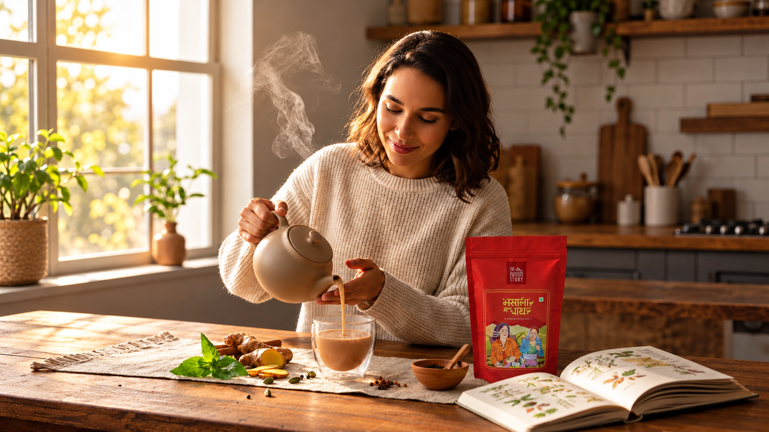
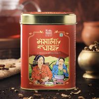
We now run the brand's growth: community building alongside performance across Meta, Google and Amazon, with influencer work layering in. We can do that because we run a direct to consumer brand of our own. Pahadi Story taught us what a founder actually needs from a brand partner once the identity is signed off, which is almost never more design.
Learning, not verdict
A brand a few months old does not yet know what its customer responds to. None of them do.
So we read the numbers as learning rather than as verdict, and the plan moves on what the market says rather than on what the launch deck assumed. The brand is still being tuned, in public, by the people who built it.
There was nothing to hand over, because we have not left.
The One Sixth Sense runs as one system. A position, a name that argues it, a range built as a routine, an identity that holds both halves, packaging made for how it is really bought, and a growth engine read by the same people who wrote the philosophy.
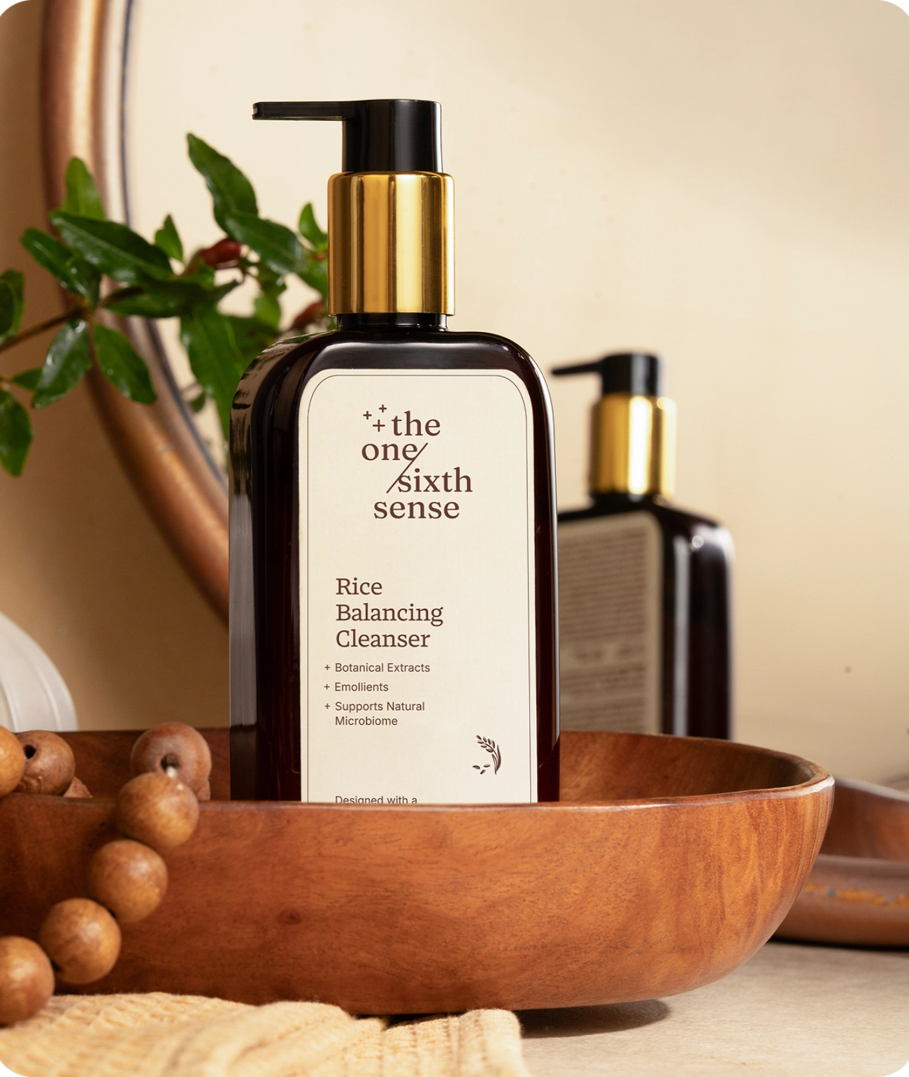
A position, not a product claim.
Frequently asked
Who created The One Sixth Sense brand?
BigBrandTheory created The One Sixth Sense with founders Desha Yadav and Krishna Vilas Yadav in 2026, covering the brand name, positioning and brand idea, the visual identity, packaging design, the ecommerce experience, launch photography, social media and the launch PR. BigBrandTheory also runs the brand's ongoing community building and performance marketing.
What is The One Sixth Sense?
The One Sixth Sense is an Indian skincare brand built around skin health rather than surface results. Its range covers five products across cleanse, nourish, treat, protect and care, led by rice extract and supported by ceramide NP, niacinamide, beta-glucan, hyaluronic acid and a hybrid SPF 80 PA++++ sunscreen, formulated for Indian skin and the climate it lives in.
Should a new D2C brand launch a large range or a small one?
Small and complete beats large and partial. The One Sixth Sense launched with five products, each with a job in a single routine, and bundles that sell the routine rather than the individual products. A new brand cannot build a habit across twenty products, and a catalogue launched on hope ends up being discounted into shape.
What does D2C branding involve?
Positioning and differentiation before anything is designed, then the name, the identity and the packaging, then the commerce layer: the store, the marketplace listings and the content that feeds them. The common failure is treating them as separate projects. Packaging designed without the marketplace thumbnail in mind, or a store built before the brand knows what it is arguing, both cost more to fix than to get right.
Why does a brand consultancy need to understand growth?
Because the positioning decision and the acquisition cost are the same decision seen from two ends. BigBrandTheory works on D2C branding and growth in India and runs its own direct to consumer brand, Pahadi Story, which is why it took The One Sixth Sense from the name through packaging and the store to the media plan, rather than handing it over at the guidelines.