
ChhattisKala: umbrella brand creation, identity, imagery system and packaging for a state rural livelihoods mission
Public and social · Rural livelihoods · Chhattisgarh, India
Branding Chhattiskala, an umbrella brand for a state’s makers.
A state full of makers, and no single name the world could recognise them by.
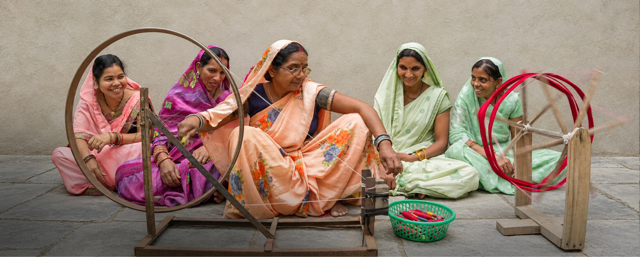
Chhattiskala is the official umbrella brand of Chhattisgarh, a flagship initiative of Bihan, the state rural livelihoods mission. It brings the craft of artisans, the produce of farmers and the enterprise of women’s self-help groups under one identity.
The work sits inside a national ambition, the Lakhpati Didi vision of rural women building sustainable incomes. BigBrandTheory created the brand with PwC, from the name through to the system districts would run it on.
Launched in 2025 by the Union Minister and the Chief Minister · Live on Amazon and ONDC · One brand, every district · Two scripts, equal weight
- Public and social sector branding
- Umbrella brand creation
- Brand strategy
- Naming · Brand story and manifesto
- Brand values
- Stakeholder mapping
- Identity system
- Imagery system
- Packaging design
- Bilingual communication
- District rollout
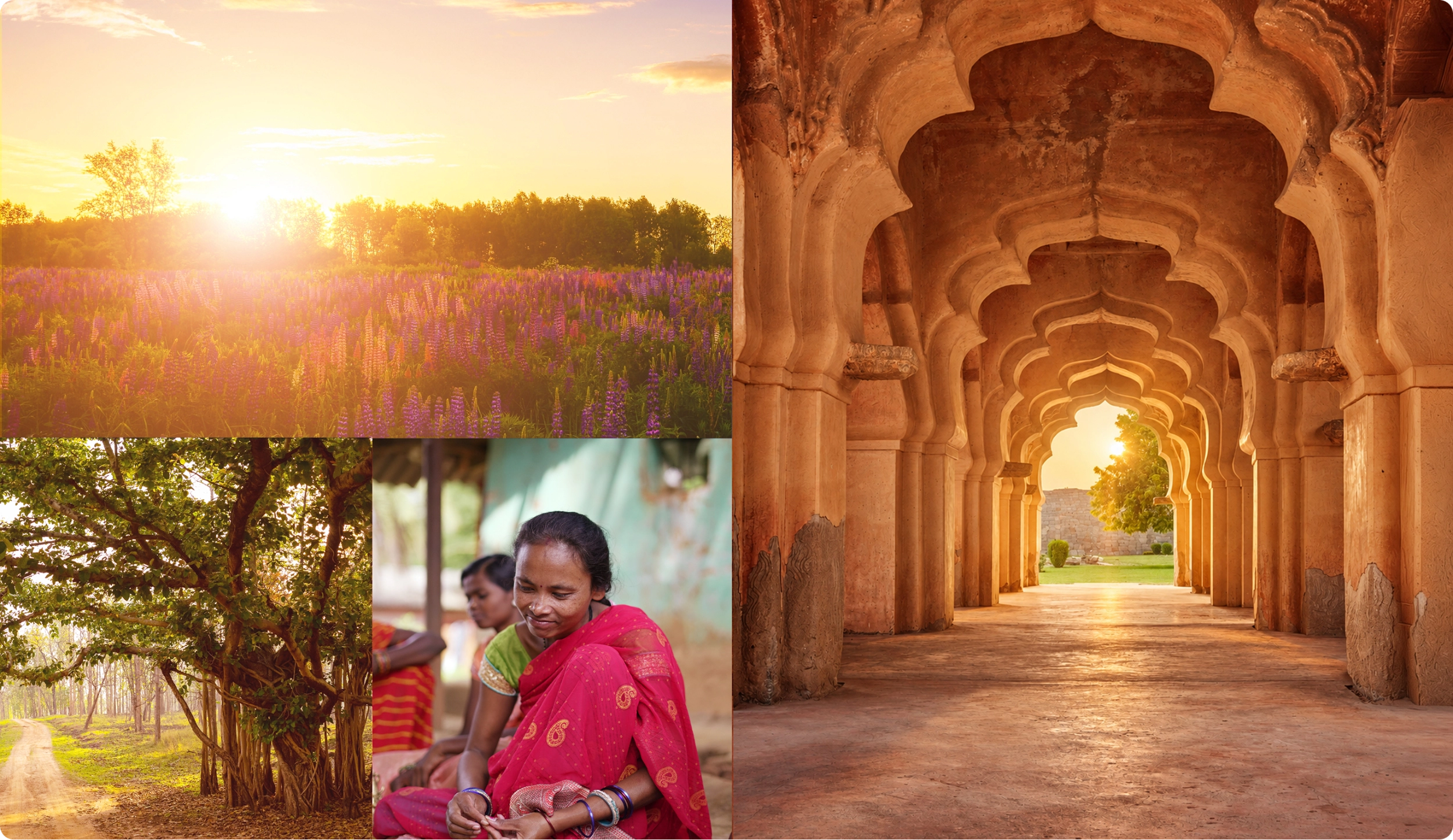
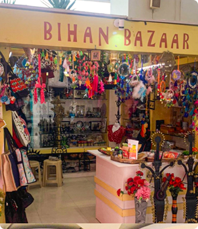
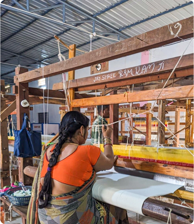
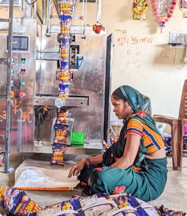
A state full of makers, and no name to find them by
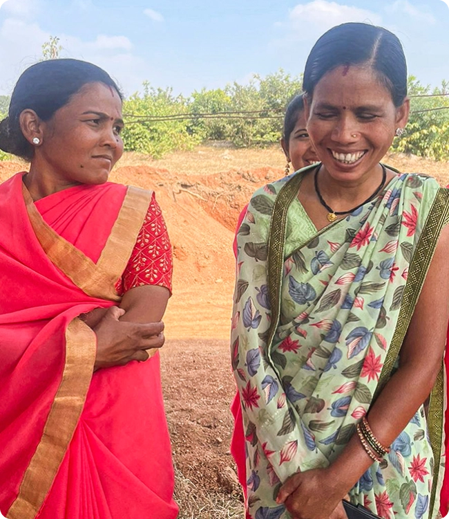
Chhattisgarh has thousands of producers. Tribal artisans, farmers, and women’s self-help groups making soap, incense, pulses, flours, sweets, spices and rice, much of it to a standard any market would take.
What none of them had was a name a buyer outside the state would recognise. A product sold under a district label reaches a district.
The quality was never the constraint. The identity was.
Umbrella brands do not fail at the logo
State brands fail because of scale rather than design. Thousands of producers, hundreds of products, dozens of districts, and no central marketing team holding any of it together.
An umbrella brand does not fail because the logo is wrong. It fails because nobody downstream knows how to use it.
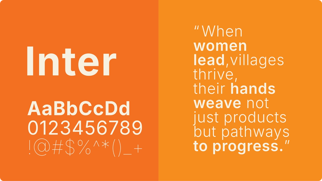
We are the voice of the unseen hands
The people in this brand have always been invisible in the final product. Somebody grew the rice, somebody pressed the oil, somebody rolled the agarbatti, and the market met none of them.
So we wrote the manifesto before anything was drawn, and it said what the brand is actually for. We are the voice of the unseen hands.
The manifesto came before the mark
In public sector work the words travel further than the design, because they are what a district officer repeats in a room we will never be in.
Getting the story, the values and the stakeholder map settled first is what lets an identity be adopted rather than issued.
The platform
We are the voice of the unseen hands.
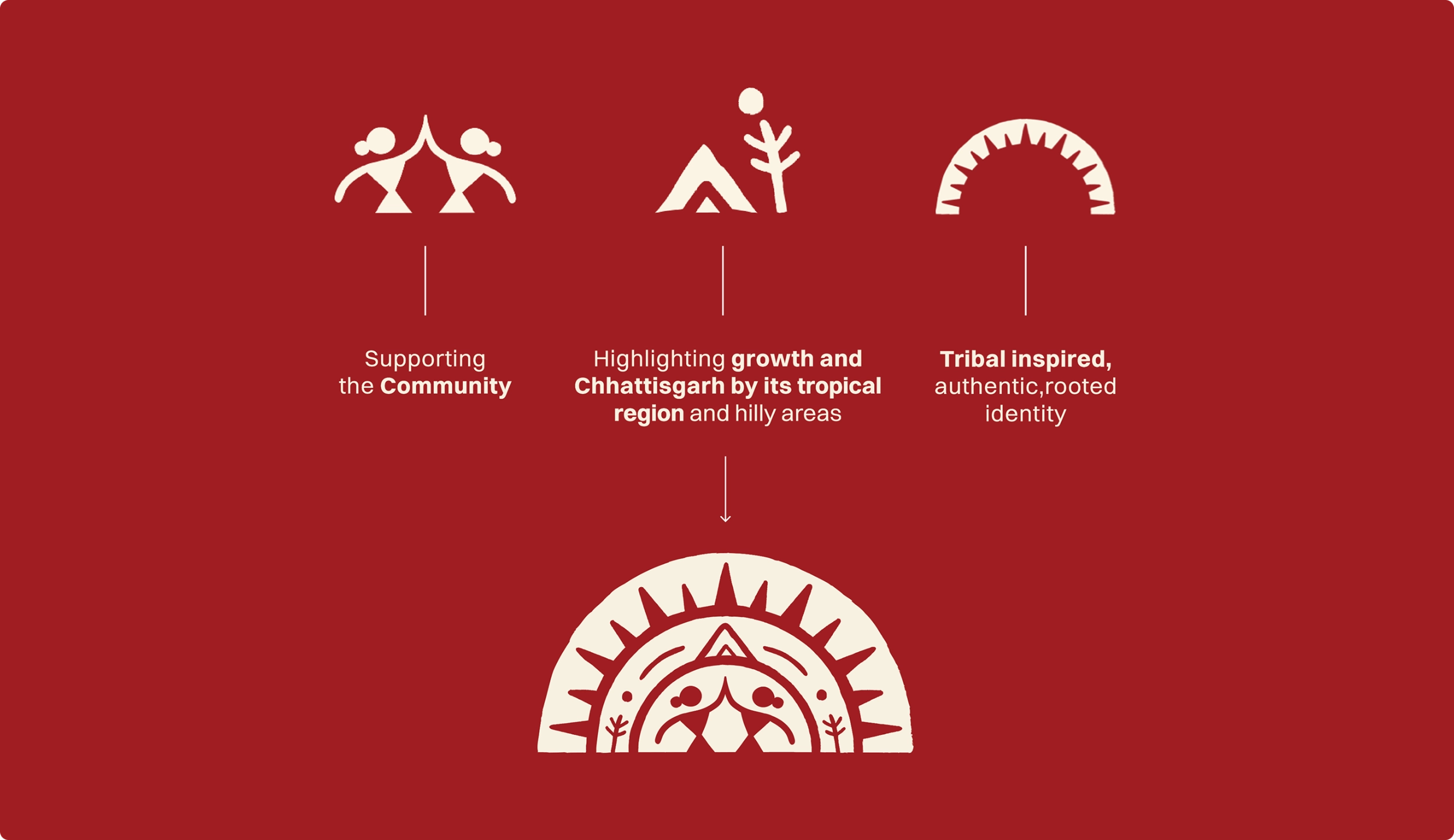
Brand identity built from the people in it
The mark is made of the things it represents. Community figures, a landscape and plant motif, and a tribal-inspired outer arch holding them together.
Nothing in it is borrowed from the conventions of government communication, because the brand had to compete on a marketplace listing rather than on a notice board.
Sunrise orange, gerua red
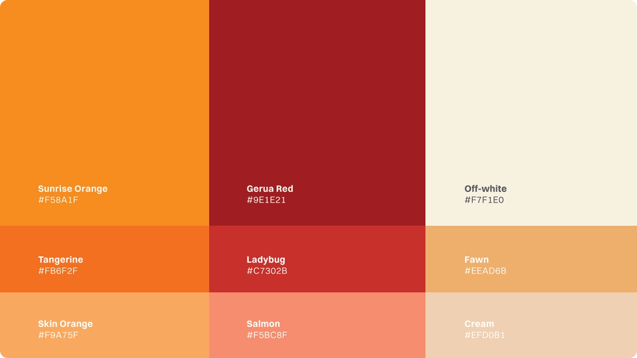
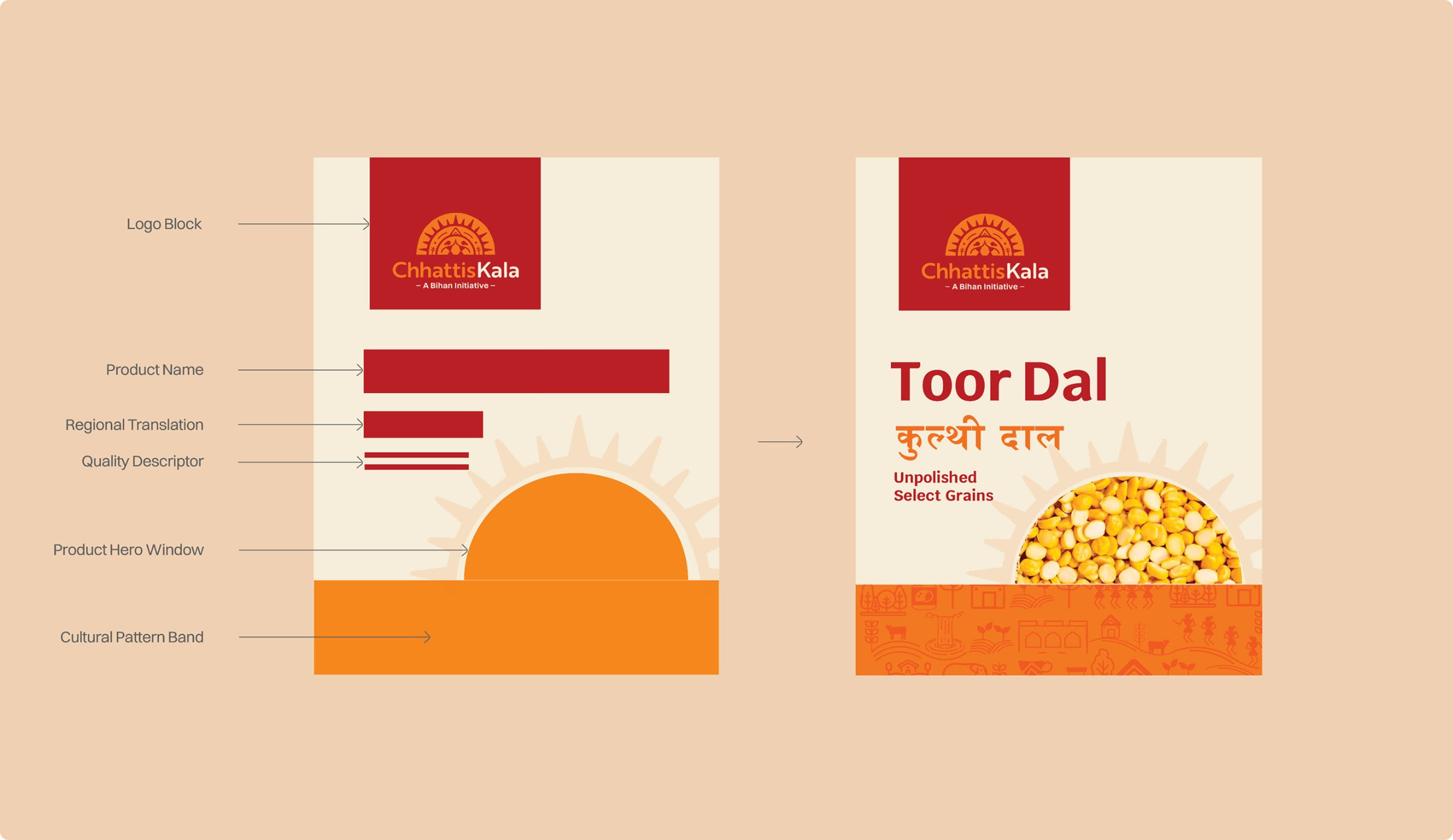
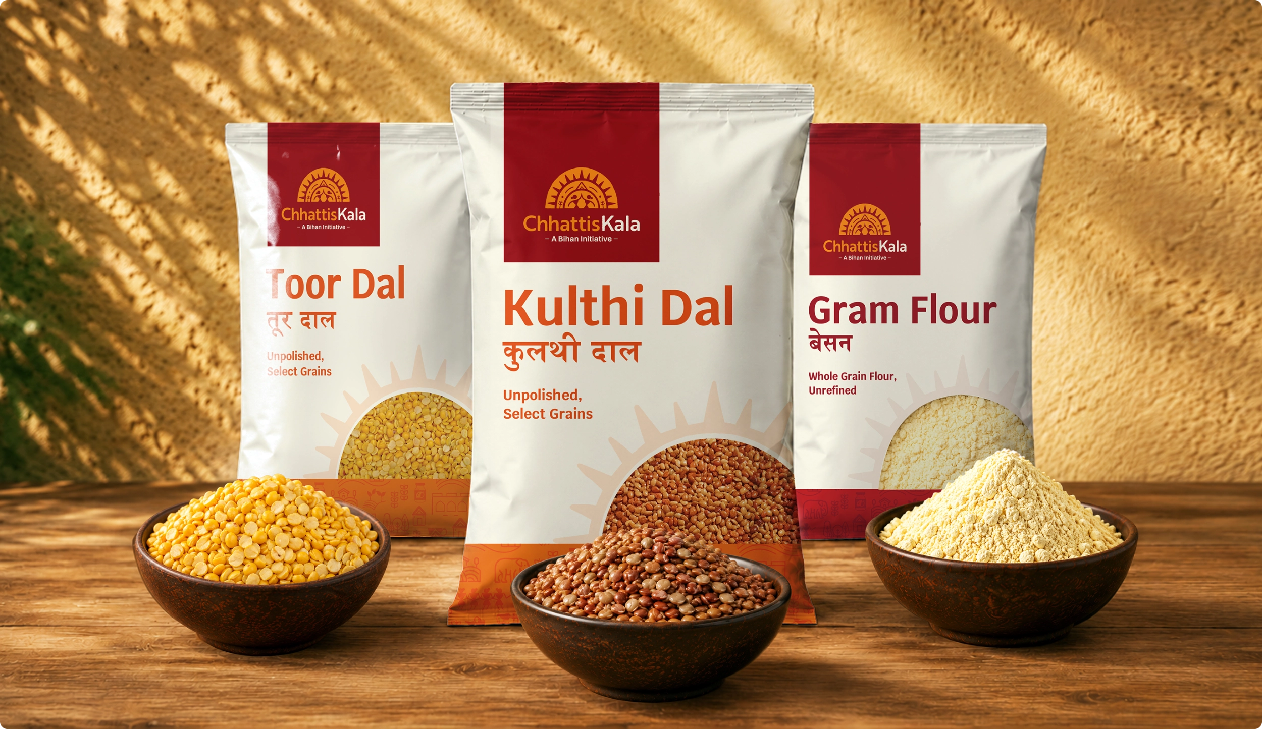
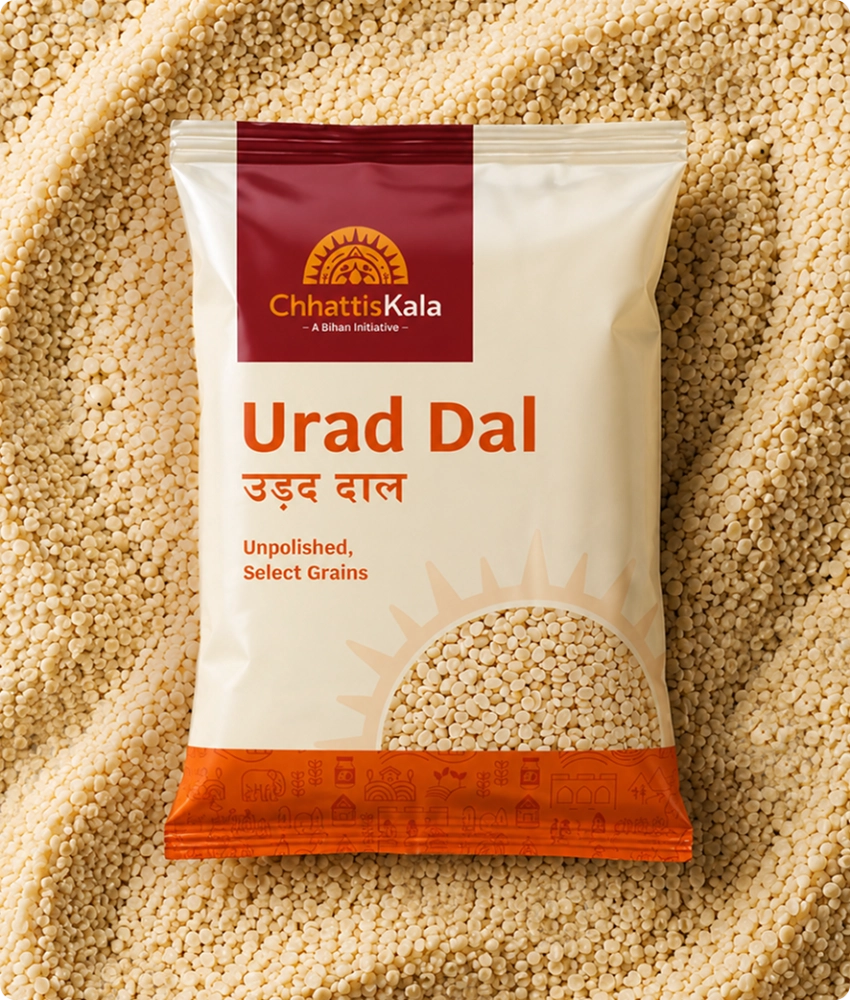
The palette runs on sunrise orange and gerua red against off-white, warm colours that belong to the state rather than to a category.
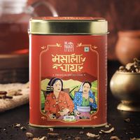
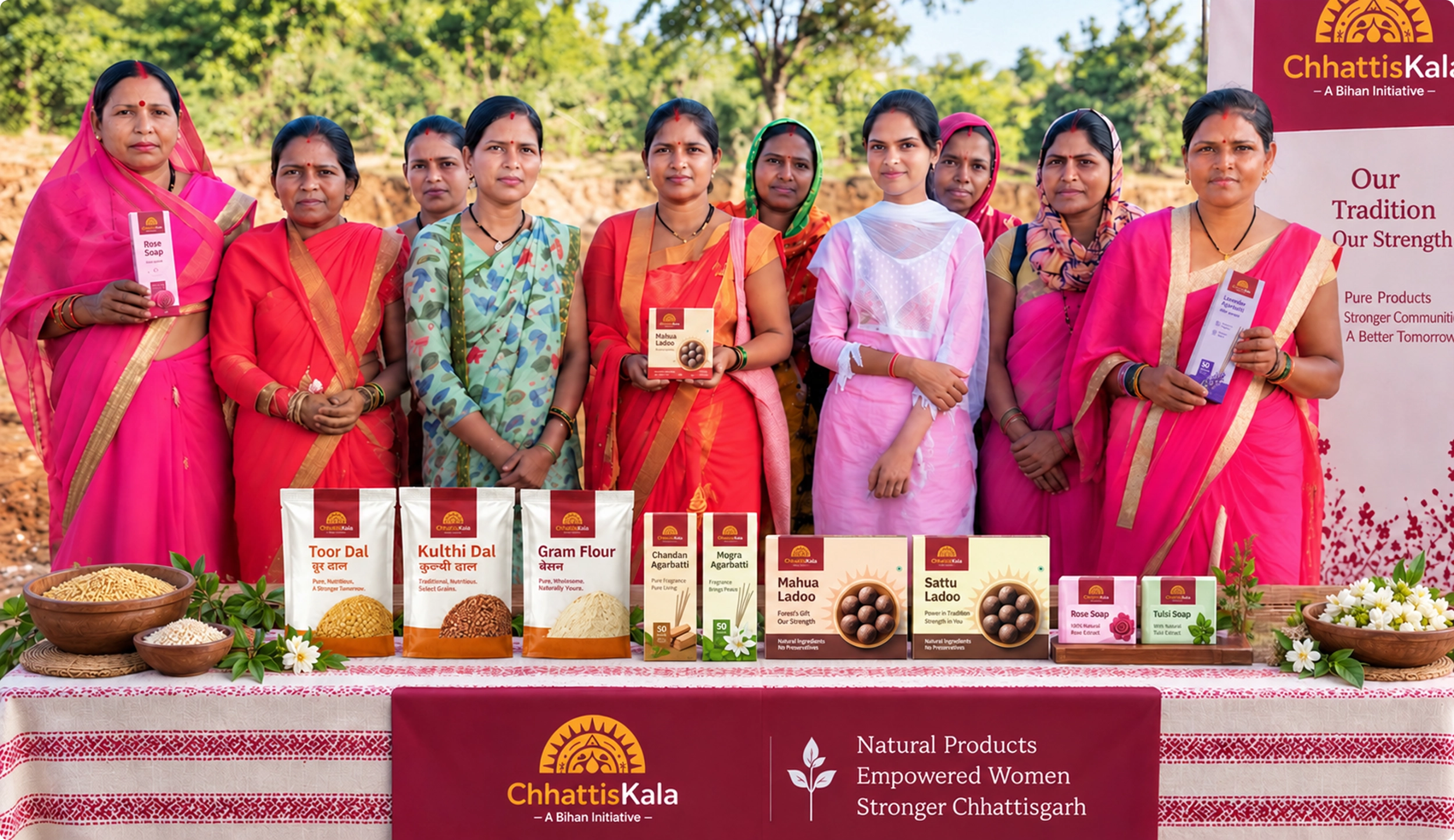
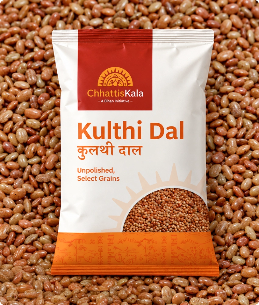
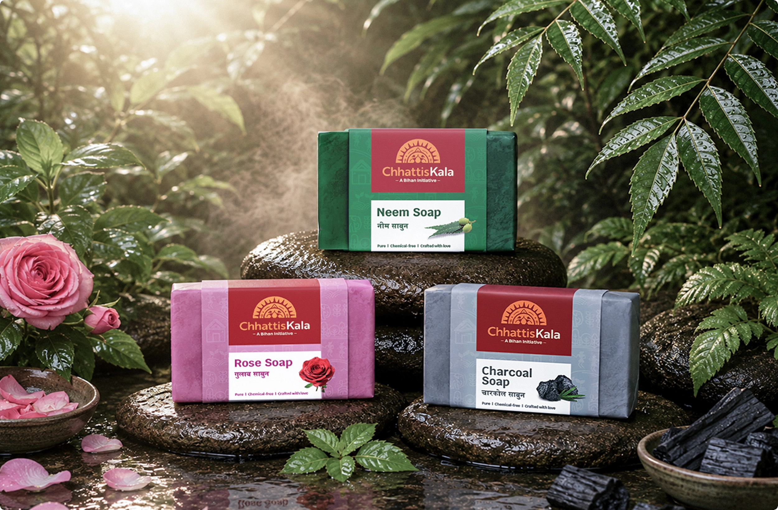
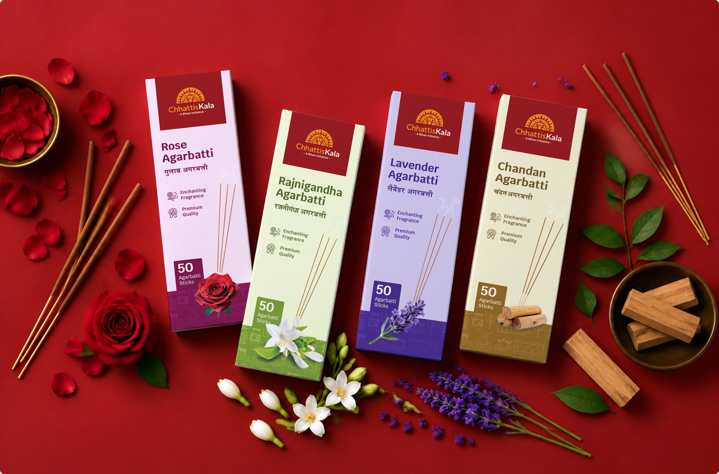
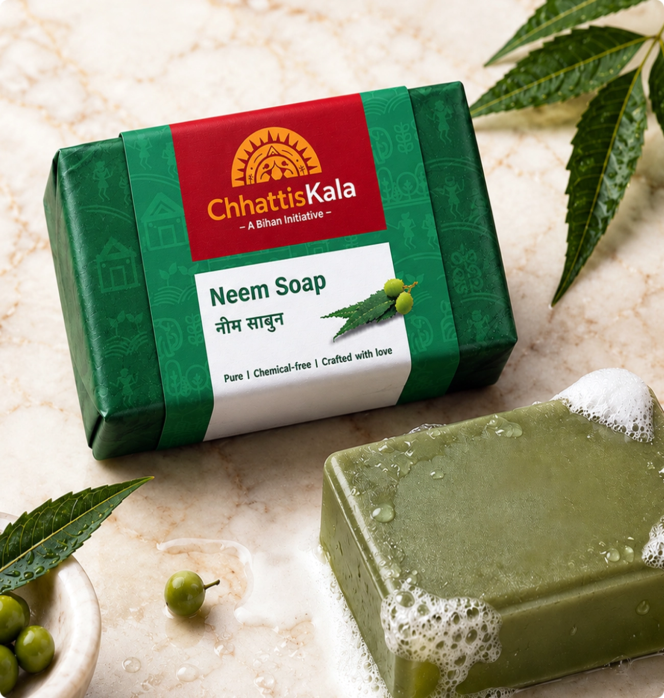
Across pulses and flours, soaps, agarbatti and sweets, the system lets a toor dal pack and a tulsi soap sit in the same family without either one looking like it borrowed the other’s design.
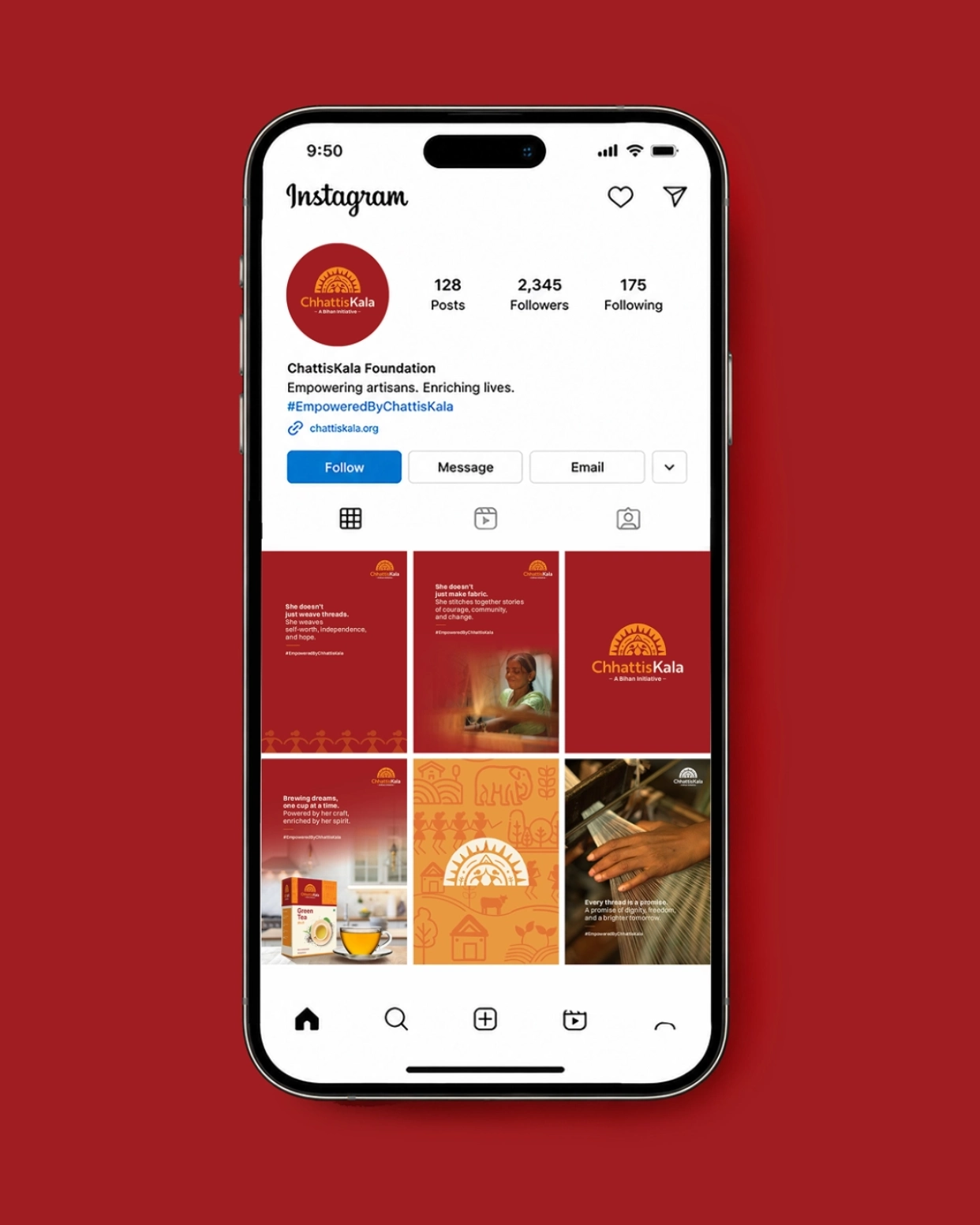
Bilingual from day one
A state brand that works only in English has already excluded most of the people making the products and many of the people buying them.
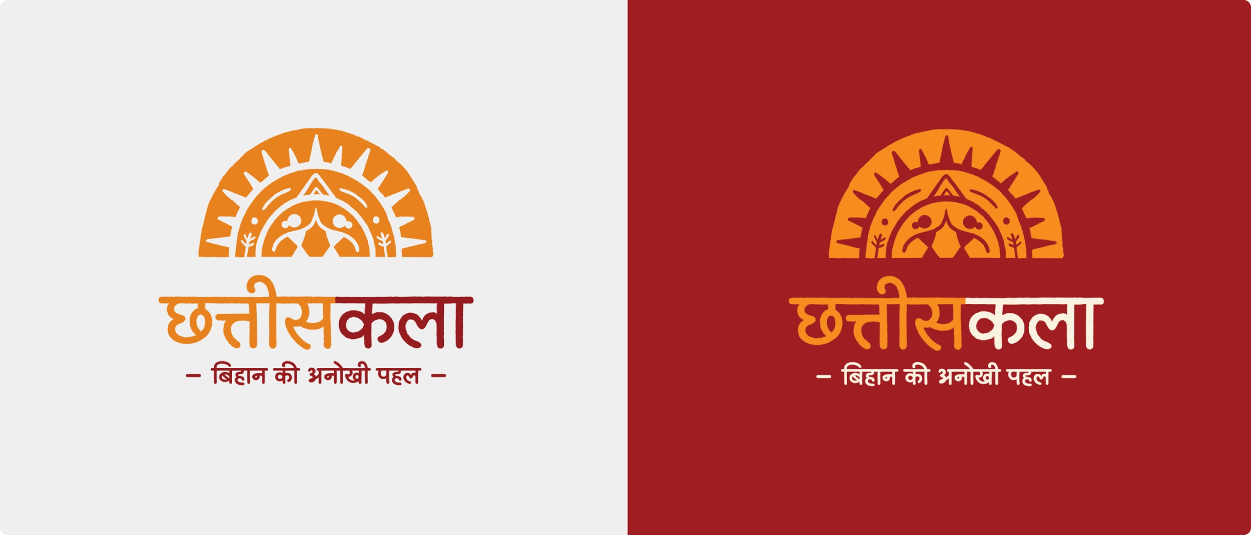
So Devanagari was built as a primary script rather than added as a translation, with both logos drawn properly rather than one set in
whatever typeface was available.
Devanagari is not an afterthought
District communication and national communication carry equal weight, which matters more than it sounds.
A self-help group in a village and a buyer on a marketplace are looking at the same brand, and neither version should feel like the secondary one.
A photography grammar for a state with no art director
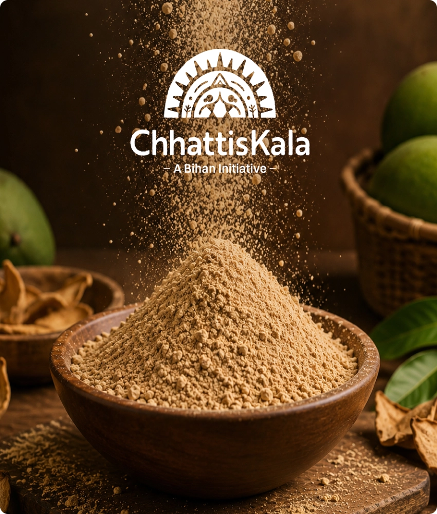
The hardest problem in an umbrella brand is the thousandth photograph. Hundreds of people across dozens of districts will shoot products, makers and places, and none of them will have a brief.
So we built an imagery system of four categories, with rules simple enough to be followed by somebody with a phone and no training.
Four categories, one look
Consistency in this kind of brand cannot depend on approval, because there is nobody to approve it.
It has to be designed so that the easiest thing to do is also the correct thing to do. That is the difference between a guideline and a system.
From a district shelf to a national marketplace
The brand was launched in 2025 by Union Minister Shivraj Singh Chouhan and Chhattisgarh Chief Minister Vishnu Deo Sai. Launched by the state, listed on ONDC
Chhattiskala products are now trading on Amazon India and ONDC-linked storefronts including Mystore and DigiHaat.
Ragi millet cookies made by the Mavali Mata self-help group. Pure tikhur powder, the traditional arrowroot starch, from the Jeevan Jyoti Mahila Cluster Sangthan. GI-tagged Vishnu Bhog rice, cold-pressed mustard oil, turmeric, coriander and seedless tamarind. The unseen hands now have a name on the pack, and a national shelf to put it on.
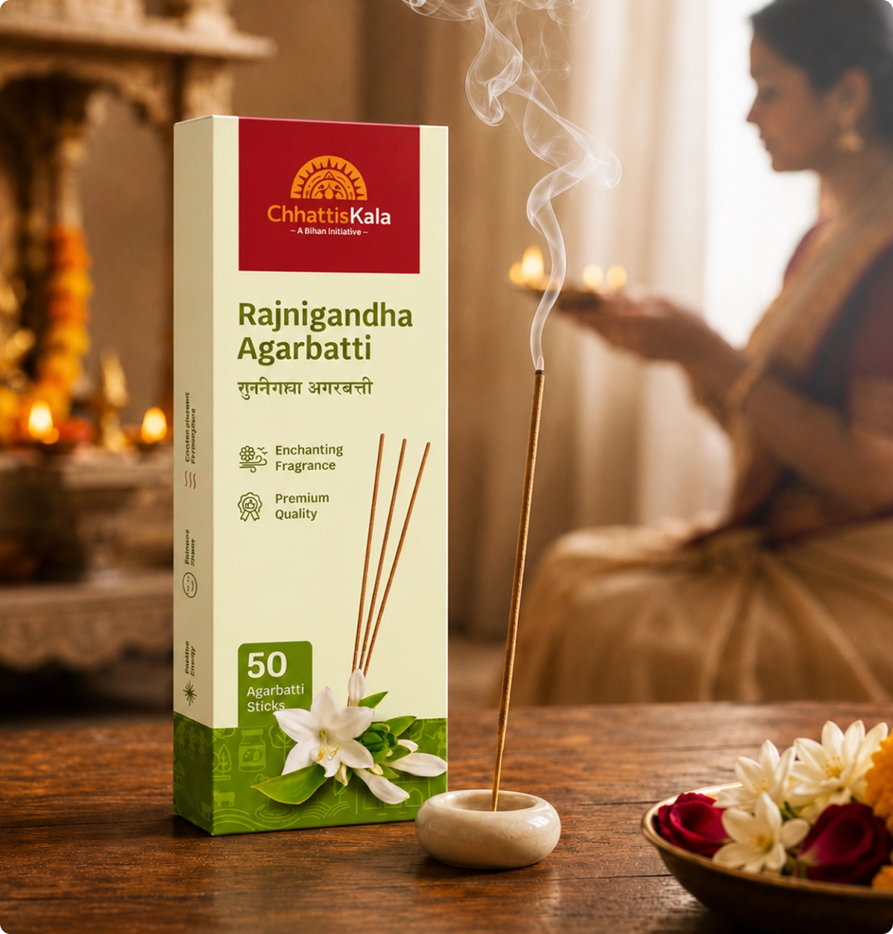
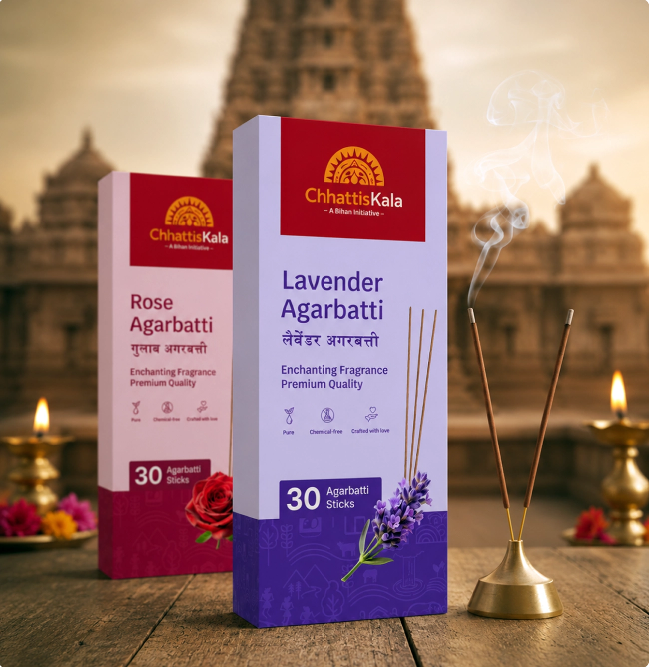
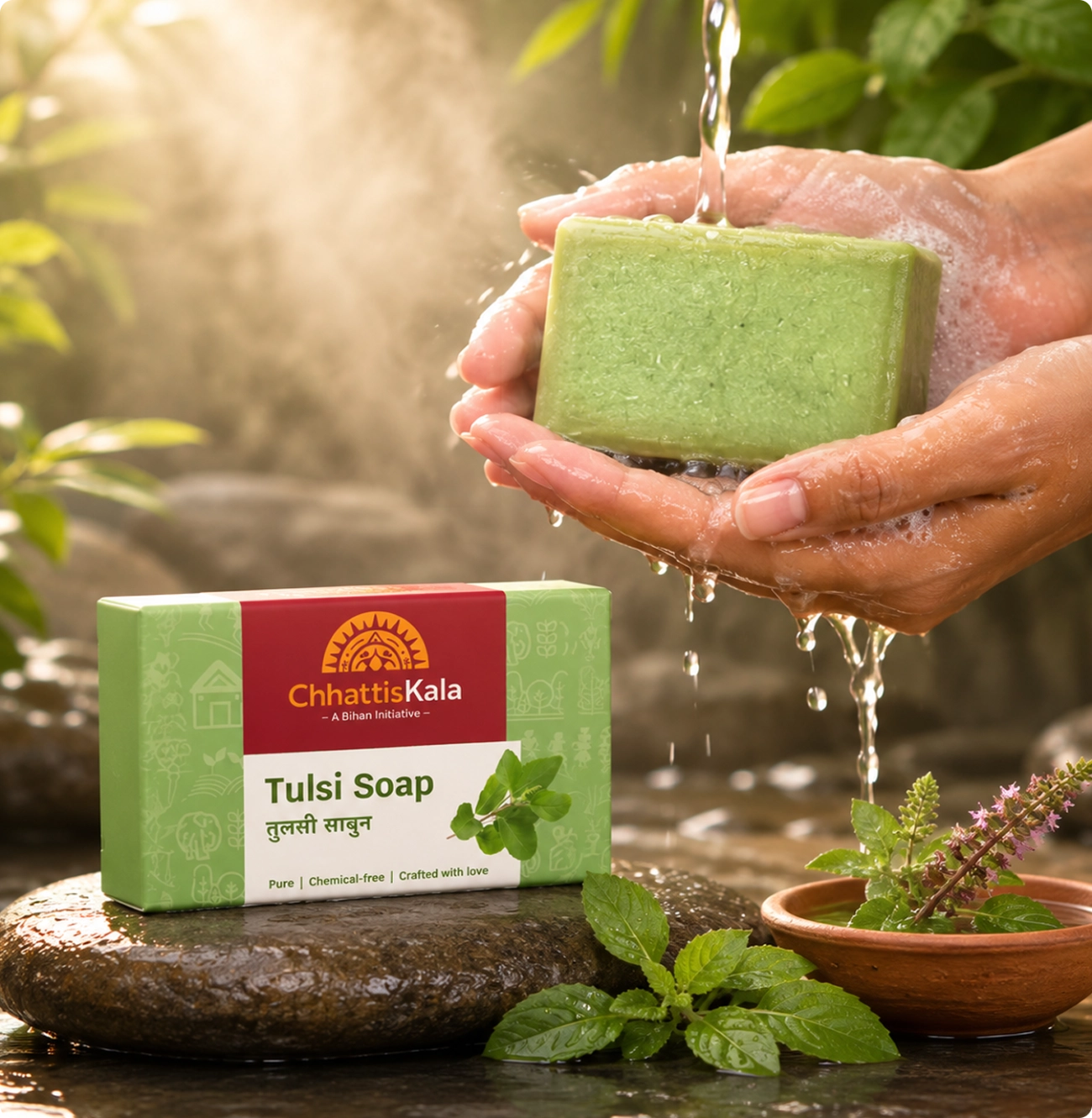
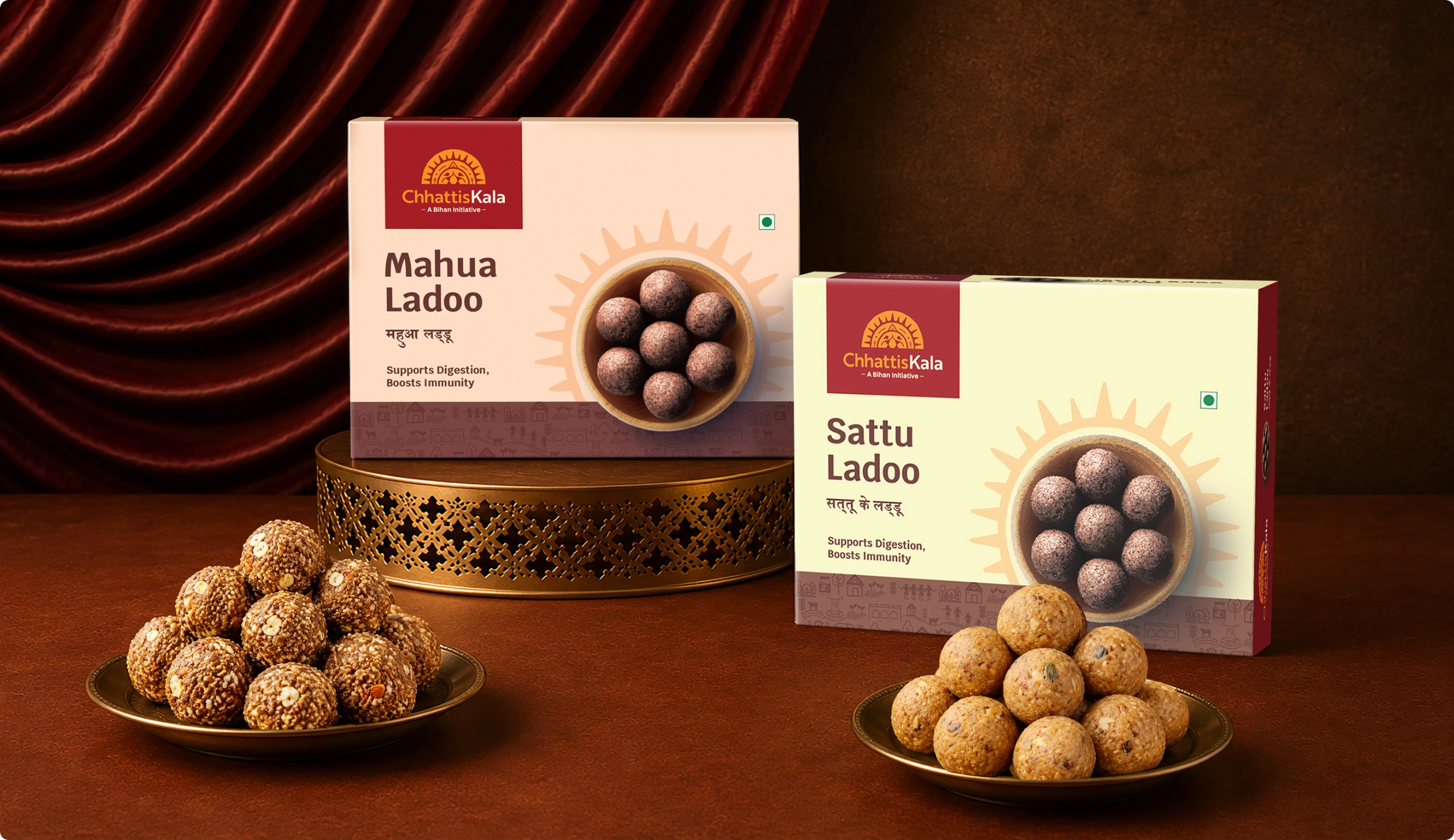

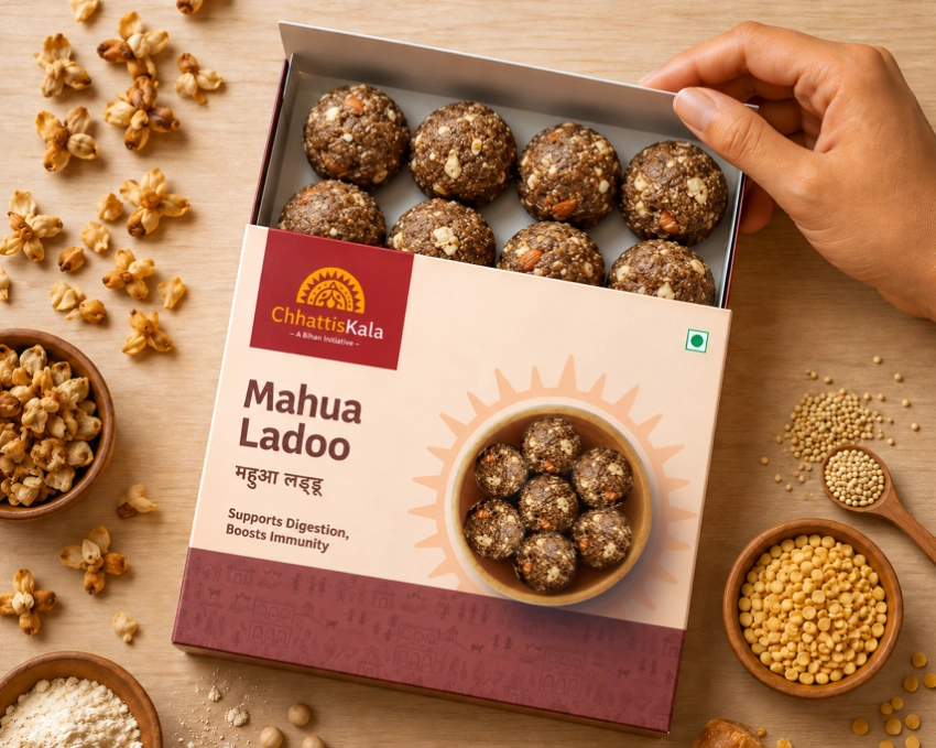
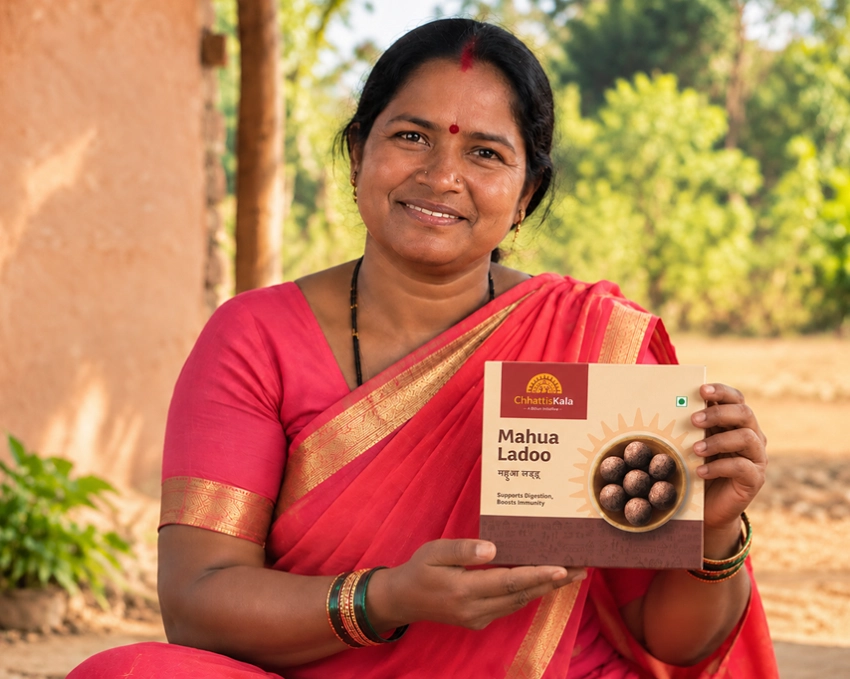
We left Bihan with a brand that districts can run without us, a manifesto its own people repeat, and one name under which a village enterprise reaches a national marketplace.
A state’s craft, given one name.
Frequently asked
What is Chhattiskala?
Chhattiskala is the official umbrella brand of Chhattisgarh, a flagship initiative of Bihan, the state rural livelihoods mission. It brings handcrafted, organic and traditional products made by women-led self-help groups, tribal artisans and farmers to market under one identity, and its products are sold on Amazon India and ONDC storefronts.
What did BigBrandTheory do for Chhattiskala?
BigBrandTheory created the Chhattiskala brand with PwC, covering brand strategy, the name, the brand story, manifesto and values, stakeholder mapping, the bilingual identity system, the imagery system, packaging design across the product range and the system for district rollout.
How do you build an umbrella brand for a state?
By designing for the people who will use it rather than the people who commission it. Thousands of producers across dozens of districts have no central marketing team, so the brand has to be usable without approval. An umbrella brand does not fail because the logo is wrong. It fails because nobody downstream knows how to use it.
Why does a rural livelihoods brand need a photography system?
Because hundreds of people will photograph products, makers and places, and none of them will have a brief or an art director. Chhattiskala’s imagery system sets four categories with rules simple enough to follow with a phone, so the easiest thing to do is also the correct thing.
Why build a state brand bilingually?
Because a brand that works only in English excludes most of the people making the products. Chhattiskala treats Devanagari as a primary script rather than a translation, so district communication and national communication carry equal weight.
Who does branding for government and rural livelihood programmes in India?
The work spans naming, the brand story and manifesto, stakeholder mapping across districts and departments, a bilingual identity, packaging across many producers, and a system that can be run without central art direction. BigBrandTheory works on public and social sector branding in India, and created Chhattiskala for Chhattisgarh’s Bihan mission with PwC.
More transformations.
See all 18 →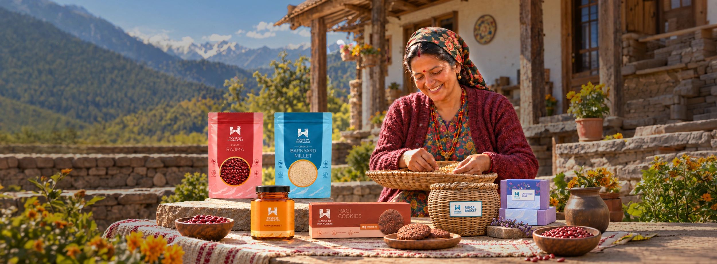
A state's hills, given one name the market could hold.
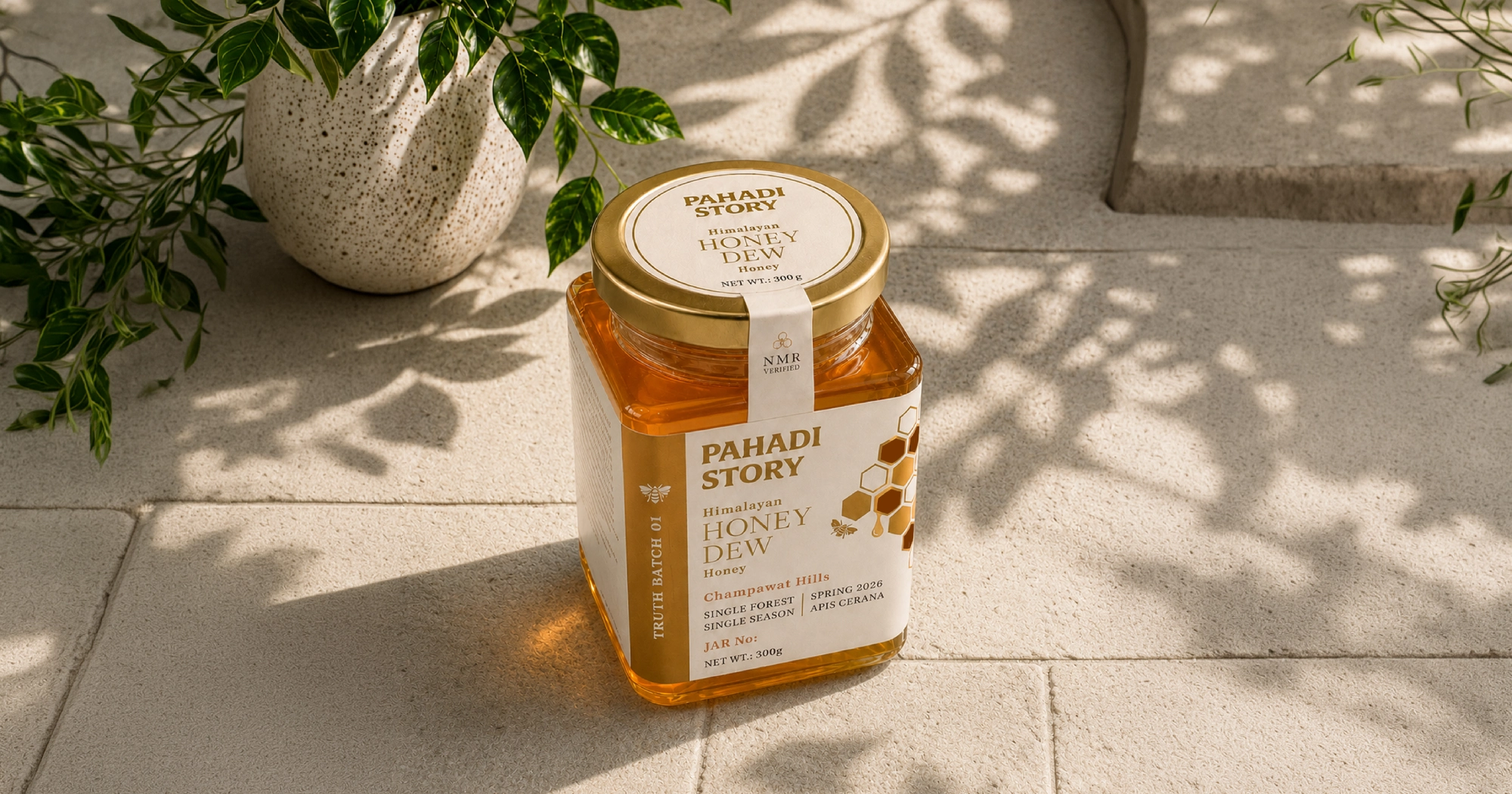
Launching a Himalayan honey brand on proof, not promises.